Typophile

MAQ new concepts

kattttor

Hi,
Starting a new thread with this to get rid of all the crap in the other one.

here’s the description again:
MAQ is a company that is going to start giving out certificates for nurses and other people in the medical field. The certificate is for treatment/handling of prescription drugs, dosage and things like that for patients.

yes yes, trying a more modern approach this time. A bowl, which references to the Bowl of Hygeia, used by other medicine organizations.

Leafs witch symbolizes growth.

The top one is the newest version.

Feedback greatly appreciated.
peter
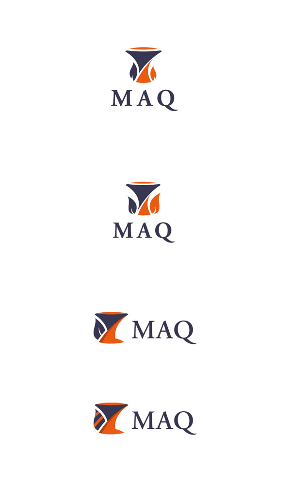
Oh yeah, looking good, looking ’important’. For me it’s definitely number one, the other ones look blobby because they don’t have enough air through the devices and also the shapes, although meaningful, seem not to balance compositionally. Although I do like the stripes.

I wonder though whether number one could go even simpler? The triangle of the bowl perhaps dominates too much (also makes t a bit top heavy) and takes away from the nice balance the leaves and the text have between light and dark. Perhaps it’s worth exploring just the leaves or the bowl or something. Loving the colours, *makes mental note to use oranges and purples together in the future*
Again, though, looking good.

01
The leafs look like flames in the top two ones. Number three looks like a leaf.

02
Remember to test the design in b/w also

03
I like the first design (the top one) best

Captured from web.archive.org on 9 Jul 2008. view this capture