
ChrisL
I'll try this again and see if it will allow me to post comments this time.
Here is a pdf of my character set:
http://dezcom.com/fatsqueeze/FatSqueezeSet1.pdf
ChrisL
| Attachment | Size |
|---|---|
| FatSqueezeSet1.pdf | 57.33 KB |
ChrisL
I'll try this again and see if it will allow me to post comments this time.
Here is a pdf of my character set:
http://dezcom.com/fatsqueeze/FatSqueezeSet1.pdf
ChrisL
| Attachment | Size |
|---|---|
| FatSqueezeSet1.pdf | 57.33 KB |
ChrisL

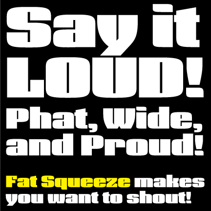
It’s great to see a face this fat with a design that doesn’t feel dated. Most faces I see in this category, regardless of how new they are, scream of some past era, usually in the vein of late 70s-early 80s arcade cabinet letting.
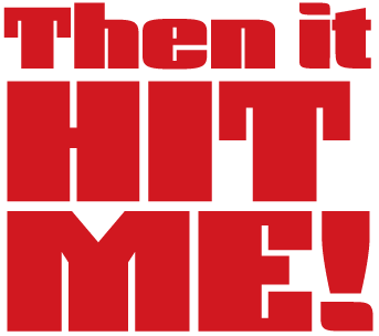
There’s something about the dots on i and ! that distract me every time I see this face. I don’t see a similar juxtaposition of squared and rounded corners in the letters, so I just can’t keep my eyes off of the dots. In the second same, the strings of majuscules without round corners look like they’re part of a different font than the minuscules. Being really nitpicky, the horizontal part of the counter in e looks wider than all of the other counters, which appear to be the same size.

This might be one of those faces that would benefit from a unicase style. When it is smaller I don't mind it in two lines, but when it is bigger and the line length is so short the descenders seem to break the text up too much.

Fat Squeeze looks pretty well thought out. The y is an especially nice (and unique) touch for this genre. The left side join looks a little week though. maybe a more abrupt curve in to add weight? The W used he same solution, but less succesfully for me. What if the two counters angled the same way instead of both pulling to the center (more like 2 V's)?
The dot on the i and explamation seems out of place. Seems like it should be either a rectangular, or rounded rectangular, or fully rounded.
I also wonder if the cap height shouldn't be the same as the assenders for something like this which will be used 100% (hopefully) in display settings. I'd lower the ascenders rather than raising the caps.
The trouble with dense and tight fonts like this (to me at least) is the varying density inherent in roman letters. Some letters present a very dense presence like the HIME, but letters like T and L break that up and look weak. It's a constant battle between desity and conistency.
What do the A. Xx and Jj look like?
Randy

I second James: fat but fresh! very nice. I want to see the whole alphabet for critique.
I wonder if the M doesn't need some rounded corners to match the ideas in the others...

I had been wondering for months what it was that bugged me about this and I think I finally figured it out. These glyphs seem just a little too simplified. They have been denuded of some small details that would help you to identify glyphs more rapidly despite heir enormous girth. Let begin with a positive example : the lc t retains it's tail. That makes the letter for me. The z too has great detail & feeling. But the lc a in contrast seems to me to be in need of a notch cut out of it so it can have a tail again too. Similar things might be done to the u & n. It may be that this kind of thing is besides the point or takes you in a direction you don't want; in which case that's fine. But that's what occurs to me. Add in some small identifying detail to joust with the mechanical/modular heaviness.
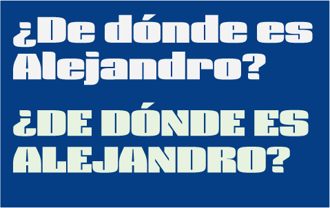
Thanks everyone! Here are some j with case punctuation positioning. More to come!
ChrisL
That N is a clever solution, but can you find ways to use it elsewhere?
Edit: I also wonder if they aren't a little too long.
I think the N works better as a Z where it works admirably.

ChrisL
ChrisL
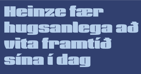
What is the Ae like with the center 'bar' more narrow or the outer elements more narrow? The eth's top should bend more maybe. Can the scoss bar on it be horizontal? What if the f had a slightly longer crossbar - more like the t perhaps? The umlaut is sweet! It feels 'just so' to me.

It's so refreshing to see a fat face that doesn't look all squishy and bloated.
I think the lower case letters are pretty much all home runs. The only ones I would question are the k and x. I would like to see them in text.
The diagonals are the most difficult thing to deal with here. I like your solutions on the VWY.
For me the most problematic letters are the KMN. The K isn't bad, but isn't as great as the others. The M looks awkward. I think part of the problem is that the middle stroke is thicker than the two outside ones. Maybe try making this thinner, rather than thicker, if you haven't already tried this. The N doesn't work, whereas the Z does. As Tiffany said, maybe with shorter cut in strokes?
Have you considered also rounding the outside corners of the spurs on the EFT? The top inside corners on the M?
The 1 needs a new solution; it looks out of place. Should the right stroke on the 4 go to the top? Should the spur on the 7 be bigger?
Great Work!
"something about the dots on i and ! that distract me every time I see this face. I don’t see a similar juxtaposition of squared and rounded corners in the letters"
James, look at the u and n--even better next to each other. Much of the lower case (see i m q r h, etc.) has this theme of a curve corner and a sharp corner.
This was my building concept, mixing soft and hard with very linear counters the sharpest feature. I was trying to find a way to make it a current design that was not just another old one--thanks, Edward (Spire) and James, for noticing exactly what I was doing!
The M and N were always my problem children! I will revisit them.
ChrisL
PS: William, I tried rounding the spurs you mentioned before and they look too serif like and foreign to the rest--Thanks for your kind words!
Randy, Thanks!
Great points. I have been fighting with those very issues and keep coming back to this solution. The vacant spots caused by L, T and J are not ever going to go away with an extreme weight like this. Since it is only display, I have just decidedto let these negative spaces speak and be a contrast to the rest. Small quantities of words will be set in this so textual color hopefully will be a minimum issue so that mass and impact can prevail.
I will take a revisit to the left of the y as well!
ChrisL
"The eth’s top should bend more maybe. Can the scoss bar on it be horizontal?"
Eben, I thought as you about this until last year when I talked to an Icelandic graphic designer. He told me most people bend the eth way too much and had me change Froggy, Boulder, and Now to be straighter. I will try to find his post for you. It was quite enlightening for non-Icelanders.
ChrisL
Thanks Chris!
Here is a try at a few more M caps. Number 5 was the original:
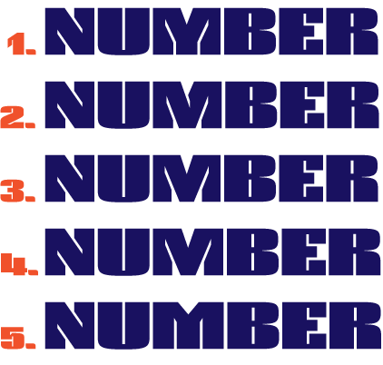
ChrisL
Here is a try with Randy's suggested change to W to match V and y with bigger cuve on left:

I think Randy had 2 very good ideas there!
ChrisL
I was just reading the discussion of the i dot. I kind of like your asymmetry, but maybe it would work better if it were flipped as in a mirror, so the points were bottom left and top right. The dots in some italics are stretched this way, so the eye might accept it as more natural.
Willliam, believe me, I tried every permutation. This way suits the rest most. It is different, true, and will take some getting used to but I am willing to gamble on that.
With the dots flipped as you say, the i looks soft on both sides with 2 curves on the left, flip the i and you buck another convention of exit strokes. :-)
Hoy vey! :-)
ChrisL
"I also wonder if they aren’t a little too long."
What is too long, Tiff?
ChrisL
PS: Did you leave TypeCon a day early? I missed saying goodbye to both of you.
I'm not getting used to the dots :-)
the z: why are the arms angled? Seems like flat is more in keeping.
NMZ: I think you have to be careful about this. If you use it too much, the overlapping tight counters will become the schtick for the face. I don't think you want that. Your original M is best.
Have you tried the middle crossbar on the E as thin as the top and bottom?
Can you do all the glyphs you have in a pdf?
The dots as they are don't bother me, but I thought it was worth trying alternatives, as you already did.
I think Tiffany was talking about how far the cuts slice into the stem of the N. The idea I think was to make them less deep.
On your new M's, #2 seems to work with the rest of the face best. But I still worry about those diagonal cuts on the new M's and N being a little out of character with the rest of the face, and thus distracting.
I would try thinning the diagonal of the N and having no cut, and thinning the middle stroke of the original M--you'd probably have to adjust the depth of the 'v' cut at the top, too. Another way would be to go with #2 and shorten the diagonal cuts in both. Wow, the M and N are tough!
Randy's y idea is a definite improvement. I'm not sure about the W--did you also try the bottom of both cuts falling from the center to the outside, paralleling the notch at the bottom?
I don't agree with Randy. But I do agree with Bill. 2 seems best to me.
I think it could benefit from some additional modeling/adustment to help your eye to flow over it but it seems quite inspired to me. In fact - I bet shorter cuts would do it and would solve some of Bill's worry too.
I happened to see this cover & it reminded me of this thread so I scanned it for ya just in case it is of any help.
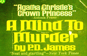

Regarding your M and N test, I like the number 2 variant the best.

Raaawk'n stuff Dezcom!
Reminds me a bit of Jazz Gothic, which I'm currently working with for a poster design. I too like the 'Y'! I agree with dan_reynolds on #2. I like the way you allowed tight/compressed negative space for letter shape - and for itself too.
Cheers!

Any mileage in laying down the strokes of the M and N in order somehow?

Whilst you guys were posting, I was revisiting the M. This last solution made me revisit the N and Z to match. I think this one works best of all. See if you agree?
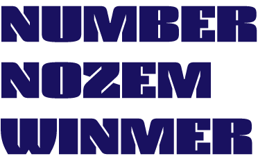
ChrisL
I like Randy's idea of thinning the middle stroke of the EF. There is something clunky there compared to the rest, and he may have put his finger on it. That's why I was suggesting trying the curves on the outside corners, which you said doesn't work.
When I look at the whole alphabet, the N really stands out as discordant, and the M as clunky. I'm wondering if you don't find another better solution, whether the best thing is to use taller versions of the lower case MN--or at least have them as alternatives. This is the kind of unicase thing Tiffany was suggesting. This would harmonize better than anything so far.
Also the 1 is, how shall I put this, "suffering from E.D." as the television commercials put it ;) The droopy bit I don't think should be there.
By the way I think it is because this is so strong that we are moved to obsess on how you can make it perfect.
edit: Ah, I see you rounded the corners on the M. Good idea :) These are an improvement, but I wonder if the unicase thing isn't still better...
"Have you tried the middle crossbar on the E as thin as the top and bottom?"
Randy, I tried that and they look anemic that way. It really messes up the F as well, which is even more problematic.
Hiroshige , THANKS!
Nick, I don't think that works on the N, it kinda looks forced.
Dan, Bill, and Eben: see if my new M is better than the old #2?
ChrisL
Randy, et al,
Here is a link to a PDF of the whole character set with new changes.
I changed both Z z to be paralel, new # 1 ; new ogonek and cedilla and some other stuff:
http://dezcom.com/fatsqueeze/FatSqueezeChar2.pdf
ChrisL
Here is a graphic with new Zz and number 1 without "appendage".
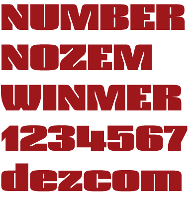
ChrisL
What about making the cuts in the W less deep?
I really like the curves in the new M.
Ah, the 1 is happier :) I feel like there's too much white over the right vertical of the 4; maybe pulling it up just slightly would help. The curve above the vertical cut in the 5 looks like it needs smoothing.
As I added to my post above, the new M fits better than the others--and is better balanced. But as I said maybe you want a big lower case m and n as alternative caps anyway, as these I suspect will fit in perfectly, as they do in the lower case.
Have you tried cutting less deeply into the stems of the N particularly? Because of the 45 degree angle on that, it seems more distracting than the angled cuts on the new M, though maybe these need to be less deep also.
I made the W cuts less deep and changed the 1, 4, and 5.
Here is a link to a pdf with character set and a 2nd page with some running text in English and Polish. (The English text is a snip from a paper on marketing I wrote in college eons ago.)
http://dezcom.com/fatsqueeze/FatSqueezeMixTxt.pdf
ChrisL
Nice.
Suggestions:
- what if the Cap A had some curve on top and had a less tall apature above the crossbar
- What if the Cap L had some curve on the inside of the base. It also might be slightly wider.
- What if the CAP E was wider?
Here is a pdf with the cuts on the N made steeper, The ogoneks tweaked, the M tweaked and cap positioing for quotes.
http://dezcom.com/fatsqueeze/FatSqueezeMixTxt2.pdf
ChrisL
@Eben, if the L is wider it makes a big hole above the crossbar, if the E is wider, it gets too dark.
I have an idea about that but I would have to show you - do you mind if I do that? If you do that's fine too. And if that's the case my hint would be the Z. It has characteristics I think I could bring to the E.
BTW the New M is getting really nice. I have a possible tweak to try for that too - what if the angles were sharper & led to a vertical bar for the last 1/4 of the middle?
Maybe the lslash can be pulled in on the right in general or in a small section so that it douesn't touch the u ( 3rd paragraph, 6th line, far right side )
"I would have to show you"
Go right ahead, I would be curious what you have in mind.
ChrisL
"I happened to see this cover & it reminded me of this thread..."
Eben, What is the connection? I think I must be too fogged to see it.
ChrisL
What is the connection?
The very thick verticals in the M The curve in the A. Obviously very different faces - different tone. But it seemed like some of the structural challenges that come from the thick verticals were related. Have a look at the lc s. Anyway. Either it's interesting or it ain't. Either way is fine.
Thanks Eben!
ChrisL
The "A" is too "deco" for my taste, is there an alternate? But the related "W", "V" are working well for me.
Hey, don't take that comment to seriously, I'm just a simple grafic designer :)
BTW, this typeface will be a winner.
Thanks, Poms!
I have tried many A variations and this one gives me the least heartburn as a member of a family.
ChrisL
This post has been edited
Moderator: Eben Sorkin
helpful advices, mr. wer
Gotta love these Spam freaks, wish they would mutate into humans :-(
ChrisL

ROFL! But if they did, we'd just ignore them anyway: a few names come to mind.... ;-)
Wer has been Blocked.
Eben,
Are you "Da Man" now? When did you get admin status, dude? Good work!
ChrisL
Now back to the task at hand:
I have reworked the M, N, T, H, E, F, and added some unicase stuff as well. The new M takes in hybrid parts of several alternates and is my number one candidate for default.
I don't know if this is what Eben was trying to tell me yesterday but I added curves to the E and F. This caused me to add curves to H, L, and T with the domino affect. I think it helps resolve the dot issue, too.

ChrisL
Chris, Yeah, that's what I was planning on doing basically. I think it looks very good indeed and relates nicely to the R, B & lc el.
I wonder about how a thinner bar would look on the UC E to be like the lc e & UC H. Probably you tried that already.
And I agree the dot on the integrates now in a way it did not before. Nice!
The new H IS really sweet. I like both Ms too.
What do you think? Is this taking the face in a direction you like?
Another small idea: What if there was a Alt W where it was like the M flipped but witha slight outward bow to the strokes?
RE 'da man'. I agreed to help moderate here at Typophile while I was at Typecon. Mostly I am doing Library/Book stuff with Tiff. But I think hyper-blatant spam probably needs to be dealt with sooner rather than later.
Cheers!
Eben,
Thanks! It was funny, I couldn't quite get what you meant but after I did it, I asked myself, "I wonder if that is what Eben was trying to get through my thick head?" :-)
I think I am ready to go beta test with this thing and finally get one font out the door! I promised myself I would put a font on the market by September and I only have a few days left to move. It has been a fight to finally get the guts to just say, yes, this is not perfect but if I wait until it is, I will be dead and buried!
Thanks for everyones' input and encouragement!
ChrisL
I think your recent numerals work very well--nice solutions. Also I like the new M. The N is better, too, but I wonder if it can be made still more harmonious.
I don't like the new curved inner corners of the EFTL serifs. I think you violated the look of your other characters, where the counters are all 'slots'. To me breaking the slot shape hurts both the strength and unity of the face. It's going too 'soft', and less coherent. Seeing the new and old set in more text will tell the story.
I'm not sure on the H. I guess I want to see it in text. Also if H is the only cap stem with that treatment I'm not sure it makes visual sense.
Such a small thing really does change the flavor or voice of the font in a big way. I feel like it reads more readily now so my vote is cast in the latest direction ( ...as if I had such a thing. ha!). At the same I do recognize that something present in the original has been tampered with. One possible solution - make lemonade.
Instead of two families there can be 2 or more. It might strike you as cheating at first but I honestly think it would be at all. These little things make a huge difference. You might look at Hoefler's Proteus Project.
http://www.typography.com/catalog/proteus/index.html
He did a great job of offering several flavors of deeply related forms. You might do something like that.
What a great work Chris!
The only crit I'd done for now is in relation with the M and the N. So far, at my point of view, I think the original M and N on #5 are the more effective for the legibility. The other are nice too and greatly wise solution, but I think the inner white slant line would cause too much “vibration” in a long text Also, I would try a rounded or a squared dot for the i, ! and ? or at least, less large for the ! ?.
I like the rounded corner on the i, l and some other character. Even though the general feeling seems square you’ve been able to give to the typeface a smooth, fresh and actual look.
Bravo!
André

This look great for a bunch of purposes I can think of, all of them good, :-). Knitting little whites is one of the best learning experiences I've had.
My largest concern in designing a face so fat as to challenge the very existence of certain features, is to be very hierarchical in determining the size of the tiny little "white" spaces. The micro-counters of "a" and "e" must be finely balanced by slight variation to "equal" those of "p" and "d", which must be finely balanced by slight variation to "equal" those of "hnmu" and so on, so that all, and their inter-letter spaces create the proper clicketty-clack amongst themselves (lowercase), and then with all the rest...
Additionally! in a dangerously fat "some-sans" like this, one introduces in the "F", "J" and "L", "vast" spaces relatively, and though you've managed to minimize these in the "VWXY" there is still a relatively vast (and unkernable) white space left. Where this and the slightly varying counters leaves one is with a need to space very precisely, to ensure less space between a character under spacing consideration and any other, than there is in the counter of the character under consideration, on both sides, always!
This whole area of style, naturally, is a serious challenge in a one-size fits all outline...but again this looks really good so far.
Cheers!
Thanks André!
I am revisiting everything again :-) And congratulations to you for your upcoming release!
Chris
David,
I really appreciate you taking your valuable time to give me helpful advice! It means a lot to me.
I have been tinkering with slivers of counters and trying to use the tension of proximity to neighboring glyphs to try to achieve some hope of a working solution. I am glad to have the benefit of hearing from your years of experience. I will look back at it all again and try to apply what you have said.
Thanks for your kind words!
ChrisL
Here is my latest version (before I saw David's post).
I went part way back to what I had but with much tinkering.
http://dezcom.com/fatsqueeze/FatSqueezeMixTxt3.pdf
ChrisL
Wow, I think this is going to be a best seller for you, Chris!
Since your last (26 Aug) M had a distinctive look, you might consider having it as an alternate.
One possibility would be doing an N with no diagonal cuts, to match the M without diagonal cuts, and then have the N and M with diagonal cuts as alternates...
The N would be tough to pull off that way. It would be easier to just have diagonal cuts and no verticals but that is a different beast altogether. The other M is already an alternate, Bill, and so is the roiunder corner N and unicase N.
Thanks for the kind words!
ChrisL

I don't know if I will have a chance to have a slash at the other ideas I had anytime soon but here at least is what I have made so far.
And now off to attend to:
"Where this and the slightly varying counters leaves one is with a need to space very precisely, to ensure less space between a character under spacing consideration and any other, than there is in the counter of the character under consideration, on both sides, always!"
ChrisL
I have been attempting to apply the concept David Berlow posted here on the 26th. I have redone spacing and am posting results of my 2-day endeavor.

ChrisL
Here is a PDF. With spacing and counters this narrow, GIF files don't do much good:
http://dezcom.com/fatsqueeze/DezSqueezeDBquote.pdf
It's not perfect yet but I thought somefeedback might help at this point.
ChrisL
Chris, if it isn't too much trouble, I'd be interested to see a couple of phrases with 'before' and 'after' examples above one another, so I can more fully appreciate what you've done.
William,
I am not sure I can figure out which was the older file at the moment but I'll try :-)
ChrisL
Night vision failure! FOGET that previous slitty-eyed PDF I posted yesterday. The morning light has opened my eyes and I have made very small (2 units) but crucial adjustments. Here is the latest:
http://dezcom.com/fatsqueeze/DezSqueezeDBqt30.pdf
ChrisL
Looks like I missed my September 1st deadline :-(
I have been redoing counter widths and spacing a zillion more times. I think I am real close now but too tired to make a new speciman to post.
I'll upload my final PDF tomorrow.
ChrisL

I haven't looked in detail but to me opening up the counters in terms of width seems to have really improved things. Reading is far smoother. I started to wonder about doing something subtle & ink trappy with the cross bar on the t - or thickening the cross bar itself - or both. I am looking forward to checking out the next file in more detail!
The adjustment of the counters has reduced dazzle, and increased readability. The question is, is that what you want? More dazzle gives more punch, less readability. One option is to go for more dazzle on caps, less on lc.
The dilemma I was running into was that I needed more units between glyphs to differentiate between spacing variations (curve to curve/curve to straight/angle to straight) and the only way I could get it was by opening up counter space. David Berlow's comments helped me to see that. His exercise really helped me see limitations. After much trial and error--a zillion revisions later, I settled on adding 6 units of space to the counters. This may move the sweet spot of the type size down a few points for high rez printing and allow better results for poor conditions like newsprint where spread is an issue. The only other out is an optical sizing structure. I will also double the UPM to 2000 to give me what I need for better kerning. At this point, I really need some 2400 dpi output to really see what I have to do.
ChrisL
I just couldn't leave well enough alone, I have been re-kerning everything and changing the f ligs to allow a sliver of space between elements.
Finally, here is the PDF sample text is in several languages:
http://dezcom.com/fatsqueeze/Squeeze_Text.pdf
A few of the samples are negative tracked at large sizes. This may move towards the effect David Berlow was trying to get through my thick skull.
ChrisL
Here is a comparison of the old with the new counter width and spacing (the new is at the bottom):

ChrisL
Great improvement Chris. Well done
Bravo!
André
See what others who know the market better think, but to me these two have different, but desirable qualities. The lower more readable, the upper more arresting. Fat Squeeze--regular and obese? :)

You know, it's seeing amazing designs like this that tempt me to never touch TypeTool, FontForge, or any other such programs again... I just can't compete.
André,
THANKS!!!
William,
I will be making a version later called "FatSqueeze Huge" for big-ass uses only. This is for cases where size really matters.
ChrisL
Wow! Thanks, Alex, but don't let me stop you from trying your own. It isn't about competing, it is about doing what you want to do.
ChrisL
Well yeah, but you pros make it look so effortless... Me, I struggle to draw an 's'.
Effortless? Hardly. Hundreds and hundreds of hours of effort go into making it look "effortless."
ChrisL
PS: I struggle to draw an N.
I like the new developments Dezcom, and like to see the pain and pleasure being squeezed from every reissue ... ;)

Chris: “You know, a lot of effort went into making this effortless.” Type certainly qualifies as an addiction, too.
LOL!
Antonio,
Addiction is writing a million lines all saying what addiction is :-)
ChrisL
"...pain and pleasure being squeezed from every reissue"
Struggle is the nature of humankind :-)
ChrisL
Chris:
I could add more, but it would probably hijack the thread when in fact Fat Squeeze looks darn fine and when will it be out anyway?
All good points and many sound painfully familiiar :-)
Thanks! Hopefully, by the end of the month, I will have this one out.
ChrisL
One last time!
I changed the UPM to 2,000 giving me some more wiggle room. I narrowed the counters 2 old units and tightened the letterspacing some so that now,the sum of any 2 sidebearings is less than the narrowest counter. This is not a huge amount and will go unnoticed at smaller sizes but I think it gets closer to what David was trying to tell me. I can "feel" the difference--like when you tune a piano an infinitesimal amount. This setting will allow tracking with less re-kerning for the enduser because the spacing increments are closer together.
This final revision is between the last one and the earlier ones (about 1/3 of the way between. To me, it just seems to "sit" better here. My 600 dpi laser doesn't do the job at anything but bigger sizes so I will have to get some Lino output to check for sure.
http://dezcom.com/fatsqueeze/Squeeze_Text2000.pdf
ChrisL
Hey, I think you hit the sweet spot on the spacing. Looks good!
Thanks William!
I think I am going to get this thing ready to sail :-)
ChrisL
Here is the last version I am posting. Some putzing with diacritics and added kerning pairs. I also changed T and t commaacent to their Unicode names so that they show up in stupic Mac OS apps like Textedit and Mac Word. I wish APPLE WOULD FIX THAT!!!
http://dezcom.com/fatsqueeze/Squeeze_2000upmFin.pdf
ChrisL
Thanks to JLT for reminding me of this thread. I just reread it and it was a good chronicle of my struggle. The hard part was the nearly 2 years that passed between this last 2007 post and final release in 2009! The battle to let it free was sreong and the many revisits and tinkerings between are unseen and indescribable but still huge in the process.
I am really indebted to David Berlow for what I learned from his post!
ChrisL
PS: the final result=
http://dezcom.com/typefaces/squeeze/
.
Dez Squeeze Pro seven width family now released:
http://www.myfonts.com/fonts/dezcom/dez-squeeze-pro/
Captured from web.archive.org on 17 Mar 2015. view this capture