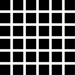
In his book ’While You’re Reading,’ just out in an English edition, Gerard Unger discusses the ’edge effect’, whereby the eye increases the apparent contrast at edges between black and white.
The edge effect is, I now learn by googling, an instance of a well confirmed phenomenon of perception known as lateral inhibition. Here is a brief explanation of it on the Wikipedia. And here is a longer introduction to the science, with links and bibliography.
The idea is that the brain wants to pick out edges in the visual field, and our neural networks make the black apparently blacker and the white apparently whiter at an edge in order to facilitate this. In other words, the visual network exaggerates contrast so that the brain can identify edges more easily.
Gerrit Noordzij has also noted this effect and its relevance to type design, though I don’t remember him using this label of ’edge effect’.
This phenomenon I think sheds light on the issues of ’notan’ we have been discussing on Typophile. In particular, Frutiger is reported on the Linotype site as having the goal of ’activating the whites’ in his design of letters and inter-letter spaces.
My feeling is that this ’activating the whites’ is largely a matter of shrewd exploitation of the edge effect.
Here for illustration is the ’e’ from Frutiger vs the ’e’ from Myriad—a subject in the ’rip off artists’ thread.

Note how the Frutiger ’e’ uses the edge effect to ’activate the whites’ more than Slimbach and Twombly’s Myriad.
First the top of the e and the bar are thicker than Myriad, and the eye narrower. I am guessing that a thick black will have more ’edge effect’ than a thin one, and that seems to be the case here. These decisions together make the ’edge effect’ ’light up’ the eye of the Frutiger e more than the Myriad e.
In addition, Frutiger cuts the terminal vertically, and flares the terminal upward. This increases the ’edge effect’ also for the terminal, so it is more vibrant, and it probably combines with the edge effect on the bottom of the bar, so creating a white spot between the terminal and the bar. By contrast, Myriad slims down the terminal, and cuts it at a diagonal, probably both reducing the edge effect.
I don’t think the question here is one of better or worse, but of different design decisions. Frutiger wanted a vibrant face for signage. Twombly and Slimbach I think were going for a more calm text face. Myriad is also a bit narrower, more traditional ’humanist’ proportions.
more to come...