
I'm working on a Logo for a theater group. They will perform
«Der Vogelhändler» (The Bird Seller) by Carl Zeller.
Here is a link about the story:
http://en.wikipedia.org/wiki/Der_Vogelh%C3%A4ndler
I thought to use some letters from book covers of Emilio Salgari.
The covers have been made during the late 19th century. This operetta was performed in this period the first time and this gives me an opportunity for an hommage. It might be a small connection, but i will give it a try.
The logo will be used for an advertising campaign (ads, brochure, posters, etc.). So it has to work in different sizes. The following logo is still in a rough stage, but the idea has been accepted by the client.

I would appriciate if you could give me some feedback about the readability and interpretation of the letters. Any general thoughts are also welcomed.
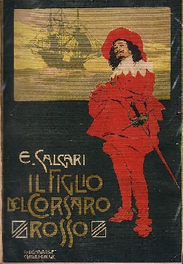
This is one example, you can find more here:
http://images.google.com/images?svnum=10&um=1&hl=en&rls=com.microsoft%3A...


