Typophile

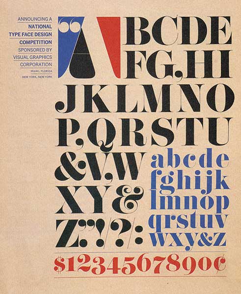
(x) Curvaceous 70s ampersand - Pistilli Roman {Mike Y}

dcastillo

Here's one that I'd love to know so much more about. It may have never ever been digitized, and usually ampersands like this only appear in the italic set of typefaces. I will say that when I see this out in the world, it is usually with a title face that looks like Bodoni Poster Compressed but I'll keep my reservations.

It's from Pistilli Roman (Phil's Photo book).

- Mike Yanega

THat is lovely!

thanks for the info! now I have a Phil's-Photo-Book-binder-shaped void in my life

It also comes in a softcover bound version published in 1985. I have seen it once or twice in used bookstores. I'll bet you could find it online through ABE Books or Amazon.com. The title is 'Homage to the Alphabet -- A Typeface Sourcebook'

- Mike Yanega

Jason Walcott's Cabernet Swash has this ampersand.

Pistilli too?

Pistilli too?

Of course! :)

As has the OPTIPirogi-Roman (under the œ).

Add:
The Pistilli-Roman is on Dafont. http://www.dafont.com/pistilli-roman.font (Unicode 00A4).

Sure, there may be a Pistilli Roman on Dafont, but that doesn’t make it the Pistilli Roman. It’s a pretty shoddy digitization with poor spacing/kerning and strange mistakes (see below). We’re still waiting for a proper revival.

More Pistilli at Fonts In Use »


Poor kerning.


Whoops.

Captured from web.archive.org on 31 Mar 2015. view this capture