Hi everybody!
1.
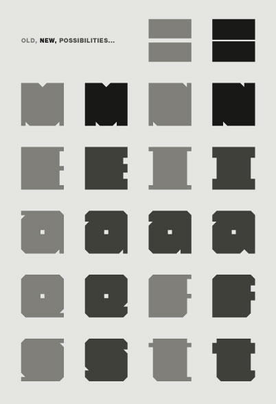
Chumbitos is an unicase & monospaced ultra-fat typeface I'm working on. Take a look on this pdf and tell me what do you think about... ;-)
2.
Some days ago, after I've drawn all the basic glyphs -- Caps, lower-case, numbers and some diacritics --, my friend Quincunx told me about some similarities between Chumbitos and Deuce. In fact, some glyphs are very very similar, but the intentions of mine are far from that, as you can see on the pdf. Well, I don't knew Deuce before to drawn Chumbitos, so what do you think about this kind of situation? Legally, Ethically, ...
Thank you,
undr