Typophile

bloody rip off artists!

This thread ran to 4 pages of replies and only 3 were recovered, so replies are missing.

muzzer0 votes

SO what do you fullas think about this? I know there ar eheaps of con artists ripoffs but this is so blatant that it is shocking!

orignal: http://vllg.com/Thirstype/Infinity/mudTyper+Weights/

ripoff: http://www.myfonts.com/fonts/t26/aeon/

is this typical for t26?? I know they were really hot about 10 years ago, but who is really into this??

Muzz

This is not a typical T26 borrowing of concept. I think Thirstype definitely has a legitimate cause for complaint.

Well maybe they thought chester was some old guy like adrian frutiger, so it was OK to make like microsoft (segoe) or adobe (myriad).

A little closer than those, Nick.


wow. that's bad.

is there any recourse for something like this? i always remember hearing that you "can't copyright an alphabet" which allowed for all kinds of helvetica and frutiger knockoffs. so the question is: what can 3st do other than shame T26 into voluntarily removing the font from their collection?

Perhaps T26 is unaware of Infinity, and just accepted it on its merits. Hard to imagine, but possible. Either way, they should be more careful.

What Mr. Paul Nojima was thinking, I can't imagine.

This happens all the time. The only thing you can protect is the name.

Robert - I understand your experience is from the film type era when copying was common, but this level of plagiarism of an existing digital typeface is actually pretty rare today.

Of course, what's truly unforgivable is that the T26 ripoff is of inferior quality. When H&FJ rework the already excellent Avenir into the transcendently good Gotham, that's called "standing on the shoulders of giants." But this is just trying to make a dishonest buck off the backs of others.

In other countries than the US, there may be legal recourse. In the meantime, Mr. Nojima and T26 have created an entry onto their permanent Internet records that will be very hard to erase. I certainly can't imagine legitimate font people or designers working with either one now. For shame.

I've emailed them to see if we can't get a response. Until then I think it is best to not jump the gun. T26 is a nice group of people who do not condone piracy so I will give them the benefit of the doubt as I hope we would all do.

> you “can’t copyright an alphabet”

But in some countries, you may register new and original letter designs.

> bloody con artist ripoff

In my terminology, it is not a "ripoff", but rather a forgery by the Monotype method, because, while most lowercase and uppercase letters and most tabular figures are identical in design, there are a few exceptions, e.g. capital "K", German "ß", the "@" sign and a few other characters:

http://www.sanskritweb.net/temporary/infinity-aeon.jpg

Yet, another question is, whether "Infinity" is an original font at all.

More research would be required to decide this question.

I've done the research. Infinity is original. Aeon is not.

Paul Nojima about Aeon: "I created this typeface to be used for my own personnal identity system. I wanted something UNIQUE to represent myself."

Wow!

It's too close to be unintentional. Not one person has the same exact idea for 97% of the alphabet.

Although it is not discussed very often, designers do compete with each other. New genres enter the market (or re-enter) and then in two to three years time you have many types that are competitive with each other. And it makes sense too. If there is a [historic] model- there's always room a new spin- even if it's not old. Its also good for consumers too.

If I like Bureau Grotesque but not the price (700 smackers) or its serious demeanor
then
Process Type's Maple- but it doesn't have old style figures and maybe too much personality
then
Parry from OurType which is super clean maybe a little too sanitized
then
I have to wait for National Grotesque from KLIM which has a little Akzidenz in it but if want more Swiss
then
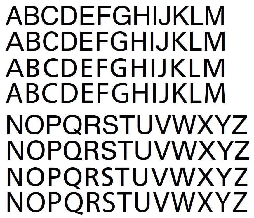
Endurance Pro from Ascender Corp which is super affordable and reminds me of...

I think you get the idea! Inspired- but not a copy nor a forgery. So since this is an obvious copy I wonder if he just customized Infinity to his liking and mistakingly reasoned he could sell his modified copy. And just for arguments sake- What inspired Infinity? Is Infinity based on a type that has a structure/skeleton just so that we could say two people looking at the same source could get 'inspired' to created a techie sans with a similar look much in same way my examples above seem to?

I hope all is worked out soon,

Mike Diaz

Muzz, curious as to what your connection is to the typeface and why you're interested in stirring this pot so publicly...

Off Topic>>> Nicole I love your Elena!!! I hope to see it published soon!!! Congrats... Mike Diaz :o)

That's just a bit too close.

is there any recourse for something like this?

Yes. The affected parties could work it out amicably or it could get messy. Too close for coincidence and T.26 likely was unaware or would not have released it. Perhaps the type world could use an arbitrator for such issues.

I was only playing list-mom again. Sorry to those who think I was out of line. When I come across things that are too close for comfort I email the foundries.

Raph, a note: Frutiger referred to Futura when designing Avenir (hence the name). Gotham is derived directly from building signage in New York City, hence its name. It shares some traits with Avenir, but I doubt H+F-J even referred to Avenir in the development of Gotham. The major difference is the x-height.

Aeon isn't available on the T.26 site.

Tiff why are you apologizing? You stated that you asked both foundries for their comments and asked us not to speculate until we hear their positions. Truly commendable.

But also, thanks to muzzer for drawing our attention to this. Now we, as a group, are aware of the situation. But we need details from Village and T26.

Hello all. It has been interesting to read the lively discussion here.

Murray is a long-standing and repeat customer of Village, and previously Thirstype. He has licensed several of our faces, and has provided valuable feedback and insights. Yes, he has a gruff manner and an... "unedited" prose style, but he's a good guy. He emailed me yesterday to point out the similarities of Aeon to Infinity, and asked if I thought it was appropriate for him to post on this site. I didn't see why not, and told him I had no objections.

I immediately leapt into action myself, contacting both MyFonts and T-26, and receiving quick replies from each concerning the matter. In fact, the Aeon typeface has already been removed from the T-26 site, and should hopefully be wiped from the MyFonts database shortly.

To address Uli's question about the originality of Infinity. The face was originally designed at Thirst as part of a new identity for the modem manufacturer USRobotics in late 2000. The process is documented in the book "Emotion As Promotion": http://www.amazon.com/exec/obidos/tg/detail/-/1580930972/qid=1108143698/...

With best regards to the Typophiliacs,
chester
Village

Thank you for filling in the blanks, Chester.

Tiffany, First of all... Thank you for having our back. And, thanks for sending this to me. How very unfortunate that folks are so quick to chop anyone down without the facts.

I have been discussing this with Chester in a very friendly way since we learned of it. We have had a good relationship with Chester for many years (as we try with all others) and plan to keep it that way.

We had no idea that this font was a rip-off. It is practically impossible to know of every situation, or to know, or control what designers do.

We can only react responsibly as soon as we can, as we did here, and, of course, have already removed it from our offering. I hope this lowers the temperature here. It is really not necessary to start off on a negative. Best to all.

Glad to see that talking the the right folks does the trick. Hats off to all of you for quickly doing the right thing.

ChrisL

Thank Dexcom.

Yes, he has a gruff manner and an... “unedited” prose style, but he’s a good guy.

I agree with Carlos that there was no need for such a harsh tone right off the bat. It's important to point these things out, but to leap to insults is unnecessary. It reminds me of the guy I kinda know who was running around yelling "someone stole my cell phone" when it was in his bag and he just couldn't find it.

If only every outfit operated with the integrity and sense of responsiblity as these two. I respect them even more than I did before, and that's saying a lot.

Bravo.

Again, thanks to Pattyfab & Malbright. :-)

My apologies, Carlos.

Great to have you here, Carlos. Thanks for fixing the issue so quickly and protecting the original design.

Apology accepted Nick. :-))

I respect them even more than I did before, and that’s saying a lot.

Well put.

Cheers Carlos!

Glad to see all has been worked out in a timely manner. And Tiff, you did the right thing :-) I hope Mr. Nojima will learn a valuable lesson here... BE ORIGINAL! Perhaps he will design something fabulous one day and we'll be speaking of him in a more positive light.

Mikey :-)

PS... if not he can work for this company:
http://www.macxware.com/candypress/Scripts/prodView.asp?idproduct=67

While I'm at it!!!

I think everyone should have a look this. Both in Germany. The original- Ingrid Liche, this other one- Joachim Frank.
Is this what I think it is ??????

http://www.fontshop.com/fonts/downloads/fontfont/ff_liant/

http://www.myfonts.com/fonts/joachim-frank/waldorf/

http://www.waldorfschrift.de/index.html

Here we go again :-/

Mike Diaz

I'm always impressed with the lack of creativity even with the name changes:

Mistral to Mystic
Algerian to Tangiers
Tekton to Techno

Stupefying.

My hats off to you to Tiff!
I wish I had your calm and correct approach in some of my prior client meetings;-)

Hmm... I don't know if I would call that lack of creativity, Ken; I think it's more of a wink-wink thing... You know, they give it a similar name, or one that references similar sounds or names, so that you recognize what face is being ripped off...

Yes, I'm impressed with T26's professional handling of this, and even more so with our fabulous moderators. As for Mr. Nojima, I hope he learns his lesson.

The discussion about Futura/Avenir/Gotham is another interesting one to have, but maybe we won't go into it in depth here. To me, it is self-evident that Gotham references Avenir. The "G" alone has that distinctive Adrian Frutiger form, and if you look at the lowercase you'll find that the only letter that's structurally different is the 'k' (Avenir has a symmetrical right part, like Univers, while Gotham's bottom leg meets the top leg partway). Futura is significantly different from both others: single story 'a', tail of 'g' curves up, tails of 'j' and 'y' are straight, top of 'r' curls to 1:30 (it's noon on both Gotham and Avenir), top bowl of 's' is much smaller than bottom, bottom of 't' is straight, 'u' has no right stem, and apexes of 'v' and 'w' are pointy.

But I'm not saying that's a bad thing, quite the contrary. H&FJ have created something that's a little bit new and different, and (by taking the challenge of increasing the x-height) definitely a lot better for some uses. That is a fine standard for type designers to aspire toward.

Non-gender-specific attaboys to the parties that worked out the facts. One can always get plenty of exercise jumping to conclusions.

Nick, would you care to elaborate on your insinutation about Myriad? Did you skip my presentation at TypeCon, or do you have a counterpoint?

> like microsoft (segoe) or adobe (myriad)

> Nick, would you care to elaborate on your insinutation about Myriad?

I think that everyone knows (including Mr. Phinney) what is meant by "like microsoft (segoe) or adobe (myriad)", because Myriad (vs. Frutiger)

see http://www.sanskritweb.net/forgers/ssi.pdf

is in the same category as

Segoe (vs. Frutiger)
Veracity (vs. Utopia),
Aeon (vs. Infinity),
Waldorfschrift (vs. FF-Liant)

etc. etc. etc.

While Mr. Segura frankly admits that Aeon is a "rip-off" (and without delay removes this forgery from his website), Mr. Phinney would never have the courage to admit that Myriad is a "rip-off", nor would Mr. Gates ever have the courage to admit that Segoe is a "rip-off" of Frutiger, despite the incontestable and non-appealable decision, that Segoe and Frutiger are "considered identical" (denoting in legalese that Segoe is a rip-off).

see http://www.sanskritweb.net/forgers/segoe.pdf

Mike Diaz: I think everyone should have a look this. Both in Germany. The original [FF Liant] -- Ingrid Liche, this other one [Waldorf] -- Joachim Frank.

I think that's a typefaces from the twenties or thirties. In this respect, FF Liant is as 'original' as 'this other one'. In the FontFont 2004/05 catalog it's in the 'historic' section, by the way. So nothing to worry about.  ;-)

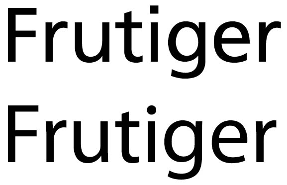
Here are samples of Myriad (top) and Frutiger (bottom). I think type designers should be able to judge for themselves, but they sure look significantly different to me.

Thanks Thomas!

OH SNAP!

... they sure look significantly different to me

Since the legal notion of "considered identical" (as used in the Segoe decision) ignores minutiae, it is useless, from the legal point of view, to point to such details as e.g. that the Myriad-i has a round dot and that the Frutiger-i has as square dot.

The only legally relevant criterion is the "show-through effect".

Typophilers are so very much specialized and so very much devoted to minutiae that they are usually not able to experience the show-through effect. Therefore it is necessary to explain the show-through effect to typophilers with reference to other intellectual works, for instance with reference to poetical works.

Have a look at the following poem:

Lion Lion, burning bright,
In the deserts of the night;
What immortal arm or eye,
Could make thy dreadful symmetry?

If you are familiar with English poetry, you will almost instantaneously experience the show-through effect while you are reading the above poem. What does this effect mean?

Of course the words "Lion Lion" not only "look significantly different", but ARE "significantly different" as compared with the two words in the original poem, and the words "deserts", "arm", "make", and "dreadful" are also "significantly different".

Nevertheless, the original poem shows through, when you read the above forgery. Therefore it is not necessary that I quote the original poem for comparison, because you instantaneously know the original poem which shows through here. This is called the show-through effect.

Exactly the same show-through effect is experienced by non-typophilers, if they are accustomed to read texts typeset in Frutiger and suddenly see a text typeset in Myriad. Of course, non-typophilers do not know the name Frutiger and do not know the name Myriad, but if they have read many texts typeset in Frutiger, they will spontaneously think that it is the same Frutiger typeface, if they are presented with a text typeset in Myriad. This means that Frutiger shows through in texts typeset in Myriad, and hence Myriad from the legal point of view is "considered identical" with Frutiger, even though several letters of the alphabet are not fully identical in design.

(Note: The term "show-through" is also used in the paper industry denoting that a text shows through from the reverse side of thin printing papers.)

I call bullshit.

Ms. Uli,
you seem like a passionate woman, but I'm a little confused. The "show-through effect" that you are talking about — or maybe are making up? — is called the latin alphabet. The comparison that Thomas Phinney posted shows the differences between Myriad and Frutiger which are to my eyes, just as clear as the differences between Univers and Helvetica.

JN

Obviously the "show-through effect" is relative and depends on the viewer. I have shown "really different" typefaces (helvetica and a futuristic looking sans) to friends who wouldn't even notice the differences.
That's the first thing. Then, there is the fact that tiny differences in the shapes can bring important differences in the rythm of the text so i think you can't compare type with poems.

i don't think Uli is talking about the latin alphabet. Uli is talking about the "show through" of the poem giving an instant impression to which we are accustomed, taking advantage of that familiarilty, and transferring it to another incarnation of the original. yes?
i know blake, and i know the words above aren't blake, but they sound similar enough that i can't help but pick up on the "show-through" to connect (and someone less familiar may, in fact, confuse) one to the other.

I could manipulate nine out of ten ordinary Americans, or for that matter EU bureaucrats, into thinking that that Myriad was just a half-assed knockoff of Arial if I showed them ten pages of Arial at sixteen points first. But blow it up a few picas and the differences are pretty obvious, and cannot be legitimately described as subtle or involving minutiae.

Unless, of course, the person doing the describing is just a nutter, but I digress...

All a supposed 'show-through effect' would demonstrate in the case of Myriad and Frutiger (and it should be noted that no such effect has been demonstrated in a legal contest) is what I stated at the time of the Segoe UI issue: that the genre of sans serif type typified by Frutiger is too narrow to admit many other members. It would not demonstrate intent by Adobe to create a clone of Frutiger.

I happen to think that Myriad is sufficiently different from Frutiger to constitute a legitimate, original design: one that further reduces the options for originality within this narrow genre of type design. As I have stated before, I think Segoe UI is too close to Frutiger for comfort (but this is something of a non-issue now, since Monotype Imaging now owns the rights to both typefaces).

I find the argument that typographers are too specialised in their knowledge and experience to make these judgements, and that they need to be shown the show-through effect, problematic. What is the value of the opinion of the person who 'spontaneously thinks that Myriad is Frutiger', given that the value put on type is entirely determined by ability to distinguish between different typefaces? What is the control in this experiment? What if the same person spontaneously thinks that Frutiger is Univers, or Myriad is Gill Sans? Does that mean that all these types are to be considered legally identical? Or that the test is unreliable?

The question of value suggests a different test: whether an experienced typographer finds it worthwhile to purchase both typefaces, instead of just one and, even more importantly, whether he uses them in distinctive ways, i.e. whether he finds value in their distinctive features. I have had, at various times, access to Myriad Pro and three different versions of Frutiger (including Frutiger Next in which the unskilled 'non-typophiler' might detect the show-through effect of Myriad italic!), and have never found one design to be a useful substitute for the other. On that basis I judge them to be sufficiently distinct and to have independent value. On the other hand, I can't imagine using Segoe UI for any purpose that I wouldn't by preference use Frutiger (other than for technical or linguistic reasons relating to e.g. format, hinting and character set coverage).

To say that the details are unimportant in anything related to design is to risk undermining the whole. As Charles Eames famously said 'The details are not the details. They make the product.' And that is as true of type design as it is of furniture design, another field beset by unauthorised copying. The problem with relying on the opinion of people who can't tell the difference between an Eames chair manufactured to the exacting standards of the original design and a knock-off version is that the same person is going to buy the knock-off because it is cheaper. Effectively, you've created a legal environment in which educating people about design and quality becomes contrary to the interests of designers and manufacturers, because they are going to rely on people who are ignorant and are not going to pay for quality to be unable to tell the difference between two products in a legal contest, rather than relying on a knowledgeable, educated person to accurately describe the ways in which the two products are similar or distinct. This means that the legal interests of designers and manufacturers now run contrary to their normal commercial interests, which are to educate the market and increase the number of people who value the quality of the originals. That's a crazy situation.

ChuckGroth, I agree with you that the Blake poem trick was interesting, but I don't see how it's relevant to the discussion about Myriad versus Frutiger. (Unless Uli was trying to say "FruTyger Tyger burning bright...")

okay. i don't think the blake poem was a trick -- it was an analogy.

Hello there:

Karsten> You are not correct about Liant's origin. See this page: http://www.fontfont.com/shop/view_product_desc.ep?id=12386

Is it legal for someone to reference the Liant digital font files and create derivative works as it seems here?

Or in order for it to be legal would the creator of Waldorfschrift had to have a sketch pad and draw every letter he saw on the front of the building of the Weleda cosmetics company or hair dye bottle and then go digitize his sketches? ( Like Loki Cola might have... a CokaCola looking font)

As for Myriad...

I refuse to believe that during the brainstorming/strategy phase taking place at some conference table at Adobe that the Frutiger types did not come up. I have to agree with Uli- Myriad is very close to Frutiger. There are new details but ultimately its derivative.

But just because its derivative does it make a forgery though?

Mike Diaz

> but this is something of a non-issue now, since Monotype Imaging now owns the rights to both typefaces

Is it a non-issue to Adrian Frutiger? I'm not trying to be snide. I'm really curious about what he thinks of Segoe.

>Is it a non-issue to Adrian Frutiger? I’m not trying to be snide.
>I’m really curious about what he thinks of Segoe.

I do not know what he thinks, but you should remember that this is sadly not a new topic for him. His typefaces were flagrantly copied during the phototype-era. Perhaps this is just the latest instance in a long story.

Mike Diaz: You are not correct about Liant’s origin.

Right. I shouldn't have relied on memory ... today I found the other type which I had in mind. Same genre (nice notion by John Hudson) but it is different.

Karsten

> But just because its derivative does it make a forgery though?

Point well taken. Heck, if we couldn't use derivatives of other fonts, then we would have one sans (maybe two, geometric and humanist) one serif (or three, garalde, transitional and modern) a slab, a black letter or three, a script or three, and a couple hundred display faces ... and if a sans font has flames coming out of it ... that would make it a derivative too, wouldn't it.

Copying, as in the original post is wrong. Improving and building on the work of the past is a scientific principle, and one that should be considered a base for typography as well.

Mr. Hudson, as often, made some valuable contributions to this thread which are worth a more detailed discussion. In order not to digress too much from the topic, I will select here only his statement about who is to decide whether two fonts are to be "considered identical" or not. In this connection, he mentions

"experienced typographer",
"knowledgeable, educated person"
"designers and manufacturers"

As far as Europe is concerned, the situation is a follows: Six years ago, in December 2001, a "Council Regulation" was published, the legal text of which is reprinted here

http://www.sanskritweb.net/forgers/segoe4.pdf (see page 2, section 14)

For your convenience, I quote here this section 14:

"The assessment as to whether a design has individual character should be based on whether the overall impression produced on an informed user viewing the design clearly differs from that produced on him by the existing design corpus, taking into consideration the nature of the product to which the design is applied or in which it is incorporated, and in particular the industrial sector to which it belongs and the degree of freedom of the designer in developing the design."

The two important legal notions are "overall impression" and "informed user". In the legal discussion preceding the above final "Council Regulation", three types of persons were discussed:

1) "ordinary consumer"
2) "informed user"
3) "design expert"

The Council selected the middle term "informed user". For instance, the "informed user" of typefaces would be for example the production man in a school book publishing house who selects "Myriad" for the chapter titles and "Minion" for the body text of a new schoolbook. This means that the "informed user" is neither a "bloody layman" (e.g. his grandma), nor a "design expert", for instance a font designer (who may or may not be found at the Typophile website).

If I remember correctly, it was Luc Devroye who estimated that there are only about 300 type designers worldwide, and if this estimate is correct then the group of "design experts" (in the sense of "font design experts") is much too small as compared with the large group of the "informed users" working in printing plants, publishing houses, advertising agencies, etc.

The other important legal notion is "overall impression". This means, as far as fonts are concerned, that you must abstract from (minor) details of single letters and must view the "overall impression" instead. The "overall impression", in my personal view, is very hazy, and I do not like it very much, but it must be accepted as the law in most European countries. The term "show-through" (in German the term "Durchscheinen" coined by a famous German copyright expert named Ulmer) is connected with the term "overall impression". Here again we may explain the term with reference to the Blake poem:

Such words as "lion" instead of "tyger" etc. are (minor) details, because the "overall impression" of the above mutilated poem still makes it possible that the original poem "shows through".

Concerning Myriad vs. Frutiger and Segoe vs. Frutiger this means: Does the "informed user" come to the conclusion that Frutiger "shows through", if he or she abstracts from the (minor) details and only compares the "overall impression" of the two fonts? For Segoe vs. Frutiger, this was confirmed by the legal decision quoted in this thread. For Myriad vs. Frutiger, I am of opinion that the same decision would be made by the Invalidity Division, if Adobe tried to register "Myriad" as "community design". But you cannot be sure, because the decision ("yes" or "no") depends upon the court and upon the judge and upon whether the judge had a delicious or an awful breakfast in the morning of the judgement day :-)

>something of a non-issue now, since Monotype Imaging now owns the rights to both typefaces

But Frutiger doesn't get any royalties from Segoe, right?

Stewf: Is it a non-issue to Adrian Frutiger? I’m not trying to be snide. I’m really curious about what he thinks of Segoe.

Indeed. I should have been more specific: it is a legal non-issue since, so far as I'm aware, it isn't possible for Monotype Imaging to sue itself.

Uli: The two important legal notions are “overall impression” and “informed user”.

I think the other important legal notion in the cited council regulation is 'taking into consideration the nature of the product to which the design is applied or in which it is incorporated'. This implies taking into account the nature of typography, and I would argue that this limits the suitability of the 'overall impression' test, since it is in the nature of typography to be concerned with details. This is why I suggest that a test based on perceived value is more reliable (not least because it can be confirmed by people pulling out their wallets) and also directly reflects the fundamental economic issue that gives rise to intellectual property litigation, i.e. illegitimate competition. So I maintain that the basic test of distinctiveness between two typefaces is whether an 'informed user' is willing to spend money to license both, i.e. whether he finds independent value in each typeface such that each is desirable. Of course, informed users may disagree, but then they may also disagree about the overall impression.

For instance, the “informed user” of typefaces would be for example the production man in a school book publishing house who selects “Myriad” for the chapter titles and “Minion” for the body text of a new schoolbook.

That sounds like a very reasonable definition of 'informed'. But I wouldn't hire someone for that job who couldn't readily tell the difference between Frutiger and Myriad. :)

>it is a legal non-issue since, so far as I’m aware, it isn’t possible for Monotype Imaging to sue itself.

John, to put my question in another way, in theory Frutiger could sue Monotype for royalties from the revenue from Segoe, no? Not that he'd want to, but it seems that a legal issue does exist.

Mr. Berkson:

In theory Frutiger could sue Monotype for royalties from the revenue from Segoe, no?

The question is a very theoretical legal question, but nontheless, the clear answer is "no".

It seems to me that the decision of the Invalidity Division was not fully understood by everyone, otherwise you would not ask your question.

At the time in December 2004, when the Heidelberger Druckmaschinen AG (please note that the applicant was neither Linotype nor Monotype) applied to the Invalidity Division to invalidate the Community Design "Segoe" registered by the Microsoft Corporation, the legal situation was as follows:

1) The design of the old typeface Frutiger created decades ago was no longer protected and had already entered into public domain, so that even the Heidelberger Druckmaschinen AG, which at that time fully owned the Linotype GmbH, was not permitted to register the public domain typeface Frutiger as a "new" European Community Design.

2) The Microsoft Corporation (or rather Monotype and later Ascender) made a forgery of the public domain Frutiger design, renamed this forgery to "Segoe" and illegally registered the Segoe design alias Frutiger design as "new" European Community Design thus deceiving the Design Office. (Incidentally, anyone, e.g you or me, could apply for the invalidation of an illegal registration, because it is in the interest of the public that no illegal forgeries of designs such as "Segoe" etc. are registered.)

3) When Linotype and the Heidelberger Druckmaschinen AG learnt that Microsoft had made an illegal registration of the public domain Frutiger design renamed to Segoe in order to deceive the Design Office in Spain, the Heidelberger Druckmaschinen AG applied to the Invalidity Division in Spain to invalidate the Community Design "Segoe" registered by the Microsoft Corporation on the grounds that the public domain design Frutiger and the design of the forgery Segoe are "considered identical", and hence the Invalidity Division invalidated the illegal design registration.

4) Now the answer to your question "In theory Frutiger could sue Monotype for royalties from the revenue from Segoe, no?" is an easy one: Since the design of the old Frutiger font had already entered into public domain, the designer Frutiger himself lost any design rights into his own design, and therefore cannot sue Microsoft nor Monotype nor any other font forging company, which made forgeries of his Frutiger design, for royalties.

5) It is presumed that the designer Frutiger still gets royalties resulting from the sale of his public domain font Frutiger, but such royalty payments are based only on contractual agreements and not on the design law, because the latter does not apply to public domain designs, hence the designer Frutiger could not sue Microsoft for royalties for the Segoe font.

I think the other important legal notion in the cited council regulation is ’taking into consideration the nature of the product to which the design is applied or in which it is incorporated’. This implies taking into account the nature of typography, and I would argue that this limits the suitability of the ’overall impression’ test...

The expression "product to which the design is applied or in which it is incorporated" only means the combination of a design, e.g. a logo, with a product, e.g. a leather belt.

Fonts are separate designs not applied to or incorporated into a product. Installing a font in Windows could -only theoretically- be interpreted as "incorporating the design into the product", but this is certainly not meant by the above definition.

The "overall impression" regulation is obligatory and cannot be overruled, but there is this exception:

As regards the expression "taking into consideration the nature of the product", an example would be a font specifically designed for such products as the cell phone display. Here the "nature of the product", i.e. the little LCD display on the cell phone, may have so low pixel resolution that even a font with very simple design would have to be regarded as original design by "taking into consideration the nature of the product".

Nick, would you care to elaborate on your insinutation about Myriad? Did you skip my presentation at TypeCon, or do you have a counterpoint?

Myriad is close to Frutiger, especially when one considers that when it was published, the only other typeface remotely like that was Adsans (little known).
In the context of this thread, I'd say that the difference between Aeon and Infinity is of the same order as the difference between Frutiger and Myriad.
So if we Typophiles can get all worked up about Aeon, why do we turn a blind eye to Myriad?
Firstly, because it is published by Adobe.
Secondly, because it is by designers who have produced many completely original faces.
Thirdly, because it is so well done: there is a double standard, where we may be prepared to accept skillful derivatives, because they add to the original, but not poorly executed efforts.
Reputation counts for a lot.

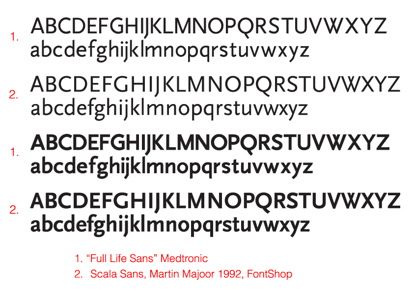
I got sent a font called ‘Full Life Sans’ by a US-based medical equipment company and told “This is our custom-designed corporate typeface” … but I kept thinking I had already seen it somewhere before.

I'd love to know how much the type designer got paid for all that work.

I get the impression this kind of thing happens frequently. See for example the UPS custom font.

Uli, thank you for posting the information about the German law and the public domain status there of designs like Frutiger. That's considerably more helpful, I think, than trying to use a purely artistic analogy like a Blake poem in the domain of something that's part art and part functional.

: (

Oh my, that Scala Sans rip-off is also pretty sad...

Christ! lookat all these comments!! you guy make more noise than a cat on a hot tin roof!

"I got sent a font called ‘Full Life Sans’ by a US-based medical equipment company and told “This is our custom-designed corporate typeface” … but I kept thinking I had already seen it somewhere before."

crikey mate, I have seen that beofre, this guy did it:

http://www.chank.com/services/custfontspop5.php

another bloody rip off artist! Haha, i suppose if you just draw 'fun fontz" all the time it must be hard to do a real text typeface. Maybe the designer of scala let him fiddle with it?

-----------------------
Chopper Reid says "Harden the **** up".

Hi again:

There is possibility that Chank licensed a copy from FontShop to make specialized version for a client.

Dalton Maag did this when they made a 'regularized' version of FF Just Left Hand for a client of theirs:
http://www.daltonmaag.com/about/modification/case_studies/cruk.html

For Uli- If Chank did not license Scala for modification is it still legal? Is Scala a public domain design already? How long does it take for a design become public domain- in the US and abroad?

Nick you hit the nail on the head! I find it ironic too- Myriad is patent pending too.

Mike Diaz

Licensed or not, Chank fonts make me want to cry. I have to go hug my dog now...

Can someone make a bulleted list describing when its legal/ethical to copy/modify/derive etc. type designs and then conditions when its not. It would make clear the cloudiness surrounding these issues.

Mike Diaz

On the ethics side I don't think you can find much to argue with here... http://www.emigre.com/Editorial.php?sect=2&id=1

That 'full life sans' is a really great example of a bad pirate job. There really should be a way for Martin to get either suppress the Pirate font or get his %.

There is possibility that Chank licensed a copy from FontShop to make specialized version for a client.

We learned early on in this thread not to jump to conclusions. He certainly has made some original fonts. But with a name like Chank, it wouldn't surprise me if he is up to some kind of hanky-panky. What kind of name is that, anyway.
; )

Mr. Heptonstall:

I got sent a font called ‘Full Life Sans’ by a US-based medical equipment company and told “This is our custom-designed corporate typeface”

Mr. Diaz:

For Uli- If Chank did not license Scala for modification is it still legal? Is Scala a public domain design already? How long does it take for a design become public domain- in the US and abroad?

1) My recommendation for the American Typophile website is that they badly need an independent American design law and copyright law expert, who is not affiliated with a certain font company, for answering legal questions, because there seems to be much need among Typophilers for reliable legal information in these matters.

2) "Is Scala a public domain design already?"

This would be such a question which should be submitted to an independent American design law expert. My answer as a German with only a flimsy knowledge of American law (but with some knowledge of German law) is: To the best of my knowledge, typeface designs are not protectible by US laws and hence, as far as I know, must be regarded as public domain in the USA.

3) "How long does it take for a design become public domain- in the US and abroad?"

(a) In the USA, a typeface design, as far as I know, becomes public domain on the day, when it is published, because, as far as I know, the design of typefaces is not protectible.

(c) As regards Germany, I can give a reliable answer: In Germany (and several other European countries), the design of a typeface (the British legal expression is "typopographic typeface") may be protected for a maximum period of 25 years, if the design is new and original AND if the design is registered at the design patent office within the first year of making public the new and original typeface.

(d) As far as FF Scala is concerned, I could not find any registration for any of the FF fonts of the FontFont or FontShop outfit in the electronic files of the design patent office. This means that apparently none of the FF Fonts have ever been registered with the consequence that none of the FF Fonts are protected by the design law. No registration, no protection. It's as simple as that. So, the answer is, that FF Scala entered into public domain in the same year, when in was first published.

4) As regards the "US-based medical equipment company" Medtronic, I have here temporarily uploaded an old nice sarcastic caricature which appeared at that time of the criminal court law proceedings:

http://www.sanskritweb.net/temporary/dough.jpg

depicting a would-be heart surgeon in hand-cuffs with a lot of "dough" (= bank notes in legalese) in his hands.

The background to this legal affair is as follows:

In Germany there was a huge "heart valve scandal" involving also the Medtronic outfit, whose sales manager for Germany got a one-year "stretch" (= imprisonment fine in legalese) for having given "nice monetary presents" to heart surgeons in order to "convince them" ("bribe them" in legalese) that they should buy Medtronic heart valves instead of the valves of the competitors.

Germans may read the old news item, e.g. here and at other websites:

http://www.welt.de/print-welt/article530332/Herzklappenskandal.html

There have been no less than 1500 criminal proceedings against numerous heart surgeons in many hospitals all over Germany. For instance, the chief heart surgeon in my hometown Heidelberg received the nice "gift" of more than 50000 Euro for "research purposes".

So, as regards the forgery "Full Life Sans", is becomes apparent that the Medtronic outfit, whose German sales manager had enough "dough" (money in legalese) at his disposal to make heart surgeons happy by presenting to them nice money gifts, will most certainly also have had enough "dough" to present a nice money gift to a font forger for making a forgery of the FF Scala font.

I do not want to disparage Adobe in anyway. I love their fonts and their expertise, and I truly have the utmost respect for Mr. Phinney. He is far more knowledgable and experienced than I. Moreover, as one would expect from Adobe, Myriad is very well done and displays beautifully. I use it myself.

But to my simplistic eye, the difference between Frutiger and Myriad is molecular. In the real world, what normal human being could possibly tell the difference without a very trained eye? It's like taking a symphony and changing a note here and there, and calling it something new.

I guess by changing a few curves a few degrees and making extraordinarly subtle changes, one can claim originality these days. But it certainly isn't art.

"Copying, as in the original post is wrong. Improving and building on the work of the past is a scientific principle"

And the difference between the two is often highly subjective, contextually based, and all to often decided by lawyers. ;o)

As for Chank, he's a good guy. He makes his living off of fonts, so I wouldn't want to jump to conclusions either. Medtronic isn't some ma-and-pa company, either.

a bad pirate job

What's quality got to do with it? Authorized or not, Medtronic Sans is a consistently, considered derivation, in the manner of Myriad.

As Uli argues, type designs (but not BCPs, of course) are automatically in the public domain, and it is only the court of professional opinion that censures piracy.

So that court, as recently convened on this thread, has judged Aeon and Medtronic Sans guilty, yet for being the kind of fonts that do what Myriad does. Aeon has been sentenced, and the sentence enacted. Meanwhile Myriad is a typeface that practically everyone uses, and is not considered unethical by the design community.

I'm not condoning or condemning anything, except perhaps an institutionalized double standard, for the whole thing is extremely grey, and every type designer has, ultimately, to rely on their own discretion when developing fonts that are revivals, derivatives, or similar to typefaces by other type designers.

Those who are best able to form an objective opinion are type designers, and are unlikely to speak out, as it's bad form to throw one's peers under the bus, and few indeed are the type designers who have not blatantly copied another's work, in the guise of a revival.

Uli: Fonts are separate designs not applied to or incorporated into a product.

Typefaces (and we are talking about design issues here, not technical or format issues, so let's avoid the term 'font') are designs incorporated into typography. Typography is the product. You proposed the example of an informed user being used to reading pages of text in Frutiger being presented with text in Myriad and thinking it was Frutiger. Pages of text: that is the product into which the design of a typeface is incorporated. Indeed, I would argue that type, far from being a separate design not applied or incorporated into a product, has no separate meaningful existence outside of typography, it exists in order to be incorporated into typography. The distinctive nature of individual typeface designs have their value in the distinctiveness that they bring to typographic design, i.e. design with type, and this is why the question of value is a good indicator of the distinctiveness of type designs. Again: if an informed user, such as the book production person you described, finds it worthwhile to spend money on both Frutiger and Myriad, that is a concrete measure of their distinctiveness and independent value.

Uli: (a) In the USA, a typeface design, as far as I know, becomes public domain on the day, when it is published, because, as far as I know, the design of typefaces is not protectible.

In the USA, a typeface is protectable by design patent for a period of 14 years from the date of registration. Design patent is a special class of patent protection, and like all patent protection it requires the designer/inventor to apply for and register the patent.

So there is no copyright protection for typeface design in the USA (although there is for fonts as computer programs), and there is no automatic protection for new designs, but it is incorrect to say that there is no protection or to assume that any typeface design is automatically in the public domain.

Nick: So that court, as recently convened on this thread, has judged Aeon and Medtronic Sans guilty, yet for being the kind of fonts that do what Myriad does.

That's begging the question, Nick. Surely the issue is what Myriad does.

Since the concept of 'overall impression' seems so important, let me state that even in a comparison of a single word -- your Frutiger/Frutiger image -- the overall impression I get is that Myriad is a softer, more flowing design than Frutiger, that the differences in design details 'make the product' (to use Eames' phrase) and the Myriad product has a different overall character to the Frutiger product despite the similarities of letterform architecture. I believe you are more committed to the idea of type presenting a mood or a feeling than I am, so I am surprised that you do not find this difference in overall impact -- the softness and gentleness of Myriad compared to Frutiger -- significant. It is the reason why I would not consider the two designs exchangeable and why I would use both but for different kinds of projects.

PS. If you include Adsans in the same design category as Frutiger and Myriad, then I think you definitely need to include Stone Sans, which is much closer to Frutiger and Myriad than Adsans and, for obvious reasons, must be considered influential in the design of Myriad. I consider Myriad as occupying the middle-ground between Frutiger and Stone Sans, in the narrow field of this particular genre of sans serif types.

In the USA, a typeface is protectable by design patent for a period of 14 years from the date of registration.

Is there still a requirement that the design of the font be especially new and distinctive to qualify for a patent, or can any font design now be covered by a patent?

Mr. Hudson:

In the USA, a typeface is protectable by design patent for a period of 14 years from the date of registration. Design patent is a special class of patent protection, and like all patent protection it requires the designer/inventor to apply for and register the patent.

A couple of years ago, I read the US design law which is called "Patent for Designs" and which is incorporated as three short sections 171 through 173 into the overall American "Patent Laws", but I could not find any special provisions for typefaces.

This is crucial in my opinion, for the US design law is restricted to "the design for an article of manufacture". This "article of manufacture" must really exist as a specific product or commodity, whereas a typeface exists per se as a "scheme of ornamentation" and is not inseparably attached to a specific "article of manufacture".

For instance, the situation is entirely different for the typographical logo "Marlboro" specifically designed for and inseparably attached to the cigarette packet as "article of manufacture".

But a typeface is nothing but a collection of separate letters, where even the sequence of these letters is not predefined in the sense of specific words (such as "Marlboro"), let alone of specific texts and let alone of two-dimensional arrangements of these letters on an "article of manufacture" such as a cigarette packet or a beer bottle or whatever other commodity.

Regulation 171 runs as follows:

"Whoever invents any new, original, and ornamental design for an article of manufacture may obtain a patent therefore, subject to the conditions and requirements of this title.

We read at the US patent website

http://www.uspto.gov/web/offices/pac/mpep/documents/1500_1504_01.htm

"Design is inseparable from the article to which it is applied, and cannot exist alone merely as a scheme of ornamentation. It must be a definite preconceived thing, capable of reproduction, and not merely the chance result of a method or of a combination of functional elements."

"A claim to a picture, print, impression, etc. per se, that is not applied to or embodied in an article of manufacture should be rejected under 35 U.S.C. 171 as directed to nonstatutory subject matter."

So, could you please explain to me, where there exists for you, for instance in the case of "Myriad", the "definite preconceived thing", the "specific article of manufacture", the "specific product" to which "Myriad" is inseparately fixed.

(By the way: In Germany, we had the same legal problem at the time, when the old German design law did not contain specific provisions for typefaces, so that typefaces, a couple of decades ago, were practically not protected under the old design law on account of the reasons stated above for the US design law.)

what Myriad does

You explain it well:

"... the Myriad product has a different overall character to the Frutiger product despite the similarities of letterform architecture."

Same letterforms, different finish.

Aeon is like Myriad in that respect, it is softer than Infinity, with rounder curves and smoother joints.

I am surprised that you do not find this difference in overall impact — the softness and gentleness of Myriad compared to Frutiger — significant.

This is probably where we differ. I don't think this kind of subtle gloss is significant enough to constitute a new typeface, given that the letterform architecture is fundamentally the same.

I would not consider the two designs exchangeable

That is not the acid test for singularity; the architecture of two faces may yet be the same, despite differences in finish that give them quite different tonalitites.

While we're at it...

Do the same people who think that Carol Twombly and Robert Slimbach copied Adrian Frutiger, feel that Frutiger copied Edouard Hoffmann and Max Miedinger? No? Why not?

Forgot Frutiger. Doh!

Do the same people who think that Carol Twombly and Robert Slimbach copied Adrian Frutiger, feel that Frutiger copied Edouard Hoffmann and Max Miedinger? No? Why not?

That’s not a great argument, Miguel. The release year of Helvetica and Univers make it pretty clear that they were in development simultaneously (and I think Univers started first). And both faces are pretty clearly derived from Akzidenz.

Do the same people who think that Carol Twombly and Robert Slimbach copied Adrian Frutiger, feel that Frutiger copied Edouard Hoffmann and Max Miedinger? No? Why not?

Because the grotesque form was well established, and Helvetica was not an original design, but an adaptation of Akzidenz Grotesk. So Univers was designed within a genre. (And within that genre, Akzidenz Grotesk, Helvetica, and Arial are all the same typeface -- in the same way that there are different cuts of Garamond.)

However, the Frutiger typeface was a genuine innovation, right down to its letterforms, directly attributable to Adrian Frutiger.
BTW, I don't think, and I've never said, that Myriad is a copy of Frutiger. I'm merely pointing out the architecture is fundamentally the same. Surely you can't disagree with that?

There is some difference between starting with someone else's typeface and modifying away from it, and starting from scratch and ending up with something similar to an existing face. I suspect our understanding of that process is why we're critical of Aeon and Medtronic, but not, perhaps, Myriad, although from a purely physical inspection, they appear to be equally derivative.

Ms. Uli,
you seem like a passionate woman, but I’m a little confused.

Me too.

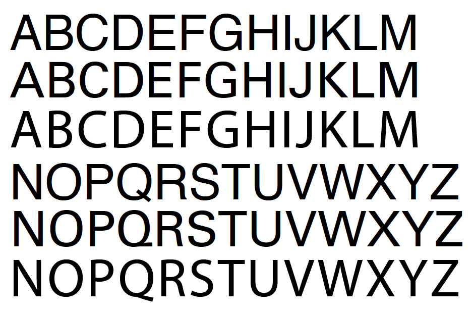
I'm glad Miguel posted those images and saved me the trouble.

There is another thread going on about Tschichold and modernism, and I think this is an enlightening illustration of how modernism can create havoc with our notions of creativity and originality. If modernism endeavors to strip away ornamentation and reduce everything to pure functionality, how can anyone create anything modern without violating some previous creation? How many different ways are there to design a knife or fork? If one goes out to buy a set of flatware, one doesn't consider how only the forks are different, but how the spoons and knives are different too, right? I think typefaces are the same in that they are captive to their function, and especially so when ornamentation is reduced. When I look at Frutiger and Myriad, I see two different approaches to the same functional idea. Most of us here appreciate the differences between Helvetica and Univers, and I would say that the Frutiger/Myriad comparison is about the same in that they are two distinct approaches to a functional category that has already been pretty well distilled. In this context, the differences that are there, such as the tail of the lowercase y, are quite significant, non-trivial aspects to Myriad's personality.

Remember, also, that Myriad (being "modern") is a product of its function, and that it was conceived as a multiple master typeface. That technology is greatly responsible for the appearance of Myriad, I think. I also think that Myriad's own characteristics are more evident at the ends of its dynamic range, not in the middle -- not to mention the italic design, which I would argue is rightly half of the entire Myriad design, making it even more distinctive and original overall.

So, in other words, Myriad in its entirety -- with the hundreds of possible instances from its original MM release, and with its italic design -- is certainly different from Frutiger.

Oh, and Myriad does have a U.S. design patent.

> However, the Frutiger typeface was a genuine innovation, right down to its letterforms, directly attributable to Adrian Frutiger.

Sure, and no one is contesting that. Now you can't disagree that Myriad brings novelty to that design category, and that's what makes it a different design within the same theme.

> BTW, I don’t think, and I’ve never said, that Myriad is a copy of Frutiger.

If you don't, what made you bring up the subject in the first place? What's there in Myriad that "gets you all worked up"?

> I’m merely pointing out the architecture is fundamentally the same. Surely you can’t disagree with that?

No, I don't. But what's wrong about having the same architecture. There are dozens of typefaces out there that share the same structure. Does that make them all the same, or does it make them be part of the same genre?

If modernism endeavors to strip away ornamentation and reduce everything to pure functionality, how can anyone create anything modern without violating some previous creation?

From a practical and social standpoint, post WWI Central-European modernism was not concerned with individual creativity. It was a pragmatic design theory, focused on producing practical output for mass consumption. I don’t get the impression that Tschichold and co. cared as much about anything new being created as they did about being active in the restoration of Europe.

what made you bring up the subject in the first place?

Because I'm interested in intellectual property, and I wonder about the line that divides originality from plagiarism, and how it's drawn.

...a functional category that has already been pretty well distilled.

Modernism isn't a catch-all category. Futura, for instance, is quite different from Frutiger. And neither typeface is the discovery of a modernist truth, they are inventions, unique distillations.

...it was conceived as a multiple master typeface. That technology is greatly responsible for the appearance of Myriad...

Yes, that might explain things. I remember when it was released, and the specimen Adobe produced packed with its many instances, really exciting. The Multiple Master stuff was a distraction from being more circumspect about the basic type design. New technology has a way of devaluing old skills.

This is one of the more interesting threads in a long time here.

Mike: If Myriad is included in the app you use everyday at no additional charge then why would you buy Frutiger?

I think you are making my point for me, because people do buy Frutiger, despite the widespread availability of Myriad, and I think this is precisely because the faces are different enough to be independently valuable and useful for distinct purposes.

Myriad certainly put competetive pressure on Frutiger because it is in the same narrow genre. And what was the result? Frutiger Next, with its extended range of weights and its true italic. That's what competition is supposed to do: drive improvements and increase the options available to buyers.

If a typeface is a straight rip-off with no independent value, it is unfair competition, which is what one wants intellectual property laws to protect against. But it is an abuse of such laws to stifle legitimate competition. To my mind, legitimacy has to reside in independent value that makes two competing products desirable on their own merits.

It is my opinion, based on having worked with Myriad MM, Myriad Pro, Frutiger Linotype, and Frutiger Next, that Myriad meets this criterion of independent value. And by possessing its own value it doesn't diminish the value of Frutiger, which it would if it were just a copy with no independent value. Again, that's my opinion: the conclusion I have come to on these particular fonts. I came to a different conclusion about Segoe UI, which I don't think is sufficiently different from Frutiger to have independent design value (it has independent technical value in its character set coverage and hinting, but we're talking about design here). In neither case is my conclusion influenced by knowledge, gossip or supposition about the process by which these types came to be made. I actually don't much care whether Myriad was copied from Frutiger or Segoe was miraculously arrived at without reference to Frutiger. Why not? Because it doesn't change what I'm looking at.

One of the benefits of this approach to the issue, i.e. concentrating on the value of the thing made rather than the question of how it was made, is that one doesn't have to wade through the swamp with a divining rod, listening to the competing chatter of the inhabitants and trying to determine the truth of who said what, and who did what to whom, and who kissed whom behind the gym at recess. In other words, you can look at two typefaces, work with them, and make up your own adult mind about whether they have independent value and ignore the previous 150 messages in this thread.

>For Bill Troop.... Can you please tell us your association with Adobe? Not trying to harp on you. Just would like to know more about how you’ve come to know these things. (Although you have stated you’ve had direct conversations with Twombley and Slimbach)<

I don't think that upsetting old story should be told or retold in this thread; let me know an email address and I'll send you a note.

I am more interested in John's honing of his position. I still don't think he is right, but he has gotten around to stating it in a way such that I think we all should be seriously thinking about it and I for one intend to think about what he is saying for a day or two before replying.

!!! Who can spot the Myriad letter wins the book prize !!!

I have already read too many hazy terms in this thread:

- "Myriad’s architecture"
- "Myriad's tonality"

and similar hazy, undefinable notions.

The real test is whether you can spot Myriad letters.

I guess that those who assert that Myriad is not a clone, not a rip off, not a forgery etc., will not be able to spot most letters of the Myriad alphabet, if these Myriad letters are mixed with letters of other fonts.

I have uploaded one letter test file, here for the letter "o", at my site

http://www.sanskritweb.net/temporary/myriad_o.pdf

In order to make the experiment more attractive, I offer this prize:

Whosoever is the first to quote the correct number of the "o" of the Myriad in this Typophile thread, wins a precious original booklet dealing with the Syntax-Antiqua, which belongs to those famous sanserif fonts designed by German-speaking designers (Akzidenz-Grotesk, Helvetica, Frutiger, Syntax, etc. etc.) which have been imitated and cloned and forged so often by others.

This valuable 24-page Syntax-Antiqua booklet with a cardboard cover has portrait format (69 picas height by 40 picas width) and is typeset in 7p, 10p, and 14p Syntax-Antiqua foundry type and is printed by letterpress and contains numerous black-and-white illustrations and one color illustration and is not a promotional booklet, but a scholarly documentation in German language comparing Syntax-Antiqua with numerous other typefaces. The booklet is entitled:

Erich Schulz-Anker
Formanalyse und Dokumentation einer serifenlosen Linearschrift auf neuer Basis: Syntax-Antiqua. Frankfurt am Main 1969

In his dissertation, page 39-40, Keith Tom made quotations from this booklet, see here:

http://typeculture.com/academic_resource/articles_essays/pdfs/tc_article...

So, again, whosoever spots the Myriad-"o" in the file myriad_o.pdf and who is the first to quote the correct letter number (printed to the right of the letter "o" in the file) will be sent the original Syntax-Antiqua booklet as a book prize.

- Take care not to select Frutiger. This would be a give-away :-(

- Look for "architecture" and "tonality", provided this helps :-)

So, 284 is the one NOT to select, then!!

______________________________________________
Ever since I chose to block pop-ups, my toaster's stopped working.

It's number 329 plain as day, on page 19, third column sixth from the top. That said, picking on a single letter, especially 'o', especially in a humanist/geometric sans, to prove whether a font is or is not original is ridiculous. The test proves nothing.

"I have uploaded one letter test file, here for the letter “o”, at my site"

*groan*

(unless you are just having some fun with us, in which case: well played!)

BTW, nice post, John. Lots to think about in that one.

I love Uli's latest party trick. Is this your card?
How about a similar file with the period or maybe the space?

I'm sad that Bill Troop isn't willing to continue his public statements about Myriad's development. This kind of inside insight from a player in the type industry is fascinating. Which foundry do you work for again, Mr Troop?

Mr Hudson, I applaud your thoughtful comments, and I agree with you.

JN

I wouldn't say I work for any foundry. I have done work for Adobe and Bitstream in the past and am working with Lino on project now. My own organization, if you can call it that, Adagio Type Foundry aka Addict Type Foundry released some fonts in the mid 1990s through Precision Type but they are difficult to find at the moment. There is an Australian retailer which doesn't pay royalties that sells them, and there is a UK retailer that does pay royalties that sells them -- I forget the name of both.

Without really coming to grips yet with John's position, I reluctantly can't agree with it. Is it, simply expressed, this?

'That if a clone has value independent of its model, it is ethically clean' ?

I would, in the meantime, like to raise a red herring, which is that I disagree with the statement that the original Frutiger did not have a 'true italic'. This is simply too value-laden. Of course it had a true italic, and it isn't a mere mechanical slant (and even if it were, am I the only person to remember the graphical Berthold ad which memorably showed the difference between the Postscript mechanical slant we are all familiar with, and the rather more artful slant that Ikarus is capable of?). Frutiger Next and Myriad both have (somewhat) cursive italics, and cursive is the term I wish John had used. I don't think the cursive italic for Frutiger is 'true'; for one thing, it wasn't designed by Frutiger. I detest these politically correct cursive italics, or rather the unthinking dictum that there shall and must be cursive italics, rather like Lenin's famous promise 'After the Revolution you shall have strawberries and cream.' No 'you may' there, or 'you will be able'. You shall have them, whether you like strawberries and cream or not.

John, I don't think there's any doubt that Aeon is a "rip-off" of Infinity, but your position whitewashes it.
Imagine a situation where the art director specs Infinity but the client is uneasy with a typeface that actually has a personality, so a compromise is reached, and the watered-down Aeon gets the job.

Mr Shinn,
your argument is ridiculous. If someone wants a replacement for Infinity which has less character, why would he choose a typeface which is 99% identical? Surely he would look at typefaces like Flama, or Klavika, or DIN.

I have emailed "off-list" to ask you to stop using the blatant copying of Infinity as a tool in your odd little crusade against Myriad, and I'm doing it again here: Please act like a professional, and leave my work out of your arguments. Your comments lend credence to the existence of Aeon, which is not defensible.

With many thanks in advance,
Chester Jenkins
(publisher and co-designer with Rick Valicenti of the Infinity types)

I find it strange to compare frutiger/myriad and infinity/Aeon
Infinity is a modular-based display face. There is so much space and possibilities in display typeface (and even in modular faces) that it is obvious that Aeon is just a plagiat. It is just a plagiat made by some unimaginative designer.
I don't want to defend and get involve in the myriad thing too much, but I think that are really two different things.

It’s number 329 plain as day, on page 19, third column sixth from the top.

Mr. Levien:

My congratulations. You have hit the nail on the head. Please let me have your postal address (with zip-code, town and street) so that I may send you the Syntax booklet by airmail.

But please do not say that it was "plain as day".

I know that you are a GScript expert and a programmer. For you, it was easy to extract the PS source from the PDF.

/FontName /RPZTQP+Myriad-Roman def
...
[/N3785/RPZTQP+Myriad-Roman 1 TZ
...
/N3785 1 Tf (o)Tj
...
/N3887 1 Tf (3)Tj
/N3887 1 Tf (29 )Tj

and voilà, it was "plain as day" to you that Myriad had number 329.

The other possible approach for you would have been to enlarge the letters in the PDF to huge point sizes in Acrobat and to study these blown-up letters. But this is not permitted here. The German regulatory specifications to the design law prescribe that the alphabet submitted to the design office must be typeset in 16 points and must not be examined with a magnifying tool (microscope etc.). In other words: Tiny details in letterforms, which are only visible in huge point sizes, are ignored, if two typefaces are compared. The law had to define a specific point size for objective comparisons of different typefaces, and it should be remembered that the vast majority of all texts are typeset in point sizes much smaller than 16 point.

Therefore, as regards the file myriad_o.pdf, the sample would look like this:

http://www.sanskritweb.net/temporary/myriad_o.gif

Here nobody sees that 329 is Myriad. Here nothing is "plain as day".

All typeface samples reproduced in this thread are much to large for legally relevant comparisons. Since the differences between Frutiger and Myriad are not visible in small point sizes, ridiculously huge samples were displayed above in this thread.

In the good old days, typefaces could be compared with the naked eye even in ordinary point sizes. In our modern Bezier-node-twiddling era, you need a magnifying glass to see what is "new" in so-called "new and original" typefaces.

>Your comments lend credence to the existence of Aeon, which is not defensible.<

Nick's comments lead credence to Aeon? That's not the impression I got from this thread, but I am not masochistic enough to reread it.

Trying to examine the strength of my position that what is important about a typeface is not just what it is but what it was, take the following case. Someone in the early 90s has the idea that 'Frutiger Battered' would be a great font. The designer takes the Frutiger data, batters it about a bit either by hand or by program, and places the resulting thing on the market. We now have a functional object which is completely different from Frutiger. So what are the ethics there? The ethical problem occurs not in the final result, but in all the processes -- thefts -- that led up to it. Frutiger has been robbed, all the technicians who worked on the font have been robbed, the foundry has been robbed.

Or take another case. I think Minion is just a tad too narrow. Suppose I take a copy and widen it by five or ten percent. Suppose I do this really carefully, not mechanically with the scaling control, but paying some real attention to the process and the results. Maybe I make a few improvements along the way -- that dreadful question mark for instance, and the too tight fitting, and maybe I fix some of the mistakes in the italic, even. Etc. etc. I now have a complete theft but it is not at all a substitute for Minion, though it might be a useful companion.

All of these devices are plausible, and they are getting us away from the idea that the final utility of the product is the valid arbiter of the issue, no?

I'm not even saying that I don't agree with John fundamentally, maybe I do, I haven't really thought it through. All I'm saying is that it's not too difficult to poke some serious holes in his position, which will also be holes in my position if I adopt his.

Uli: I guess that those who assert that Myriad is not a clone, not a rip off, not a forgery etc., will not be able to spot most letters of the Myriad alphabet, if these Myriad letters are mixed with letters of other fonts.

Earlier in this discussion you were explaining how the legal question rests on the response of an informed user to a page of text, which is very sensible, now you are making tests based on identifying single letters mixed with other fonts, which is very silly. This has nothing to do with typography.

For the record, I've said everything I want to say on this subject, and I'm going to stop following this thread now. Anyone who wants to go and work with Myriad and Frutiger can make up their own mind about whether they have independent value. I certainly don't expect everyone to agree with my conclusion, but I do think the basis on which I made that conclusion is a sound one. If someone tells me that he or she has worked with both typefaces and finds them interchangeable, with no independent value, I might question that person's perceptive skills and typographic sensibilities, but at least it will be a conclusion arrived at from the types themselves and not from gossip. Goodbye.

Sorry, post removed.

Unfortunately, Mr. Hudson, in my opinion, makes a logical error here (at least as far as the German design law is concerned).

By the German design law, you have to supply for a new typeface the alphabet in lowercase (a...z) and uppercase (A...Z) and the figures (0...9) and 5 lines of arbitrary text, all this typeset exactly in 16 points. The file

http://www.sanskritweb.net/temporary/frutiger-myriad.gif

shows exactly, what you would have to supply to the design office in case of the regular styles of Frutiger and Myriad. I intentionally did not upload a PDF file, but only a gif file, so that nobody can enlarge the sample to huge point sizes.

Two things become apparent by viewing the sample: Firstly, most of the tiny distinctions between both fonts vanish, because they are no longer visible in 16 point size. Secondly, the five lines of text ignore "typographical sensibilities", because the typeface, for whose design you request the registration, is not a text, but a collection of single letters. You do not apply at the design office for the protection of the design of a certain text, e.g. for the layout of a certain book, but you only apply for the protection of the design of the letters A-Z etc. constituting a specific typeface. Hence Mr. Hudson's view is a hysteron-proteron. The design of the typeface comes first (proteron), the design of typographical products (books, magazines, etc.) using this typeface come second (hysteron).

Mr. Hudson is correct in assuming that I never worked with Myriad. Indeed, I never used Myriad nor any of the other forgeries documented at my website for legal authorities. Why should I want to use forgeries?

>Sorry, post removed.

Oh, what did I miss!

>Why should I want to use forgeries?

Well, a fake Chippendale chair can still be awfully nice to sit in, and a good copy of a Goya can be rewarding to look at (see the endless passages Galsworthy devotes to just that issue). I think a mistake both John and Uli make is to consider font usage only from their unique personal perspectives. One has to consider whole blocs of other users as well.

Ultimately I think it is a mistake to focus exclusively on the technical elements of font forgery, to use Uli's loaded term. The ethical and historical aspects should also be considered. What is the matter with looking at the whole picture?

At any rate, it is nice, and just, that the Segoe design patent was invalidated. The design patents for Myriad and Cronos should similarly be invalidated except that there is no compelling financial reason to do. Not even Adobe has the effrontery to claim either typeface has the kind of originality a design patent would, ideally, embody. Their motives for seeking this protection were far more cynical: they could get away with it. When I was working on my 18th century transitional for Adobe, I was told never to describe it as such, but as a completely original design, because that way I could get a design patent. 'Nobody at the patent office will know the difference,' as Carol told me.

I went along with that. This kind of opportunistic thinking is very corrupting, not that that is any excuse. What a sordid web! You can never get a little entangled. You're always a lot entangled. Just like you can't be a little pregnant.

To sum up, it's as important to me, now, to know everything behind why and how a patent was claimed, as to know that the patent has been granted.

John's English Department point was awfully on-target. The lowest level of hell on earth may be the college English department. However, below that I imagine is the poetry world, and below that the font world. Yet we keep on going!

not to start the fire again, but i just read this 10 years old article by Erik van Blokland: http://www.letterror.com/content/value/index.html

Believe it or not, I found this thread while doing a Google search on Father Catich… :=|
I have read the most of it, and I wish to congratulate witj John Hudson and Karsten Lücke, which took their time (especially John) to articolate their reflections in such a substantial way. They are perfectly balanced. Bravo!

All I wish to add are two things:

1) Infinity is more a "conceptual" typeface (relying mostly on "geometric" treatment of forms, "mechanized" monotonal treatment, uneven endings et al), while Frutiger is the fruit of a long synthesis over letterforms. As different as they are, a thing like Aeon is unacceptable, because it clearly builds almost entirely on the work done to create Infinity.
A face like Myriad, despite all the references to Frutiger, shows a process of work over all the preceeding forms. Many elements are extraneous to the fruit of Frutiger's own work on letters;

2) Ultimately, I have only one criteria to decide in these situations: Was an alphabet produced out of the desire of doing something meaningful and – as Karsten said – expressing the designer's mind?
If any reference or borrowing has been done with the desire of doing something new, the effort is enough visible, and the time spent – which makes the work an effort with merits on his own – always shows through clearly.

Nick, I always admire your sharp approach and intelligence of things, but this time I cannot agree: Myriad is Myriad, Frutiger is Frutiger.
As long as I don't find an explanation on these issues done by Frutiger himself, there are no substantial elements to consider Myriad a "byproduct" done by mere copying…

“ Times, Thimes, Temps, Tempos, Tiempos ” ...

Captured from web.archive.org on 1 Oct 2019. view this capture