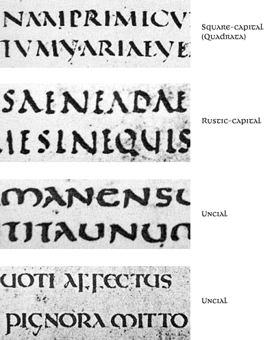
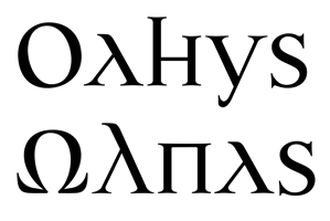
A new typeface of mine (in development).
Critiques about this face and sugestions to amplify the family are very welcome in this moment!
Thanks,
Ricardo Esteves Gomes
http://www.outrasfontes.com
| Attachment | Size |
|---|---|
| janathork-test02.gif | 30.34 KB |
| janathork-test02.pdf | 14.52 KB |