
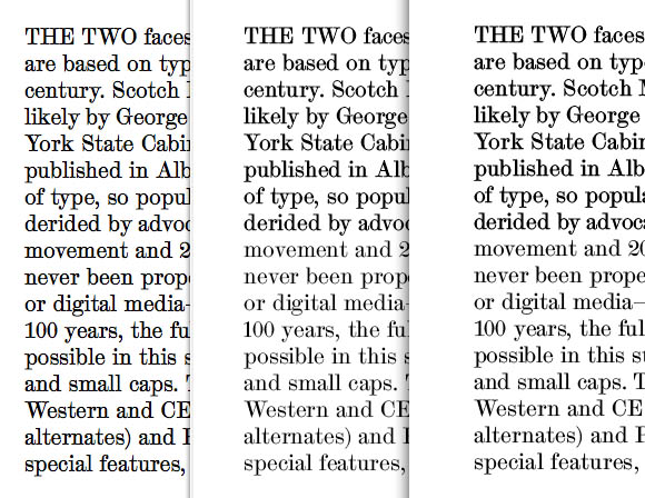
These are all screen grabs of the same text, set in the same font (.otf, Type 1 outlines) with some variation in hinting settings.
At left is TextEdit, showing the way the system rasterizes fonts — love it!
At centre is InDesign, at right Illustrator.
The bottom type face is “properly” hinted with stem widths and alignment zones (generating with no hints at all produces a similar result).
I find it much too weak and blurry, and would prefer something stronger, like in TextEdit.
The only way I could achieve something like that was by giving the stem widths “crazy”, very narrow values - that’s the top font in the CS specimens. I hesitate to do that, in case Adobe changes its rendering engine in the future.
What’s going on — why does CS over-ride Apple’s rasterizing with something that, at least for this typeface, is inferior?
Or have I missed something important in the production process?


