
Let’s list SANS SERIF font packages/families/suites that are as complete and have something “safe” about them. Not totally sterile safe, just safe enough.
Let’s list SANS SERIF font packages/families/suites that are as complete and have something “safe” about them. Not totally sterile safe, just safe enough.
Hmm. I’ll add I’m looking for complete as in: Thin/Light to Black, Condensed, Extended and Regular.

Arial.

Myriad Pro, Frutiger Next, Futura, News/Trade/Franklin Gothic, Meta, FF DIN.
EDIT: Maybe Benton’s sans-serifs don’t have extended and compressed versions; haven’t looked.

UNIVERS the DESTROYER
The original complete family.
TheSans and FF Kievit (Kievit doesn’t have condensed or extended versions, but I think it qualifies in the “safe” category well enough).

If meta is ’safe’, then add bliss, officina, etc... oh, and auricfuzz, i really can’t let you have futura... it’s one of my favourite faces, however i’ve had that rejected on account of the ’squirly’ question mark on a number of occasions :-)

I have issues with Futura too. I think it was the good, safe “stylish” font for so long it’s become the past few years what Helvetica was in the 70s. While I still think it’s great, whenever I see it used now I just think it looks either generic or gimmicky.
Brett, I was going to say that I’m a big fan of each of these faces (except for FF DIN ), but I didn’t want to repeat Tiff’s initial comment that they’re safe, not necessarily sterile. As vectorgirl said, I see Futura a ton nowadays, probably more than anything other than Helvetica, Arial, and Times — and it’s often squooshed obscenely >-o . However, I’d love to see someone shake things up by using one of the versions of Futura with Renner’s alternate a’s, g’s, n, m, and r.

Helvetica, Frutiger and Meta aside, a couple to add to the list.
Gotham, Gotham Condensed, Gotham Rounded, fairly comprehensive and has rounded counterparts just like Helvetica.
Interstate.
UNIVERS the DESTROYER
If Fruitger had called it that, Univers would definitely be more popular than Helvetica. And probably also the name of a death metal band.
Proxima Nova, which again is not a condemnation of it. But it’s not condensed or expanded.

Univers gets my vote as well. Anything Frutiger touched is in my opinion amazing, especially in regards to the range that you’re looking for.
Univers is the only one, no?, that has condensed and extended as well as regular. I guess I need to check.

Benton Sans is a favourite.
I haven’t gotten to use Flama yet, but it looks great and have 42 styles.

FF Kievit
http://www.fontfont.com/shop/index.ep?clist=PK,13591&cview=P13591
Very safe - and seemingly quite up to date. I haven’t used it yet myself. But I am a fan.
Stewf? What do you say?

http://www.myfonts.com/fonts/device/paralucent/
No extended but the basic is pretty extended already.
Tim
Yes, as Reed and Eben recommend, FF Kievit was designed to be a neutral humanist face.
As for other grotesques like Helvetica, I can suggest some of these and Neutral, which was created from the start to be as neutral as possible. Read more about it in Interrobang 5. It’s not so “complete” though. And it may qualify as sterile, which isn’t what Tiff is seeking.
My favorite safe faces with lots of weights and widths:
(I’m not so much a fan of using condensed faces with their standard counterparts — I think there are usually better ways to make type fit within a system.)
Univers
Titling Gothic
Galaxie Polaris (one width)
Gotham
Interstate
Proxima Nova

Proxima Nova...But it’s not condensed or expanded.
oh but it is! condensed at least, and also extra condensed.
also with no expaned, but 2 condensed widths:

My vote is for Univers. I use Helvetica for web because it’s convenient, but if I had the option I’d use Univers instead.

Univers isn’t safe. It’s too much power for the uninitiated!
People complain about Trajan on all of the movie posters, but there is one guy that’s been on more posters than anything.
Univers 59 Ultra Condensed or his partner in crime Univers 49 Light Ultra Condensed!
Complaints about Futura can be solved. It’s called “Use Avenir instead.” Does anyone know offhand how large the Avenir Next set is?

MASTERS OF THE UNIVERS
@Dan Gayle
Avenir next is quite large. Cn-weights, small caps and stuff …
http://www.linotype.com/90672/avenirnext-family.html
>Complaints about Futura can be solved. It’s called “Use Avenir instead.”
At the moment we have a project running where Avenir Next was a possible option. We haven’t it yet, we still made layouts with the Avenir Not Next. We were interested especially in the condensed weights. But the client insisted on Futura in the end, hehe …

FF Info

Miss tiffany, why do you consider condensed/regular that important? When i look for safe font families, I rather look for small caps, osf/lf (tabular and proportional). maybe it’s because i work mostly with books?
I like Klavika.
alex
.........................................................
Bison Design
Spön

UNIVERS THE DESTROYER
LOL!

48 fonts: Three widths, 8 weights, all w/small caps and other OT features.
I agree with you Stephen. I only need all the variants to satisfy different uses through out all of the different items. Condensed and extended are rarely used, but they figure into it.
I’ll have to review the embedding rules in the licenses for the fonts suggested so far.
I do create Keynote files (exported to PDF) which my client uses to make presentations around the country. At present I am using Myriad Pro instead of Helvetica as a work-a-round. I’ve already stepped my client through that process twice as I had to explain to him why we couldn’t use Whitney or Helvetica because he occasionally gives the files (as PDFs) to his other seminar leaders as well as those people they train who then turn around and do more internal training. It is a logistical nightmare and makes using Myriad more and more attractive. I don’t hate Myriad. I do like it and have found it serves most purposes in the presentations. I might just have to license the rest of the family and see if I can’t make it work through out the company.

If memory serves me Myriad Pro with an incredible amount of weights and styles came with CS - I think they did it to make up for the fact that MM support was dropped.
If you still have your CS disks I would take a look.
pbc
Verlag is pretty complete but I think it’s too original to be completely “safe”. Whitney.
But I’m with Alex, I’d rather have a complete family (multiple weights, expert collection, osf/lf, fractions, etc) than worry about condensed or extended.
Thesis TheSans is a very complete font but no condensed.
UNIVERS the DESTROYER
I think I got up too early this morning.
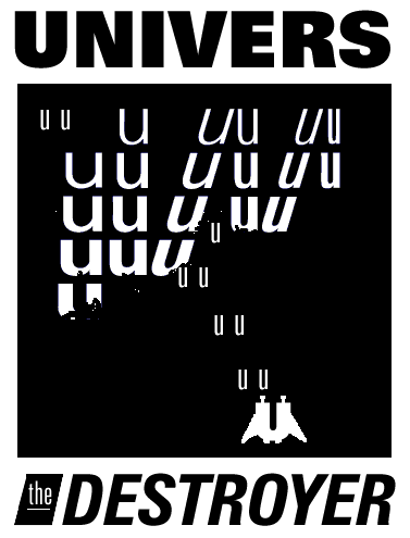
Can you put a link to a .pdf for that? Looks like a t-shirt to me!
Guess so, although I’m afraid it was a quick pixel job in photoshop, might come around to doing it proper.
Captured from web.archive.org on 12 Jan 2008. view this capture