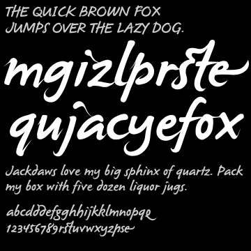
Hi. Long time listener first time caller.
I would like to receive some feedback on this font based on my handwriting. The original has been on 1001fonts.com for a couple of years now but I decided to clean it up a bit to make it more usable. I like to think it's worth saving. My intention is to make it look like I actually spent time on it while keeping the same feel as the original. It's obvious from the sample that I have no design background whatsoever. The capitals are too embarrassing to include :)
Thanks for your time.
| Attachment | Size |
|---|---|
| himasf.pdf | 11.97 KB |