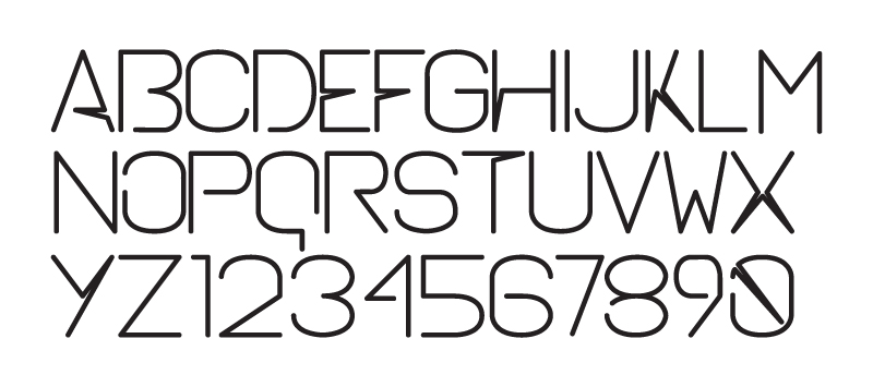
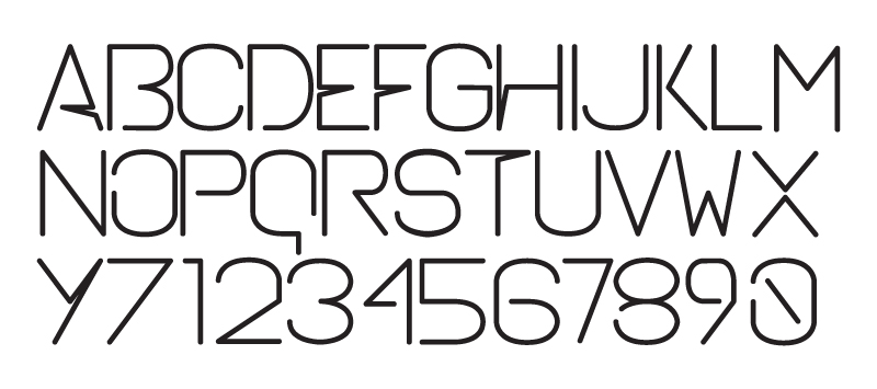
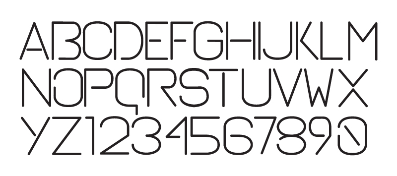
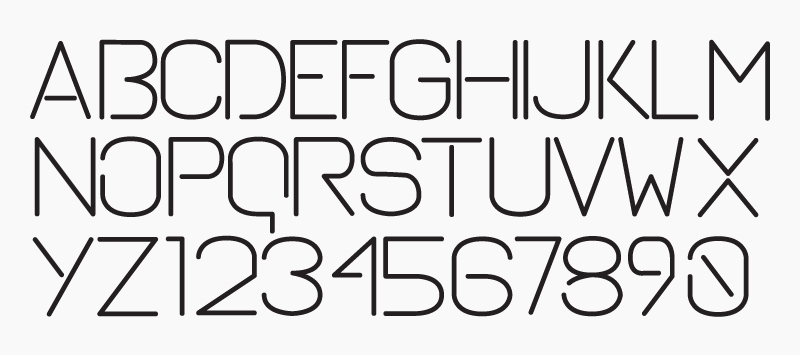
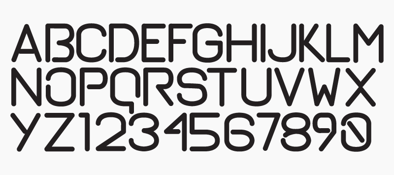
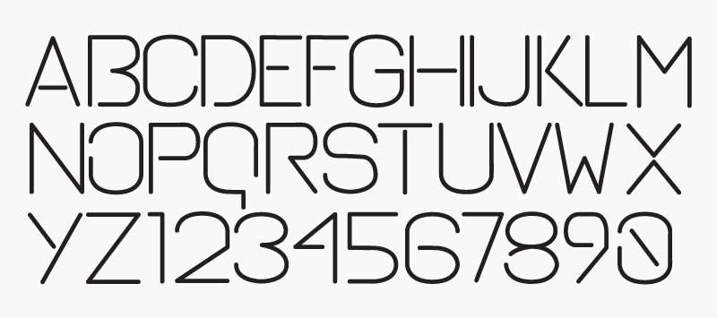
My name is Luís Martins, I'm from Portugal and I study communication design. I've recently started trying to design a typeface. In my current college they don't push us to do typeface design so I've started to learn the basics by myself.
This is my first go and I would like some C&C from all of you. I've ordered already some books to learn more about it.
I'm quite glad to join this community.
Cheers
| Attachment | Size |
|---|---|
| grelha1.jpg | 67.08 KB |