
Hi guys, here is a link to next years us presidents election candidate logos:
http://www.4president.org/ocmi2008.htm
Who's hot and who's not?
What do yo think?
What type do you want to see on future presidential key arts?
Let's discuss.
Best, Flo
This thread ran to 2 pages of replies and only one was recovered, so replies are missing.
The capture this came from was cut short by the archive that made it, so the text may be incomplete.
Hi guys, here is a link to next years us presidents election candidate logos:
http://www.4president.org/ocmi2008.htm
Who's hot and who's not?
What do yo think?
What type do you want to see on future presidential key arts?
Let's discuss.
Best, Flo

i love the vilsack logo! very 'underground'!

Obama at least has a creative logo chock full of symbolism: a rising sun over rolling plowed felds, and all that goes with it shaped like a big O. It's a pity the type isn't nearly as interesting.
But that Vilsack logo is great too. The rest of them all resort to American patriotic cliches, when they have an image at all.

> i love the vilsack logo!
The announcement page has some odd kerning on the 'sac' of the top logo (or is that correct in some way us amateurs don't know about?):
http://www.4president.org/speeches/tomvilsack2008announcement.htm

Hillary: snooz.
Obama: I love the logo, but I have never liked it when an apostrophe is used in front of shortened dates, words, colloquialisms, etc.
Edwards: That rising star gimmick would work a lot better if he had not sunk to blatant populism.
Richardson: Fun type treatment and a cool logo. Nice stuff.
Dodd: Oh look, pointless letterspacing!
Biden: Joe, everyone in town already knows about your giant ego. But you still can’t be president.
Vilsack: I really loved this one. Too bad his campaign tanked.
Kucinich: Not remotely crazy enough to represent him.
McCain: Ok, Ok, I get it, you’re a war hero.
Rudy: Still buying his own post 9/11 hype.
Romney: So he’s a viper disguised as an eagle? Backed by the USPS? Whatever, it has a vaguely corporate look, and that’s better than most campaigns.
Huckabee: As much as I get sick of all federal election materials being red, white, and blue, adding yellow was a stupid idea.
Tommy: That’s right, Townsend and Daltry are back on tour! He’s a pinball wizard...
Brownback: A design that’s almost as stupid as the candidate.
Hunter: Guess who hired a design team that only knows how to use Photoshop?
Tancredo: I think they just re-used the "God Bless America" sticker design that was stuck to every taxi cab and ethnic restaurant in America on 9/12/2001.
Gilmore: Yeah dude, we know that there’s an election in 08. Maybe if you had hired a decent designer you might not have dropped out already.
Ron Paul: Conservative and simple, how appropriate. Too bad the kerning sucks.

It's kind of sad to see that three of these stickers have the wrong apostrophe to the left of the "08"... The ones for Biden and Paul have an opening single quote instead of a closing one. Hunter's has the correct apostrophe, except that it's been flipped horizontally.
I guess I shouldn't be surprised though... This kind of mistake is starting to crop up in high-profile ads and billboards, too.

I wish we had access to how much each designer was paid. Then later compare poll results. How many different ways can you use symbols of freedom...

Most of them have that same old tired American Flag look. Too bad mediocrity is the catch phrase of american political image.
ChrisL
I miss Paul Tsongas.

Back when buying music on those shiny discs was a habit of mine, I'd often purchase music based purely on the cover art. I have to say, I was probably batting .700 or so via that method.
So, based on this...hmm...
Hilary is bold, iconic but not cliche even though it's using the stars and stripes. I like the fact that it's using her first name. Clever and probably a strategically good move. Type is nothing spectacular but feels very well balanced in relation to the mark.
Obama has the best logo...it's an actual logo...with a concept...and some cleverness. I might have to give him the lead. But the type is so weak in comparison.
But wait...Vilsack! Futura! Oh man, Futura...well played! Tempting...
Rudy...wow...look at the size of his ego.
McCain...subtle, but clever..."look at me...I was in the military!" (That really should be a plus for him right now...too bad he's been veering out of control for so long).
Edwards, Richardson, Dodd, Biden, Kucinich, Romney, Huckabee, Thompson, Brownback, Hunter, Tancredo, Gilmore, Paul...*YAWN*...did you guys even try? You couldn't find ONE semi-design savvy intern to help you? Did you all share the same 'stars and stripes' clip art package?

I think Vilsack uses Eagle, not Futura.
- Lex
"I think Vilsack uses Eagle, not Futura."
The fact that it's "eagle" makes me think that the typeface was chosen solely for its name. ;o)
Whew! I didn't want to vote for him anyways. ;o)
This is almost enough to get me to vote for Vilsack, if only I had the faintest idea who he is!
The rest are pretty lame. Duncan Hunter in particular should fire his communications director.
Hmm. Stars and stripes, red white and blue, these logos are about as original as most of their campaign platforms.
Lots of Trajan among the dems - must be courting the Hollywood vote.
patty-
have you seen the video short "etched in stone"? brilliant!

out of the dark clouds of an illegal presidency there is hope a new light shines. Obama
have you seen the video short “etched in stone”? brilliant!
http://www.veer.com/ideas/etched/
To me the most brilliant part was the "Gigantic" movie poster. Taking a photo by a complete hack, and making it into something cool shows someone there has talent. I love it. I want to add it to my gallery, and I will watch it again to see if there is a hint of who I should credit.
This one -- also by Cheshire Dave -- is really terrific!
i wish cheshire dave would make a full series of these... i love them, and i know my students all get a great kick out of them.
I love Obama and i think his logo is pretty good. I like the "O" symbol.
Hillary's is so standard and safe it makes me die a little bit.
I'm most impressed by the simplicity of "RUDY". great strategy. Makes the best bumper sticker i think. McCain's veers away from the norm too in terms of design.
Vilsack - great typeface, bad design - that V is all you see. too much space in "T O M". reads "communist"
Its too bad none of them had the balls to get away from the red-white-and-blue cliche.
S
do you think you have any chance to design a non-red-white-blue key art for a presidential campaign? if so? what colors would you use? what colors do you think are the right ones?
Best, Flo
Red

Of course I found the perfect font for the theme.

To stand out, I would either go all black and white:

.
Or I'd go for the green, anti-war, "I don't spend a lot of money on graphics" vote:

:-)
Sharon
Is Hillary's theme song 'Let's party like it's 1999?'
it's not the 20th century girl!!! Go Obama!!!!!!
Is that Gary Puckett and the Union Gap?
ChrisL
Isn't jpad's last name Puckett? I liked his review of the logos so I decided to nominate him. No one can ever read my mind. :-)
Sharon

Gotta say, I really like Rudy. Not the person, the type. Its the sort of boring that doesn't offend me. Not sure if I am supposed to read that other one as "Tom V. Vilsack", "Tom Vvilsack", but either way it looks reminds me of french comics, and I don't care for it here. I won't get into the rest, because my mood is darkening just thinking about it.

Fontplayer: "To me the most brilliant part was the “Gigantic” movie poster. Taking a photo by a complete hack, and making it into something cool shows someone there has talent. I love it. I want to add it to my gallery, and I will watch it again to see if there is a hint of who I should credit."
I just watched the film again, and in the credits Cheshire Dave is named for background and poster illustrations.
Sorry, if this ends up in a wrong place in the thread. I changed the quoteing style, for I couldn't see the problem Fontplayer asked me to fix.
Mili, can you fix your end cite please? -
>I just watched the film again, and in the credits Cheshire Dave is named for background and poster illustrations.
Yes, I found it, thanks. Somewhere else I saw his last name is Beckerman.
The patriotic version:

alternate:


Didn't Vilsack steal that logo from some brand of jeans?
I thought McCain's was pretty good: a different look. I'm not really into the military, but I think it's a good logo.
Obama has an actual logo, which is cool.
Is Hunter campaigning to win the 1999 Internet? I think Gore already owns the internet since he invented it.
But what really made me sad were the apostrophes.
He always goes by the name Cheshire Dave, though.
I don't like Obama's logo. It looks like a butter label to me. Maybe that works for a politician.
Sharon
Mili,
It appears that, since the new web server arrived, edited posts get pushed down to the last post with each edit and make the flow out of order. I don't know if this is intentional or just a bug.
ChrisL
It appears that, since the new web server arrived, edited posts get pushed down to the last post with each edit and make the flow out of order. I don’t know if this is intentional or just a bug.
Either way I wish they'd go back to the old way.
I agree, Patty. I sent in a "feedback" post about it today as well.
ChrisL
Chris, I was aware of the problem, hence the apologies ;^)
Didn’t Vilsack steal that logo from some brand of jeans?
Or maybe from V for Vendetta.

You know where you've seen that Vilsack typeface before...
Vonnegut, anyone? This series of book covers is famous! Sure, different proportions and weight, but the right face, and very likely the influence for the designer. Thoughts?


ChrisL
V for Victory is right! That's what his designer is probably shooting for. Anyway, the Vonnegut and Viceroy examples are way better than the V for Vendetta poster... and they've been around longer.


I think it might be South African RiVer Trader, but I can't find their logo online (and the labels on the jeans themselves say "RT Denim", so I can't scan it).

Steward and Colbert have better logo than these, and more of them. To wit: http://www.cafepress.com/buy/stewart%20colbert/
At the risk of giving a heart attack to a few here, I present my dream ticket.

Ok, just kidding. I'm really for Letterman/Leno.
Franklin Gothic Heavy & Demi Italic
On second thought, just imagine what the press briefings would be like with Ann Coulter as Press Secretary. Her tact and diplomacy would have the press corps wrapped around her skinny little finger.
Her tact and diplomacy would have the press corps wrapped around her skinny little finger.
Yes, to try and take a bite out of it. :-D
Steward and Colbert have better logo than these, and more of them.
970 designs, to be exact. Gulp! I like the WTF? designs...
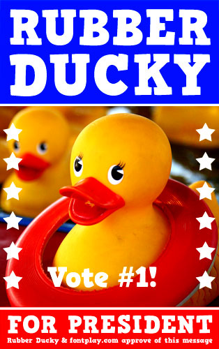
Art Director: James Arboghast

Clinton's and Richardson's look best to me. In average the Democratic ones are way better than the Republic ones.
Too much symbolic elements in such a logo would only overcloud. Anything that doesn't trigger a reaction instantly is superfluous. However, the logo should at least give some hint that it's about the presidential race -- as opposed to any other arbitrary political race. This is where I think the Republican logos fall short.

I think the McCain star-studded design has more to do with the fact that he's from Arizona. (cf. star and colors on the Ariz. state flag, though points off for using a Texas star)
And, btw, I had no idea that he was running for president!
I think the Obama log is the strongest, it seems like there was an actual good designer behind that one.
politicians could really benefit from good design. Sauli Niinistö was running for president of Finland a few years back and he hired Bob Helsinki to produce a campaing for him and they actually created something decent. Here are a few links:
http://www.bobhelsinki.fi/asiakkaat/niinisto2.html
http://www.bobhelsinki.fi/asiakkaat/niinisto1.html
They also created a Cafe for him as a promotional headquaters where people could get free coffee and learn about the candidate:
http://upload.wikimedia.org/wikipedia/fi/thumb/1/14/Café_Niinistön_logo.svg/800px-Café_Niinistön_logo.svg.png
Does anyone else know of any good design from politicians running for office around the world?

Think with the whole body and soul.
Great comments! I love it! Ha Ha...
I think the objective of the campaign has to be Very Americano Feeling... to get that patriotic thing going... It has to fuction loud, clear and strong... and reflect the canidate... so no wimpy type... that spells Calvin Klien or too punk rocker feel....
In my opnion... a lot of these presently design slogans need designer's touch.... Why are we not helping them? Each of them needs some improvement. agreed?
Of all serif type I like Hilary and Kucinich. Vilsack has potential... but need to be stronger. I can see the constructivist movement on the way! : )
AD Shamiko
Captured from commoncrawl.org on 27 Apr 2015. original URL
