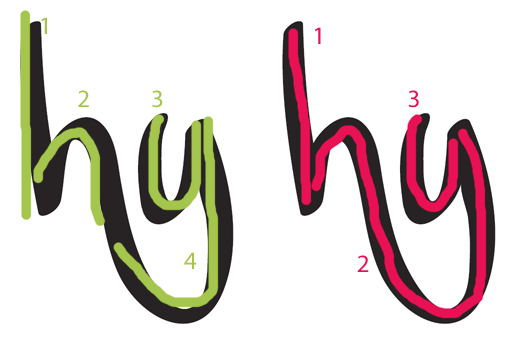
I'm just learning type design and figured a good project for learning the ins and outs of the technical side would be to digitize my own handwriting. I used my wacom tablet to sketch up the initial designs in illustrator, and tweaked them there. Brought them into fontlab, and made this... even managed to get a few special ligatures in there on my first try! Any comments would be helpful. Thanks!
| Attachment | Size |
|---|---|
| ytchknstrut.pdf | 407.03 KB |