
I'm working on an aviation startup logo. The name is as it says. I had a nice idea and made some pretty sketch. Your opinions would be much appreciated.
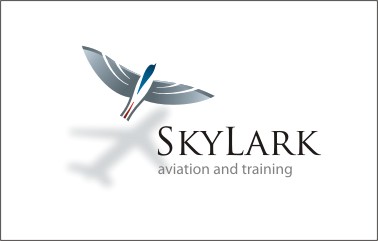
Don't forget to check the PDF too. :) Thanks.
| Attachment | Size |
|---|---|
| SkyLark Logo.pdf | 613.58 KB |
I'm working on an aviation startup logo. The name is as it says. I had a nice idea and made some pretty sketch. Your opinions would be much appreciated.
Don't forget to check the PDF too. :) Thanks.
| Attachment | Size |
|---|---|
| SkyLark Logo.pdf | 613.58 KB |

nice
is it just me or could the 'S' be kerned more tightly?

I agree -- nice job. Few things: 1) Trajan is a bit overused, although it works well enough here (unless this is a different Trajan than Adobe's). I don't have any suggestions for a particular reason, but it seems to me that something with tension in it's letterforms might be good: FF Legato, FF Avance, Sebastian, and Prensa. EDIT: Shaker and Enigma go here too.
2) The S is too loose, and I'd kern a bit tighter between the Y and L.
3) I like that you didn't track the "aviation and training" to the full width of "SkyLark," but I find it distracting that it lines up so neatly to the end of the R. I'd either line it up with the end of "SkyLark" or make it end somewhere in the middle of a letter.

I feel that the small cap height is to large. About 70% of cap height mike work better. Part of the retention process of which is the essence of a good logo, is the identity to shape. Logos that tend to be more of an illustration are more difficult to work with. Your design is appealing, but how does it work in b/w?
I told you all to check the PDF too, because there's also a BW and a small size BW version of a logo as well as a variation of it on the negative space. Please check that too.
But otherwise, thanks for all the opinions so far.
One more thing: I find this logo pretty much a great and straightforward idea with a bird casting plane shadow, but. I have to make it work applicable on plane's tail too... I know I can just use the lark for it, but what do you think?

There is some refinement required on the illustration, the wings appear a slightly different angle to the body and not symmetric. The reversed out version is a bit moth-like, it might be nice to continue the grad through the lettering. I would consider a different sans it seems a bit heavy next to Trajan. How are you applying the tailfin mark – vinyl, painted on – can it have halftone?
Tim

the wings appear a slightly different angle to the body and not symmetric.
That doesn't bother me, because it reinforces the fact that the shadow is not the bird's per se. Larks don't have swept-back wings, but most modern airliners usually do (unless you want it to cast the shadow of a DC3).
Sorry I wasn’t clear, I meant the wings on the bird not a comparison between the two.
Tim
The lark itself has been stylized over a real life photo, so I wing angles and body symmetry should be second to perfect. Real life.
I had the same problem when I first looked at it, but after looking at it for a while you get to feel it's natural...
In the process of stylising you have created an illustration, and you should be aware that I and any other audience will not have the benefit of a photograph, the left wing is clearly not a pair to the right wing and the wings are not at a right angle to the body. Unfortunately photographs are not real life, they suffer from all kinds of distortions and this is a further distortion – it is an accepted technique to work from photographs but there comes a time when you have to view it as a stylised illustration and as such it is no longer a genuine representation, it needn’t be a huge job to alter I would suggest you try it. By the way, skylark is one word and doesn’t need the L capitalised.
Tim

The top one in the PDF is very appealing but the bottom one in blue would be easier to manage. You mentioned it being applied to a plane...
i agree with the bottom sans being a bit heavy for Trajan and also the uppercase 'L' should be lowercase.

Hey Litera, nice illustration. A few comments.
Color version: I feel the plane shadow might be redundant and busy. 'S' needs to be tightened. 'aviation and training' looks pretty good to me. I might see what it looks like right justified.
Gradient Color version: I actually really like this approach. Very clean and great used of color and space. My favorite by far.
Black/White: Clean and simple. Illustration should reproduce nicely.
B/W version falls apart. Symbology and type should connect as a unit.

Hi everyone, I like very much your logo, but i would try using Aviano from Insigne for at least three reasons:
1 - as suggested at the bottom of the page "Use Aviano as an alternative to Trajan";
2 - it seems to be designed just for your logo;
3 - it's cheap.
Bye...
Aviano is actually Italy's NATO air base... :) Not a coincidence... :) I guess that the wide letter shape makes it strong.

I think this design is too busy looking. The 4 elements don't tie together for me. And they compete for dominance to too great a degree. Something needs to be clearly primary.
Keep working on it.

Nice work, if no one else said. I think the S needs more weight and I would lengthen it's serifs and widen it all, very slightly
Cheers!

I'm with Eben on this. My eyes seem conflicted. I want to look at the word mark, but the bird is beautiful and pulls my eyes up away from the word mark. Then the shadow is clever, but ultimately is the biggest distraction because it's so out of focus and light, my eyes fight to focus on it more.
and the "aviation and training feel tacked on, running into the shadow.
The elements of the logo are strong, you have a great stepping stone, but it's needs refined so the parts work in unison. You have a lot of artistic elements, which maybe be "over flavoring" the work.
Also, I tend to agree with Tim in the refinement of the stylized illustration. If your image was more "realistic" in nature, I wouldn't argue, but since the image has been striped down to the bare essentials to infer a skylark, precision takes precedence.
You're very close, it's an excellent design and you should strive to make it as perfect as possible.

Clever interpretation of an old idea.
- I like the color variation, however the shadow isn't convincing for me yet. Also the shadow needs to be cooled down it is too warm.
- I really like the 1/2 color version the best.
- The word 'Skylark' holds together in the 2 black only version, but the SK pair is too loose in the other two.
- Maybe the shadow needs to either overlap the text more or not at all?

"I think this design is too busy looking."
I agree. As I mentioned on logopond, while I think the shadow-as-a-plane is a good idea, it's not needed. The logo works just fine without it.

I like the lark. The wings do seem like they are not aligned right with eachother.
I agree with the others that the shadow of a plane is not needed, works just fine without.
Not entierly convinced about the type for Skylark but I like the type for aviation and training.
Otherwise I think it's fantastic.
peter
Captured from web.archive.org on 18 Aug 2013. view this capture