Rotis, the village is about 15 miles away from where I live and was born. I never got to know Otl Aicher. He died before I heard of his work. The typeface Rotis was later always part of my typografic life, because I discussed it a lot. To be honest for a long time I hated it. But what I hated much more was the theory Otl Aicher built arround it.
I am still getting angry now, when I see so many designers and architects following him without much critique.
Still there is something about it that interestes me.
A few years ago I started to draw a new interpretation of the Rotis idea, because there was a potential client that wanted a headline face in this direction. It never happened, but I went on with it.
I started it from zero, never used any outline of the Rotis fonts.
The first thing you can see is, that it is not condensed. That never really worked in Rotis.
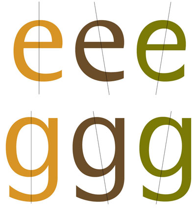
At the end there are not many elements left that remind on Rotis, accept the often discussed e and c. The stroke is oldstyle while the rest of the forms are neoclassically upright. I kept it in my first version.
Because it follow two different concepts in the stroke I made two alternate versions. One with an angled axis, called the oldstyle stroke version and one with an upright axis called the neoclassical stroke version.
I want to ask you a two questions:
1. Do you think it has got enought character to live a life next to Rotis?
2. Would you do extra fonts, or Open Type styles for the alternate versions?
I have never based my fonts as near to an existing design as in this case. So I am quite eager to hear what you think.
Hubert
| Attachment | Size |
|---|---|
| Legau2Font.pdf | 108.69 KB |
| Legau3Font.pdf | 56.23 KB |