Typophile

Best extender lengths for general text work

raph

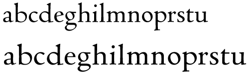
I’ve gotten enough positive feedback that I’ve decided to plug forward with my Cecco font. However, one thing that’s clear is that it looks too “small” for its point size, because the extenders are so long. In fact, I based the height metrics on metal Centaur, which is a very arty font as such things go, quite a bit more so than the foundry version, in fact.

In the Star Trek future, I’ll make fonts with variable extender length. Coming back down to earth, I need to pick some now so that I can hammer out usable glyphs today. To help me understand the decision better, I made this chart:
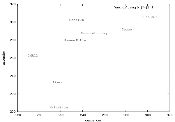
The axes are descender length (measured baseline to lowest ’p’ peak) and ascender length (measured highest ’x’ peak to highest ’l’ peak), in standard Type1 units of 1000/em.

Of the ones on this list, I’m sorta inclined to copy Gentium. It gets away with its tall ascender because it makes the caps quite a bit shorter (X-height:l-height of 615:757), thus leaving adequate room for umlauts and other accents on the caps. Does this seem like a reasonable compromise, or do the caps seem wimpy and insubstantial? Certainly that’s a completely different approach than the Scotch Roman tradition, in which caps are big, beefy, and strong.

Just so I’m clear, imagine I’m designing this for technical papers, books, and so on, in which economy of fit is important (i.e. not art books).

Is there a definitive reference on the subject, or, failing that, a Typophile thread? I know one recent project to tackle this systematically was the Vista ClearType font collection, but they were designing for 100dpi displays. I’m targeting print and high resolution displays. I’ve also reviewed Ch. 6 of “Letters of Credit,” but feel it was prescriptive enough, and besides, I don’t think he’s giving enough consideration to accents and non-Latin scripts.

Your advice, as always, is welcome!

Wow, that’s pretty hard out man!

—K

Can we please see Cecco?

—K

you can find anything with google: cecco

Raph, I don’t think your brief is specific enough for anyone to give a good answer, beyond what Tracy says.

I think you if you define what purpose specifically it is for, and why existing faces don’t fulfill the purpose well enough, then you can start to get a handle on a lot of things, including x-height. It can be a practical problem—such as low screen resolution—or an aesthetic problem, or both. But in any case I think defining the specifics of the problem you are trying to solve comes first.

Bear in mind that in the heyday of this kind of old-style revival, it was often set leaded solid (I’m thinking of the Morison/Monotype practice).

Today, with Quark and MS Word with their default or built-in extra leading, and the general sloppiness of typography, copious leading has become the norm — and that aesthetic tends to weaken the presence of liberally-extendered faces. If you’re going to produce a fogey face, don’t pull your punches. Forget theory and accomodating today’s practice, and produce a thoroughly prescriptive specimen which shows people exactly how they should use the damn thing tomorrow.

The need to support languages that use diacritics extensively was behind Victor Gaultney’s decision to increase ascender length and to decrease the cap size in Gentium from what is considered typical. Especially with stacked diacritics as in Vietnamese, the long ascenders provide enough room above the x-height for the lowercase while the smaller caps allow space for their own diacritics as well. In addition, for languages such as German that use capital letters frequently may be helped by making the caps a bit smaller and therefore less obtrusive.

I like Gentium, but it probably represents the case of going as far as you can with that approach with regards to what’s acceptable. For most uses, I’m guessing decreasing the ascenders of Gentium a hair while keeping the cap size would yield usable proportions. What sort of uses do you have in mind for Cecco, and what size range are you targeting?

William: yes, I agree that my description is too vague.

I am working, in my extremely spare time, on a mathematical publishing system called Ghilbert. This is a very long term, somewhat speculative project, with a high risk of never paying off. Even so, it is immensely rewarding to work on, and I’m hoping that even if it never achieves the main goal, the spinoffs will be useful.

One such spinoff is the default font for text. Essentially, this font will fulfill the same role for Ghilbert as does Computer Modern for TeX. It should be a usable, readable, friendly font, versatile enough that it would rarely be a bad choice for such documents. Further, it should be suitable for immersive text reading, as in books. Essentially, I want a font good enough that a non-typographer user has a better chance of sticking with the default rather than choosing another readily available font.

The Cecco sample paul posted is essentially an exercise in reinterpreting the Jenson Eusebius with my own eyes. Basically, what I want to do now is roll the clock forward - smooth over a few of the quirks of that seminal work, such as the diagonal e (still present as an alternate, though). At the same time, I want to subtly reword the metrics of the font to make it more practical, in much the same way that Bible Centaur did for Centaur.

I want the font to be beautiful without calling attention to itself. Imagine, say, that you have before you a flagon of wine. There is a school of thought that maintains that Bembo is the highest accomplishment in all fonts designed for books, and that all deviations from that near-Platonic ideal are degradations. Cecco Text will, I hope, not be a disappointment to such folk, and will also exist in digital form with good spacing and more than two instances of optical sizes. At the same time, it will be far from a mechanical clone, and in particular will retain enough flavor of the original Jenson that he might be able to recognize it if he were alive today.

I also have a few requirements specific to the 21st Century: it must handle accents without compromise, and, eventually, I hope to have at least Greek and Cyrillic complements as well. Further, this font must either harmonize with or be used as the basis for math typesetting.

Nick: thanks for the encouragement. Yes, it is valid to assume that I have full control over all typesetting parameters, definitely including things such as leading. In the most ambitious plan, my layout algorithms will automatically be able to select width alternates to improve fit, just as Mardersteig and Blumenthal did in the first half of the last century.

Hope that fills in some more context. Apologies if my ambitions sound too grand - but then, if I only accomplish a tenth of what I set out to do, it will still be useful and enjoyable.

Raph, that certainly is an interesting and highly ambitious project, one would prove immensely beneficial to the mathematical community if successful. Best of luck with it!

my layout algorithms will automatically be able to select width alternates to improve fit,

On a similar tack, an alternate “f” with less hang would be good for word endings.

eventually, I hope to have at least Greek and Cyrillic complements as well.

In that case, you should do them now.
You don’t want to make decisions in the Latin about x-height, extender length, and small-cap height, which will compromise Greek and Cyrillic later.

However, if you are working with software like Superpolator now, should changes to the vertical metric parameters be required later, it won’t be too onerous.

Raph, you’ve put a lot of demands on yourself. The math setting is evidently a key one for you. My guess is that you will have to feel your way, perhaps doing the math characters first, then doing trial and error to find the proportions you like best. And optical size is important, as I’m sure you know.

Here are two ideas you might want to chew on. First, I wonder if you are not multiplying conflicting demands on yourself, so that the project becomes an impossibility. How important is it to you to be able to set mathematics text books in Vietnamese *and* beautifully set a novel? From the point of view of being able to get it done, it is maybe a better tactic to decide on a core purpose, and if you can accomplish that to your own satisfaction, then look to expanding later.

Second, there are a lot of recent interpretations of Jenson worth having a look at to see what you like and want to avoid. I don’t know how many you’ve studied, but there are quite a few recent interpretations such as Jim Parkinson’s Parkinson, John Downer’s Iowa Old Style, Nick Shinn’s Goodchild, Christian Schwartz’s Houston, Randy Jones’s Eason and so on. And of course there is Adobe Jenson, which sets a pretty daunting standard as a revival.

William: I was familiar with most of those. Thanks for rounding out my knowledge - the less classical, or as Nick would say, “fogey” interpretations are also interesting.

I’ve been looking into this more deeply, and now have more insight into why I’ve been struggling with this. The first issue is the age-old one of “how long should the descenders be”, and the second is how to keep the type from looking really small compared to other fonts of the same nominal size, all without clipping.

The fashionable descender length goes up and down almost as regularly as dress hemlines. Ridiculously short in Gutenberg. Nice and long in Jenson and Aldus. Short in Guillen de Brocar’s 1517 Polyglot Bible. Consistently pretty long in the French work (but see Tory’s Champfleury) and short in the German. Very long in the Monotype heyday of the ’20s and ’30s. Shrinking to almost nothing by the ’70s ITC days. Not quite that bad, but shorter than the metal, when we get to the digital version of just plain Bembo, but lengthened again in the more faithful Book.

This question clearly hasn’t been resolved any time in the last 500 years, and might not in the remainder of the millennium. What’s a good postmodernist to do? Variation, of course! And yes, Nick, I am writing (and using) software “like Superpolator”.

But I think I’m also running into a purely technical problem. The entire issue of what I call “height metrics” is messy and complicated (to me, “vertical metrics” means metrics for vertical writing modes, as is common in CJK). There’s a How-To here with input from paul hunt and John Hudson, but I must say reading it left me almost as confused as before. Certainly, whenever I’ve created a font, I’ve felt the need to stay within the 1000 unit prison, lest I get clipping when using it in various applications.

I think, but am not 100% sure yet, that there is a safe way to get past 1000 units without clipping. I think the reason I haven’t figured that out before is that the rules changed between the Type1 and the OpenType days. I have yet to discover a clear explanation of these rules, but Adobe’s releases certainly show a discrepancy.

As for my own default descender lengths, I’m just going to go with my eye. I did a test set with too-short descenders, which turned out not too bad, but I want them longer to do book-like settings. This will be a useful model for the smaller optical sizes, though, which obviously need short descenders.

>Variation

Trinité was done in three different extender lengths. Recently Fedra Serif was done with two different extender lengths, both on the short side. These, Peter Peter Biľak explains, are intended for different optical sizes.

I find the look of Fedra Serif quite innovative and interesting, though I like longer extenders in books. My feeling is that what is best will vary with the destination; shorter columns, more tightly packed, will work with shorter extenders...

Slimbach’s Optical sizes for Adobe also all have variations in extenders for optical size.

On the issue of clipping, you probably already know this, but you don’t have to have the actual extenders sum to the 1000 em. There is usually additional space, partly to accomodate upper case diacritics—which are recommended to extend no more than 1200 from the descender, to avoid clipping.

You didn’t ask, but your ’b’, above, screams out at me as too wide in relation to the other characters.

Captured from web.archive.org on 24 Aug 2007. view this capture