
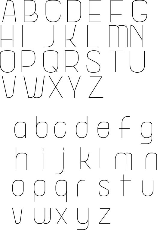

It reminds me of light modern furniture for some reason. The letters have a springy feel and some of them appear to have been sat on.
The C and G look a little too square on top, but I understand why they are that way in relation to the rest.

It's nice but the formula is getting in the way a little. The repetion of the form form of o for the n isn't working for me. The m is not working for me either. I lik the v. I would make a w based on the v instead. I suggest you learn about 'clotting' and what to do about it. Here is a start: see were the like joins the stem on the p? See how it makes a kind of dark spot? You don't want that. I ma not saying change the shape - just compensate for the clot.
Thanks for the repies. I'm thinking a slightly heavier vertical stems might solve some of the above problems.

Hello
I think that the bigger problem is at the superior part of the letter
the superior curve is too suddent, take for example the "O", the lower part of the leter is very rounded, and the top cuve is too flat.. the problem with this is that generates inestability... even though at the lower case letters is not that big problem.
Then I feel like the "M,,W,m,w" dont belong to the sistem, becouse the union from curve to line is weard... may be
The horizontal line of the "f" should be at the "x" heigt, like the "t", the bottom eye of the "B" should be larger than the top eye... and the center of the "xX" should be a little bit more close from the "x" heigt line.
Anyway, i like the "k" "v"
Sorry for my misspels, I dont write english very well...
i hope i'm not to being very hard on you, its your first font! :S hehe, just wanted to tell you what i thought, but remember its just my opinion hehe
I hope that my opinion hava a good use, and to see this font in the future...
Ferch
I have changed the capitals a bit.
They have bolder verticals (without being wider), C,G,O and Q are each taller and rounder.
I have included three variations on the M.
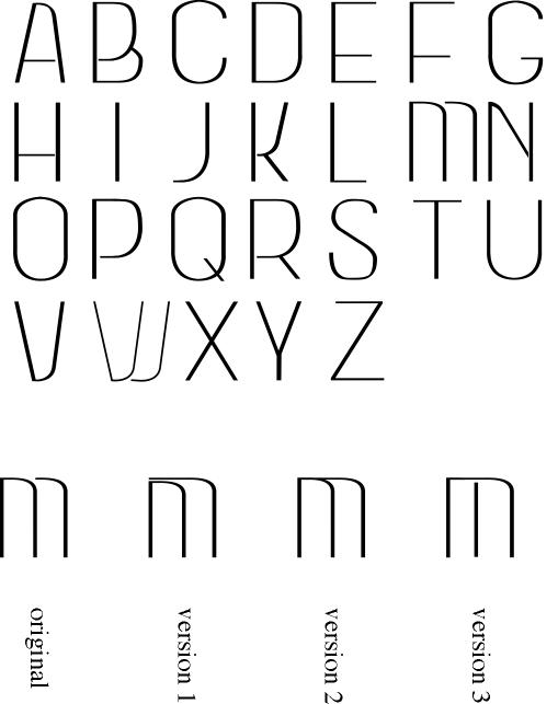
...still workin' on the W

Your W could be nice in the way of the M is, with some adjustment of course. BTW the actual W seems to light compare to other letters. To me the K looks upside down. I like the P and the R. Is your choice to give a kind of square look to the upper left of your C, Q, O and G? The curve at the right top of the P, R is more nice at my point of view and could be use for the other rounded letters.
Yeah, I just left the W alone (i.e. un-widened), 'cause I've got to change it.
I'll try extending te foot of thew K to make it more stable looking.
C Q O & G should only have squarish corners on one of the upper right corners in the miniscule; asymetrically.
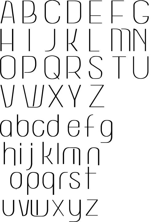

Problematic characters to my eyes would be:
- UC: V, W (both unstable), S (bottom curve is too much left positioned), D (top should be a bit narrower to make it look straight)
- LC: I don't like the descended lines on h, m and n; non symmetric m and w, same problem with v as with upper-case version
I've begun flirting with italics. I'd like to keep the stems upright, but it doesn't seem to be working. On one hand, it doesn't look italic enough, on the other, the style (to my eyes) begins to approach uncial; moving away from the Modern look.

Litera: thanks for the suggestions, I'll try them out later today. I'm also going to reduce the feet on g and y.
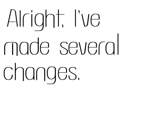
OK, I've made a ton of changes. any and all criticism welcomed.
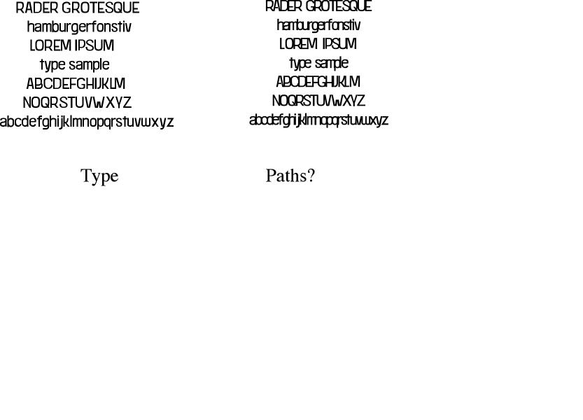
For some reason, when I convert to paths (in freehand MX) my metrics disappear. I a musing Fontlab's Type Tool.
]
Captured from commoncrawl.org on 27 Apr 2015. original URL