
This is a theory I developed in 2003 while designing Preface, but I thought I’d introduce it here in relation to several Typophile threads which have discussed the relationship and variability of letterforms in the Latin-Greek-Cyrillic script triad.
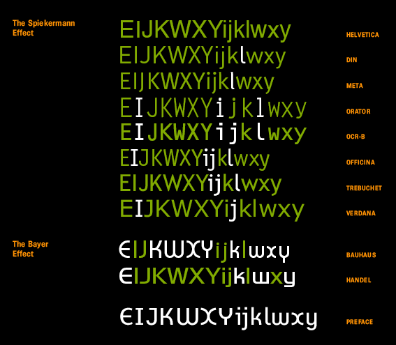
I set out to introduce a selection of more recent letterforms into the Latin grotesque (19th century sans such as AG/Helvetica/Arial), and discovered that these forms came from non-print media, where the spacing is not as subtle. Typewriter, road signs, OCR, computer monitor, neon, and the Breuer chair.
It’s not a drastic change to the Latin script, which is so diverse anyway, but it’s notable that the use of serifed forms of I, i, j and l in sans faces for typewriter and www makes these forms extremely widespread.
With both Verdana and Comic Sans featuring a serifed “I”, that constitutes a 21st century default.
Griffith/Bell Gothic also has this letterform; although designed for print, again crude, not subtle typography.
**
Going back a little further, somewhat more fundamental changes to the Latin script:
1. Abolishing the long s, early 19th century.
2. Establishing the single-storey g as a legitimate and widespread upright form (previously it had been used only for italics and scripts). AG (1890s) and Futura (1920s) were instrumental.
3. Conversely, the use of tail-less “f”, an upright convention, in italics.

