
This is obviously heavily customized.
But what could it be based on?
Thanks.
This is obviously heavily customized.
But what could it be based on?
Thanks.

Don't know what it was based on - but this can bring you close
http://www.dafont.com/pieces-of-eight.font
This might help be an inspiration from where it came:
http://www.myfonts.com/fonts/scriptorium/captain-kidd/

No based on, but similar:
Rapscallion by by Ryan Splint from Chank
Requires a commercial license if you download it from Chank; no such restriction if you download it from Dafont according the Rapscallion.txt file by the designer.
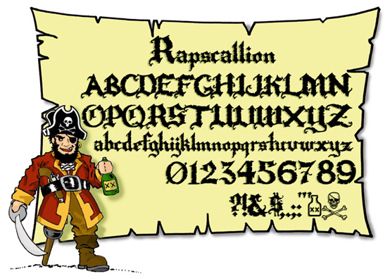

Dave Nalle of the scriptorium claimed that the movie/rides/merch use some of his fonts. Might be worth checking out. http://www.fontcraft.com/

It reminds me of Blackmoor.
- Lex

How about this:
http://www.dafont.com/caribbean.font
I think some flourishes have been added. Like on the bottom of the P and one of the B's
See lowercase N - pretty good match? I think it could possibly have been made starting with this.
Thanks everyone.
I actually found a couple of free fonts that work quite well.
(It’ll be just for a title.)
I didn’t want it to look too blackletterish/gothicy.
That’s what I like about this pirate theme interpretation.
I was more or less curious what the origins of that logotype could be.
Arrrgggghhh...se
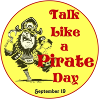
Captured from web.archive.org on 17 Jul 2010. view this capture

