
Gohan is a font I came up with back in 2001, just as an exercise in making a heavyweight sans font with some idea about some sort of optical properties inspired by an article I read about a font called Gararond. Well what resulted probably had nothing to do with the ideas that inspired it but it did turn out to be a very bold font that held up remarkably well at small sizes. Still, it had many deep flaws, and clearly was not ready for prime time.
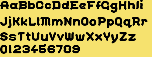
So now I'm taking it upon myself (in the interest of getting used to using FontForge instead of my old reliable Fontographer as much as anything) to redesign much of the font, and once that is covered, to develop book and medium weight versions.
The original is available for free at 1001 Fonts. Works in progress are in the attached PDF files below.
| Attachment | Size |
|---|---|
| pr-Gohan-original.pdf | 58.16 KB |
| pr-ShinGohanSix.pdf | 65.6 KB |
| pr-ShinGohanSix-text9pt.pdf | 65.93 KB |
| pr-ShinGohanSix-text12pt.pdf | 66.03 KB |
| pr-ShinGohanSeven-plain-chlist.pdf | 84.55 KB |
| pr-ShinGohanNine-plain-full.pdf | 56.93 KB |

