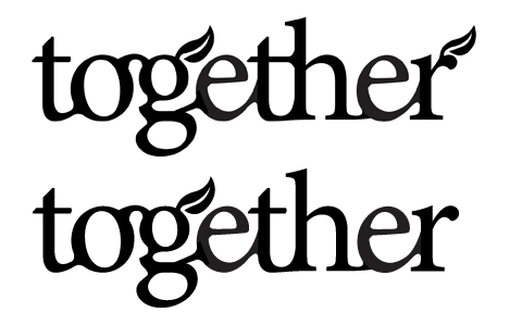
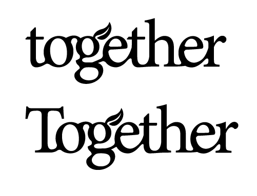
The following is a logo for a blog/forum/chat/customer-connector found at the website of an educational publishing company. The tagline is "teaching | learning | growing | TOGETHER." The desire for an organic community led to this connected and bracketed Minion Pro (our corporate font).

Does it work at all? Does one weight work better than another? Have I made any egregious errors? I welcome all thoughts, broad and nitpicky.
PS - It will be seen first in the context of our new front page, www.lampstandpress.com/xindex.htm, in the place of "LampstandLive."