Typophile

the evolution of gothic type

stw

Hi everybody,

I am writing an little article about blackletter for a college-project. For this I would like to show the evolution of the gothic types, from carolingian minuscule to textura.
Apart from the fact that this is only a quick sketch, do you think that the evolution is shown right or should I change anything?
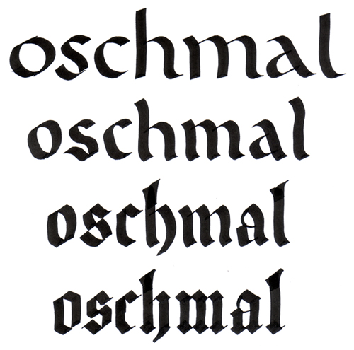
Thank you very much,

bye: Steven

Do you mean more or less Fraktur type? Or something more broad and that doesn’t specify Germanic style typeface design?

Based on everything I just read through the last few days on the etymology side of things - I think you might want to look at it as well. There’s some enlightening issues in the mix in context with pronounciation and accenting that doesn’t seem to be noted these days. (Whether in academic circles or elsewhere.)

To my under-tutored eye this looks fine. Reading Noordzij it become clear that you could go from almost any Calligraphic style to almost any other in as many steps. What I think you are asking is - does it seem Historically accurate. I am not 100% sure about that.

I was just teaching my intern about this...

What I think you are asking is - does it seem Historically accurate. I am not 100% sure about that.

Yes. Thats my question :)

If I have time I will see what I can figure out. I have a lot of books out right now. Hopefully someone with more authority than I will come along as well. You might see what Paul Shaw thinks. Or Sheila Waters. Or Julian Waters. Or Linnea Lundquist & Ward Dunham.

”...does it seem Historically accurate? I am not 100% sure about that.”
“Yes. Thats my question :)”

Since there were thousands, if not 10’s of 1000’s of calligraphic enterprises working over the span of time you are representing, I think 100% accurate would require time travel.

What you have shown is a good survey that pretty clearly makes the point, I think.

Cheers

the design museum in london has a good exhibition at the moment about Barnbrook who has done a lot to get such fonts into graphic design and to get rid of their nazi-image. check it out: http://www.designmuseum.org/exhibitions/current-exhibitions/jonathan-bar...

Very nice of Barnbrook!

hhp

Noordzij calls this process the “consolidation of the word,” and shows a similar sequence in The stroke: theory of writing, explaining that “every change that gives greater accent to the rhythmic bond of the white forms in the word counts as a consolidation of the word.”

You cannot properly consolidate notan while favoring the black.

hhp

I am still unconvinced hat you MUST be favoring the black when doing calligraphy - or put better maybe that Calligraphy has this problem in a way that is special or unique to it. I am convinced that working in the black rather than Notan is what 99% of practitioners do. But I also think that what 99% of all ’makers of letters’ in all techniques/process’ do. Going to Notan is an very expert shift not easily done. While I am open to hearing more about the ’rhythmic bond of the white forms’ I have to admit to remaining skeptical of that as well. It isn’t that I don’t see that there is something to what GN is saying. It’s just that I think it’s a very incomplete way of looking at it.

Also re: the actual topic of the thread. I think that it is reasonable to show your image as long as you don’t make great claims to precise historical accuracy simply because lots of scribes used multiple styles and the style they used was related to content and the desire of their patron. The problem with writing about calligraphic styles over time is that the actual complexity is extremely hard to wrap your head around and harder still to explain so less than accurate generalizations are made. The tendency to write in authoritative modern style ’ This is how it was ’ vs a postmodern more scientific ’These are my observations - these are my sources’ further compounds the problem. But as I say. There is no reason to present the thing as a modernist.

I que

Captured from web.archive.org on 7 Oct 2008. view this capture