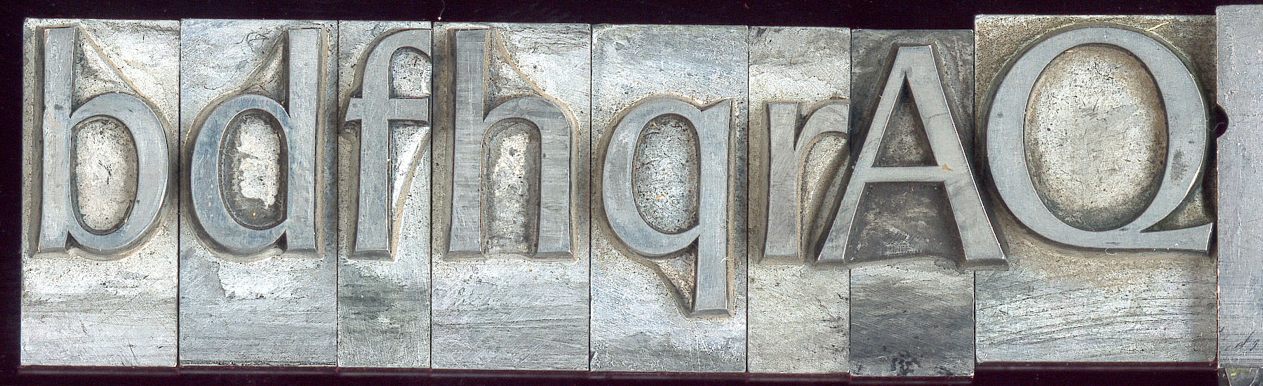
Good day to you all.
I've been nosing around Typophile for a while now and would like to have your opinions on what I'm working on.
The usual question asked is what is the typeface going to be used for - and originally I wanted to make a font to be used for body copy in magazines, something that had serifs, but looked modern rather than like a classical prestigious (considered 'old' by my previous art director) serif-font. I say originally, because to be honest I don't really know enough about magazine printing and how to go about trying to achieve what I'm trying, so I'm just kind of seeing where this is going and trying to find my feet.
I haven't really made many characters yet, but I would like to get a few comments before I continue for the sake of consistency and the probably glaring errors that I am making.
But I'm waffling. So, please be as blunt as you like in any comments you give as I will not be offended, I would just like to learn.
Thanks in advance,
G
| Attachment | Size |
|---|---|
| _01.pdf | 180.28 KB |
| _02.pdf | 225.27 KB |