Typophile

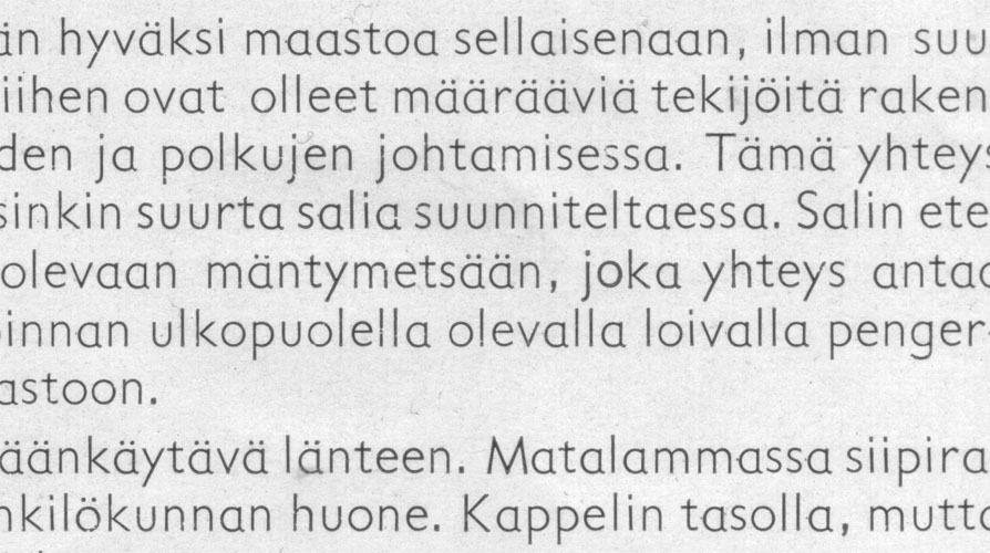
id request, sans serif sample from the 30's - similar to Gill Sans Schoolbook {Yves}

juhani

hello

anyone able to id this type? i've spotted this on several finnish architectural publications from around 1930-1950. (used in two different weights, haven't seen any italics.) i'd be surprised if it was of finnish origin. in that case there would be some secret typographic history i haven't been informed about.

AttachmentSize
sans-sample.jpg134.07 KB

It also looks like Vista Sans, if memory serves. And Fiendstar as well.

Except that Vista Sans was designed three years ago, not over half a century ago. ;^)

Picky, picky. ;-)

I said it "looks like" not "it is." Man, tough crowd. ;-)

Exactly. Both my thoughts are wrong. But check out that "y." I don't recall Gill Sans Schoolbook having that straight descender.

It could be Gill Sans Schoolbook with the 'y' from Gill Sans.

- Lex

Man, tough crowd. ;-)

Yeah, us type geeks, we even bite the heads off chickens too, just like Ozzy.

;-)

You have to realise this is a very competitive board, but I can assure you it is all in good humour. :^)

I hope you didn't misread my remark as arrogance, Michael. ;^)

thanks for all the answers.

gill sans schoolbook looks very much like it to me. only differences seem to be the "l" which is a straight line, the "4" (doesn't show in the sample) which is closed and the "y" as mentioned, all pointing to the regular gill sans.

the "M" has slanted vertical lines and the center touches the baseline, which doesn't happen in any gill sans version i managed to find.

linotype's gill sans infant looks pretty much identical to the gill sans schoolbook...? both versions appear to have a thicker stroke than in this printed sample.

is there a digital version of gill sans with a light cut with alternates for "a" and "g" as in schoolbook/infant? :)

vista sans looks too condensed. fiendstar is pretty nice, the light version has the weight right. don't like the "y" though.

Yves ... arrogance? No way!! I meant my retort in good humour too. No worries. ;-}

I love this stuff. Trying to ID fonts continues to be a fantastic education for me. I greatly respect your knowledge, as well as those of numerous other members here. I'm not in the same league, but it sure is interesting and rewarding to try.

Cheers!

juhani...did you ever find out what this is? I would like to know too

Captured from web.archive.org on 20 Aug 2013. view this capture