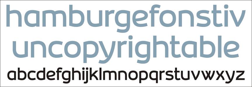
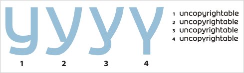
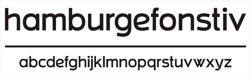
While designing my own logo I designed only the letters I needed. But looking at those I convinced myself to complete the whole lc set.
What do you think?
Does it look too similar to any existing font?
Does it have any future?
Do you think I should finish it?
| Attachment | Size |
|---|---|
| Inovares Font 2.pdf | 27.13 KB |
| Inovares Font 3.pdf | 17.96 KB |
| Inovares Font 4.pdf | 34.99 KB |
| Inovares Font 5.pdf | 35.97 KB |
| Inovares Font 6.pdf | 35.15 KB |
| Inovares Font 7.pdf | 35.54 KB |