Typophile

Rutaban

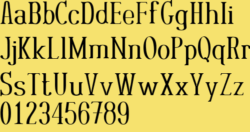
Here is a little something that I made years ago and released for free. It's based on another more grid-oriented font I made earlier called Rutager.
Anyway, it's riddled with flaws, yet it still has a certain charm to it that I feel like revising it in to something usable, possibly marketable. What do you think?

Font files are available at:
http://www.1001fonts.com/font_details.html?font_id=2204

It's color is interesting but my gut is that a new sketch would be a better place to start even if you were going to channel this feeling again. From my experience ( limited indeed ) and what I have been told it's often faster & better to make a face well straight off than to fix 10,000 errors. Look at all the weight problems for instance. This is putting it a bit too simply perhaps. And it also depends on where you think you were then & where you feel you are now. There is also the question of purpose. What purpose whould you be designing towards with this?

Captured from commoncrawl.org on 27 Apr 2015. original URL