
Sorry to delete this but I must really say that all written by me was really shxx.
My apologies to all of you.
Sorry to delete this but I must really say that all written by me was really shxx.
My apologies to all of you.

So HermesSoft are the only ones producing fonts in Bulgaria? That's rough... So what kind of Cyrillic types were produced in Bulgaria or used by Bulgarians historically, before digital fonts? How would those types be judged by today's Bulgarians?
In your opinion, what constitutes good Cyrillic design on the Bulgarian model? Are there any good, thoughtful examples being produced--lettering, custom logos, calligraphy, etc.--that might point the way? Or any historical high marks--models from the past that epitomize good Bulgarian Cyrillic design--that could be a good springboard for a present renewal?
Is there one model or a diverse range of models to follow for Bulgarian Cyrillic? Sorry to barrage you with questions, but I'm eager to learn about Bulgarian typographic traditions and the current scene.
< deleted >

I'm Bulgarian, and I just got back two days ago and I tried desperately to find a font pack on disc, but to no avail. Our actual calligraphic and hand drawn letters are gorgeous. The text on icons is gorgeous and inspiring and all of the text I see from store awning to awning I just can't imagine where they came from. I feel pathetic that I, as a Bulgarian own only 3 true cyrillic faces.

I personally have a very large interest in Latinization - in taming it that is!
From reading what you've writted I can't figure out your own stance on it.
Also, there's a Russification issue in the Bulgarian case as well, no? That's
an obscure area needing much more elaboration.
BTW, you might enjoy this:
Arabicized Cyrillic!
hhp
.
.
.
What happened to "many have forgotten and denied
the cultural roots/styles/arts/crafts (negative)"?
Does perhaps your dislike of the Russian influence
(partly) motivate your embracing of Latinization?
Personally I think Latinization is generally terrible.
For a full explanation as to why, please read my article
entitled "Latinization: Prevention and Cure", which has
been published in two jounals: Spatium #4 (Austria) and
Hyphen 2005 (Greece).
Here's a "preview":
http://www.themicrofoundry.com/ss_rome1.html
> for us there is no difference between latinised and standard Cyrillic.
I don't think you can pretend to speak for everybody.
Plus I don't understand how you can like Latinization
if there's no difference.
> so get to work
Oh, I've been working to tame Latinization for 7 years now.
I make fonts that way, and write articles & give talks about it.
> it’s no problem how actually glyphs look
Funny hearing that from a graphic designer.
Everything matters. And to us, especially glyphs.
hhp
<>
< removed >
> there is no russian influence
That's not believable.
> why don’t u tame ...
There are only so many hours in the day!
Plus I'm Armenian.
But I think during my next talk (in October at UCLA) I will indeed
mention in passing that some Bulgarians turn to Latinization as a
reaction against Russification. Politics is everywhere!
hhp

With OpenType, this is not so much an issue for the type designer, more for the type user.
That's because it's possible to put "country-specific" variants of the Cyrillic alphabet in the same font. What's specified as the default for a specific language may be an issue, however.
I've been developing some new typefaces (to be released this Fall/Autumn) in Cyrillic and Greek, and following a seminar given by Maxim Zhukov, I became aware of the Bulgarian issue. So I've included a Bulgarian "language specific" option to the standard Cyrillic letterforms in the fonts. Serbian too.
So while the basic Cyrillic typeface (below) is a fairly authentic 19th century revival (close to a type published by Adolf Darre in Harkov in 1888) the Bulgarian alternates are "historical fiction" based on a study of fonts published by HermesSoft. Given the logic of typographic style, and its relative portability across cultural (well, Latin-Greek-Cyrillic anyway) and temporal boundaries, that seems reasonable.
Here is the upright style of the serifed face, which shows the most distinction between standard and Bulgarian Cyrillic forms:

To clarify how this works: when the language used in the layout application is specified as Bulgarian ("BGR"), the Bulgarian alternates are substituted.
> this is not so much an issue for the type designer
Well, the type designer still has to make the "sensitive" fonts! :-/
As you're doing - which is commendable.
Also, software currently still ignores the language tags, no?
hhp
commendable.
Thanks Hrant, your advocacy is not without effect, and the Typophile forums really help sort out this kind of thing.
software currently still ignores the language tags, no?
I don't know too much about that, but it did come up on a thread in the Build forum, and Miguel indicated that it wasn't an issue. What's your experience of this, Vassil -- does the software used in Bulgaria support language tags in OpenType fonts?
I'm anticipating that some of the market for this typeface will be trans-national corporations producing multi-lingual material for the EU, and their suppliers should have the Adobe CS software which supports this kind of OpenType font sophistication.
Or should I (also) produce dedicated Bulgarian-only TrueType fonts?
> it wasn’t an issue.
I'm confused - what's not an issue?
> should I (also) produce dedicated Bulgarian-only TrueType fonts?
That seems wise even if the language tag is supported, because otherwise you're
assuming too much expertise both on the part of software at large as well as the
typical user. And I'd put a "Bulgarian" suffix within the name of the font.
hhp
Actually, it was Thomas who clarified the situation:
http://typophile.com/node/33087
It looks like you need CS3 to have it work properly.
I don't know whether I would go to the trouble of producing Bulgarian-specific, non-OT fonts. That's a production, marketing and distribution hassle as much as a font generation difficulty. It would certainly be quite unproductive to make Small Cap and Old-style figures fonts.
It would probably be easier to make Bulgarian-first OT fonts, TrueType flavour -- they would work on any application that supported TrueType, with the benefit of accessing typographic OT features in earlier versions of Adobe software.

Nick, I'm curious as to why you include some "Bulgarian" forms for letters that are not a part of the Bulgarian language. Do you view these as purely stylistic alternates?
Sort of.
The general idea is to make the lower case less "capital-ish" than standard Cyrillic.
That applies at the alphabetic level to glyphs that acquire ascenders in the Bulgarian version, but also to the treatment of details.
So the first changes shown here are alphabetic, but the second are typographic.
They don't effect sans fonts so much, or italic.
BTW, this principle (as I deduced it) comes from fonts such as HermesSoft "Brilliant" (their Bodoni) -- although I have applied it in a conceptual manner (eg the flag on the "be"), as well as literal copying of their forms (the "en").
Sorry, I misunderstood.
You're referring to the "softened" letters?
Again, I took my cue from HermesSoft.

Nick, thanks for showing us what you're doing with Cyrillic and Bulgarian alternates. Very helpful.
George
I felt bad because I had no shoes, until I met a man who had no Bodoni
Nick, I think Paul is referring to the Macedonian letters Gje (ѓ) and Kja (ќ), the Serbian/Macedonian letters Lje (љ), Nje (њ), and Dzhe (џ), and the Belarusian W (ў), none of which are used in Bulgarian.
I think what you did makes sense in that it provides options in the form of stylistic alternates, and it's fun to reimagine other Cyrillic letters to follow the Bulgarian model. It won't be terribly authentic, though, at least for the Serbian letters. Now I'm curious--what's authentic for Macedonian--Serbian style, Bulgarian style, a mixture of both, or something else entirely?
So regretfully most of your questions are getting too profi for me but some I think I can answer…
Nick Shinn
You are doing marvelous job…Most glyphs given as bulgarian alternates are in deed widely used with some remarks (as pointed by Jongseong). Additional notes may be pointed: all letterforms cyrillic an “typical bulgarian” are used in hand writing, note the serbian small caps b which is also used as small caps d in hand writing. Note that the k and dj are still questionable, dough beautiful, because of latinisation issue…
The open type question is little too hard for me – all the standart software, which we are using, is supporting it, but software produced in bulgaria doesn’t. But it could be implemented with proper support in the coming years, because the majority of pro oriented applications (bank software , accounting software, medicine and etc…) is still developed for DOS environments (yeah) and in the coming years they probably will shift platforms.
hrant
Really nice article, I’ll think about it in days to come….
By the way, I've seen something close to the Bulgarian Cyrillic forms used to set Ukrainian. I'm trying to remember where from and when, but I think it was 19th C or early 20th C. So that's at least one example of Bulgarian-style forms used outside of Bulgaria.
Look at the article i have started about Milka Pejkova. See specimen attached it may be helpful or clear some questions too.
the Macedonian letters Gje (ѓ) and Kja (ќ), the Serbian/Macedonian letters Lje (љ), Nje (њ), and Dzhe (џ), and the Belarusian W (ў), none of which are used in Bulgarian.
They are not, in practical terms, redundant -- one context for the use of "loan characters" in a font being educational. If you are typesetting a Bulgarian language primer on foreign languages such as Serbian or Macedonian, you will need all of their alphabet, and the characters should be available in the same style as the main font.
And in literary works, if the text is in Bulgarian, but quoting a Serbian author in his/her original language, the foreign characters are necessary.
And surely Brian, in those contexts, the use of Bulgarian style--typographic as well as alphabetic-- is authentic.
For Russian, Serbian, etc. typesetting, people wouldn't be getting any of the Bulgarian alternates.
all the standart software, which we are using, is supporting it, but software produced in bulgaria doesn’t.
It's no different in Western Europe and North America.
The support of OpenType features is limited to professional software (CS, XPress), and somewhat in Word.
Note Thomas' comment in the Build thread linked to above, that it's only with CS3 that InDesign supports the "bgr" language tag, to support alternate language-specific glyphs.
I would also expect Word to support the Bulgarian language tag in OpenType fonts.
Nick, I completely agree with the need for the Bulgarian-style non-Bulgarian letters. I just meant they were probably not authentic in the sense that they were not likely to have been in actual use. Inauthenticity should not be an obstacle to updating typographical practices; otherwise, typefaces based on the letters on Trajan's column wouldn't have J or U, Greek typefaces in the lapidary style wouldn't have lowercase letters, and so forth.
I'm curious about your Bulgarian-style Dzhe (џ) design, though. Shouldn't it resemble the Bulgarian I (и) with a stroke?
On the whole, your Cyrillic letters look really good, and I'll be looking forward to the release. Nice to see it's based on a type produced in Kharkiv (then Kharkov), whose typographic tradition I would like to learn more about.
Any chance I can persuade you to add Old Bulgarian letters to your font?
Brian, you're right that the Bulgarianized Serbian letters are not authentic to the native language; I was wrongly interpreting "authentic" to mean true to the typographic style of the (Bulgarian part of) the font, not to the alphabetic shapes.
Bulgarian-style Dzhe (џ) design, though. Shouldn’t it resemble the Bulgarian I (и) with a stroke?
I haven't a clue, not being a linguist. I copied that interpretation from a HermesSoft font that I bought. Could you explain?
Nice to see it’s based on a type produced in Kharkiv (then Kharkov), whose typographic tradition I would like to learn more about.
The Darre style I'm reviving is taken from a specimen book in the New York Public Library; Maxim Zhukov arranged a viewing for those attending his TDC Cyrillic seminar earlier this year.

Photos: Adam Twardoch
Any chance I can persuade you to add Old Bulgarian letters to your font?
Possibly.
I added four historic Russian letters, (Maxim's suggestion, re. 1918 reform).
Yat used quite a bit in the specimen above.
How many?

Strangely, I didn't find this link at typophile:
www.tipometar.org or in english www.tipometar.org/tm/IndexEng.html
It's a serbian typographic community site with special accent on cirilica (serbian cyrillic).
Enjoy.
A million thanks for the beautiful examples, Nick! I remember being delighted to see wonderful books from the period in a number of exhibits in Ukraine, including the Taras Shevchenko Museum in Kiev. I don't speak Russian or Ukrainian, so it must have confused my Ukrainian friend why I was looking into them as if I were reading them, just admiring the forms of the letters...
Returning to topic...
By 'Old Bulgarian' letters, I meant Yat (ѣ) and Yus (ѫ), which were used in the pre-1945 orthography. You already have Yat, of course, so it turns out I was just thinking of Yus... I vaguely thought there might be more letters I was forgetting about, but I guess not. So just one more letter and you've got older Bulgarian texts covered. you can do it, Nick!
p.s. I just found out that the pre-1945 Bulgarian orthography is due to one Marin Drinov, who studied and taught at Kharkiv University. He was living in Kharkiv around the time Adolf Darre was producing his types, and he died in Kharkiv as well. Just shows how important Kharkiv was as a cultural centre in that period.
Could you explain?
I'll try to. The "Bulgarian" forms are basically script forms of the letters which have been back slanted to fit within the upright paradigm. as such, the и й ц џ are all related and based on the 'u' shape that you used for all of these letters excepting the џ.
Brian, by old Bulgarian, do you mean Old Cyrillic?
Brian, by old Bulgarian, do you mean Old Cyrillic?
'Old Bulgarian' was a poor choice of words... I just meant the letters Yat (ѣ) and Yus (ѫ) that were used as recently as 1945.
I don't want Nick to go through all the trouble of resurrecting all the earliest historical Cyrillic letters and their variants described in the article you linked to, most of which were archaic by the time the Adolf Darre specimen was produced.
Regarding the 'Bulgarian' џ... Yes, I also understood the 'Bulgarian' forms as an upright script form, and so expected something based on the 'u' shape. I couldn't have explained it better myself.
Thanks for the insight, Paul.
How's this?
Brian, I note that Milka Pejkova included Yus and yus in her seminal design (see Vassil's Typowiki link above).
But just so that I know what I'm getting myself in for here, I should probably produce two variants: the standard Cyrillic form (with the more curled "K" leg), plus the Bulgarian variant with straighter leg, in upper and lower case. What about the "iotified" version -- that would be very cool as it looks like a stick-figure animal, but is it necessary for the pre 1945 Bulgarian texts you're alluding to?
the italic is just about there, i might move the tail to the left a bit so it appears to come from the bottom curved portion of the u, but if you like it as it is, this is fine too. i don't like the roman as much. i think here the tail doesn't have to match the other tails and can be a wedge shape with the narrow portion at the top, again connected to the round portion of the u. something like this, notably the Palatino italic and the Swift roman.
Paul, I think you're right on the italic, it is OK to make the disconnected tail on the џ lower than the other tails. I've seen historical precedent in similar types, and it does disambiguate the characters a bit better than how I originally drew it.

However, I think I'll stick with my upright version. Mainly because HermesSoft has established the "Bulgarianized small cap" interpretation of this character in their fonts, so it's probably a good idea to not stray too far from it.
nick, you're already pushing the envelope, just push it a bit further... :P
What about the “iotified” version — that would be very cool as it looks like a stick-figure animal, but is it necessary for the pre 1945 Bulgarian texts you’re alluding to?
Not as far as I know. Though I agree it looks like an animal shape composed of matchsticks, and would be fun to design just because.
New question for Bulgarians (and other native Cyrillic users): I came across this page with PDF files of the Bible in Church Slavonic. Does the style of Cyrillic used there have specific connotations as being appropriate only for religious literature or recreations of mediaeval texts? Or does it have broader appeal?
I'm thinking of a possible parallel example in Korean typography. The older Hangul (Korean alphabet) Bibles--the ones where the text is set vertically, not horizontally as Korean is written now--were set in a typeface designed by Seo Sangryun and Baek Hongjun in the late 19th Century and first used for printing in 1882. Because of the drab uniformity of Hangul book typefaces in contemporary use, the unique type style of old Korean Bibles is all the more distinctive.
In 1998, the Sandoll foundry produced a digital revival of this typeface under the direction of Lee Kyungbae, calling it Seonggyeongche (literally, 'Bible face'). Since then, I've seen it pop up on book covers, advertisements, and signs in uses that have nothing to do with the Bible. Although it was jarring at first, I've become accustomed to the type style being used in wider applications. Although the uses I've seen were all for display purposes, I even think a cleaned-up version would be good for contemporary book typography (as the Sandoll version is deliberately rough in imitation of the antique printing press outputs).
With the type style used for Church Slavonic typography, you similarly have a slice of older typographic history preserved through the conservative medium of religious literature. Is there a similar situation in Bulgaria and elsewhere where that type style is used for display purposes outside of the church context? To what extent could the style serve as an inspiration for contemporary developments in Cyrillic typography?
In his article on civil type in Language Culture Type, From Vladamir Yefimov states that "at the end of the 17th century, poluustav was the only style of Cyrillic printing type," and that after the alphabet reform by Tsar Peter I, "the old poluustav type was preserved only for religious literature." (pp. 128-129)
I'm guessing that this means that the style you're referring to could either have church connotations or overtones of antiquity (not necessarily religious). I have several illustrated books of skazki (folktales), which use this style of lettering in illustrations, and there is definitely no religious connection there.

> Is there a similar situation in Bulgaria and elsewhere where that type style is used for display purposes outside of the church context?
Rumania — early literary history used the OCS + Cyrillic. Around 1860 the Cyrillic was replaced by Latinica in non-religious writing, and around 1890 in the Church.
> To what extent could the style serve as an inspiration for contemporary developments in Cyrillic typography?
Bulgaria: Proto-Slavonic, pre-1945, post -1945; read: Мирчев К—Историческа граматика на Българския еэик
Does Историческа граматика на българския език cover typography and lettering styles? The google hits come up mostly for grammar and philology references, as you'd expect from the title...
More linguistic stuff
OK, so what does Italic yus look like?
Brian, I've added the Yus to my never-ending font development project -- but the lower case italic versions are place-holders really, as I don't believe that the true form is so stiff, like the roman/caps. For a "scripty" typeface like the Scotch Modern, a script-concept lower case yus is called for. So I'm passing the ball to you--please post a suitable model/precedent for such a character.
Here is a comparison of the standard Cyrillic lower case characters, with the italic forms that diverge most (in this typeface) in form:

On the last weekend Todor Vardjiev was giving a very good presentation at the Typotage Leipzig about the Bulgarian Cyrilliza.
Latin vs Russian vs Bulgarian letter shapes
more photos:
http://www.astype.de/misc/typotage07.htm -
http://www.flickr.com/photos/ralf_herrmann/tags/typotage/
--astype.de--
Hmm. I see that Mr Vardjiev's example shows "ze" with descender -- is this the latest Bulgarian trend? And will they not be satisfied until every lower case letter has either an ascender, descender, or both? :-)
***
Brian, if you're still reading this thread --any luck with the italic lower case little yus reference?
Cyrillic can definitely use many more extenders. Heck, even Latin
doesn't have enough. But of course it's possible to go too far the other way.
hhp
i wish i could see what's behind that Mac screen.
i think most of the Bulgarian preferred forms are not that radical, but i despise that 'ю' with an ascender. Perhaps I've said this before, but the "Bulgarian" forms are simply script forms adapted to type, and for the most part they are not that uniquely "Bulgarian." See Semibold Grotesk", for reference.
i've posted some photos of Cyrillic grotesks that follow this model on flickr, I'll try to upload a few more.
they are not that uniquely “Bulgarian.”
No, but that's the country that is implementing the alternative as a reform, so it's as good a name as any for the phenomenon.
Paul, use the 2nd link to Ralfs flickr account and you will see the screen from an other direction. Todor Vardjiev showed a lot of high quality type designs from his colleges and students, all in cyrilliza, latin and some times greek to. This style is not new, If I remeber it right, its teached since the late 60th at National Academy of Arts at Sofia. CYRILLIZA is not a special form of Cyrillic, as he mentioned it - its an own alphabet and now the third official alphabet of the the European union. Watch, he is wearing a blue t-shird wich yellow Cyrilliza letters. :-)
But no foundry is developing it! Only Hermes Soft, but he has no good experiences with this foundry. So most documents use Cyrillic letters, but for a Bulgarian patriot this is dishonoring.
http://www.flickr.com/photos/ralf_herrmann/561269913/ -
http://www.flickr.com/photos/ralf_herrmann/561272437/ -
http://www.flickr.com/photos/ralf_herrmann/560849498/ -
One of his master students was Ilia Gruev. So far he have done some really good text typefaces: Graphit, Scribo and Memo. But to the western (internet) world, unkown.
http://www.moire.info/en_shrift_i_1.html
He showed also typefaces from Ivan Kjossev† (Bibliophonika), Olga† and Vassil Jontschev† (Viol), Milka Peikova, Stefan Gruev† (Wawel), Vassil Stefanov and Razvigor Kolev.
BTW: Its not possible for me to add new type designers to the wiki. (Indices : Type Designers) It will no be saved. A bug or a feature?
--astype.de--
Cyrilliza
So this is the correct name for this branch of the Cyrillic alphabet?
Will people know what I'm talking about if I refer to my fonts as "supporting the Cyrilliza alphabet" -- or would it also be good to add "(Bulgarian)"?
And should I make the Cyrilliza alternates available as a "Stylistic Set" as well as with the Bulgarian language tag?
But no foundry is developing it!
I have, and will be releasing a suite of serif (see above) and sans fonts with it this Autumn.
Nick, the brave. :-) Hm, I'm not sure if Cyrilliza should be the official English name for it. Its sounds quite nice. At this point, we need some typophile Bulgarians! This is the homepage of the National Academy of Arts: http://www.nha-bg.org. Maybe, Nick you should ask someone form the book & printed graphics department.
I would make a stylistic set and would use the local feature too.
--astype.de--
CYRILLIZA is not a special form of Cyrillic, as he mentioned it - its an own alphabet and now the third official alphabet of the the European union.
This is very confusing. I should like to see the official EU documentation on this. cyrilliza is just a different way of transliterating кириллица (pronounced kiɾiliʦə), which in English we translate as Cyrillic.
Paul, you see the cultural source of your information? This is the one source of the "problem"? Even EU government institutions use the "common" fonts - Arial & Co. :-) So you can image how Mr. Vadjiev and his colleges feel if they see such typefaces each day. :-)
I think this can and should be best judged by Bulgarian type designers.
--astype.de--
There, is that better?

Nick, in many Slavic languages, including Russian, Кириллица (reads ‘Kirillitsa’) stands for 'Cyrillic alphabet'. Likewise, Глаголица (‘Glagolitsa’) means 'Glagolitic', and Латиница (‘Latinitsa’) ― ‘Latin’ [alphabet, or script].
Among non-Bulgarian designers the subject of this discussion is sometimes referred to, for lack of a better term, as Болгарица (‘Bolgaritsa’). However, by no means should it be mistaken for an official definition: it's a type designers' slang. There are a few nicknames of this kind, like Armyanitsa, Gruzinitsa, Evreitsa, Arabitsa, &c.
Sure enough, this is not a branch of the Cyrillic alphabet. It is a special pattern, an inflection of the l.c. glyph construction. The alphabet, or more correctly, the script, is still the same, Cyrillic. The character set is Bulgarian, of course.
It is. I stand corrected. The spelling of the word word 'Cyrillic' varies among most Slavic languages using that script:
Brian, if you're still reading this thread --any luck with the italic lower case little yus reference?
I'm sorry I've kept you waiting. I went scouring all over the Internet for samples of early modern Bulgarian printed works that include italics—how I miss having access to a large university library!—and after some frustrating 'almost' finds, Google Books bailed me out:
A grammar of the Bulgarian language with exercises and English and Bulgarian vocabularies (1859) includes a table of the letters that include italic forms. Perhaps because it reflects a chaotic situation in terms of orthography at the time, it also includes a variety of iotified forms including the iotified yus. It includes some interesting information, such as that the fact that most of the books then in use were printed in Russia, where some of the letters not available were substituted, including yus with 'y' (p. 10).
The italic yus, as far as I can tell from the low-resolution scan, simply looks like a slanted yus.
That's all I could find so far, and I hope the Bulgarians here can provide more help on the italic forms of obsolete letters.
Thanks Brian.
I love the exercise phrases in that 1859 book.
I'll post images of some yus's soon.
I love the exercise phrases in that 1859 book.
Charming, aren't they?
What kind of needles has he brought from Hamburg? (p. 62)
When we were rich we also wore fine clothes. (p. 89)
From whom do you come? I come from the shoemakers. (p. 98)
Where are you going in this rain, in this bad weather, in this cold, in this dust? (p. 98)
When I saw that you were doing a 19th-century revival, I thought it would be nice to have the additional Bulgarian letters appropriate for the period. After looking at the low-resolution samples online of Bulgarian printed texts from the period, I'm only more convinced that those letters would be excellent additions to your project.
The typographic component of the Bulgarian revival seems to have owed a lot to the Cyrillic types produced in the Russian Empire, and the Adolf Darre typeface you chose is as good a representative as any. I confess I'm not really a fan of moderns for Latin type, but for Cyrillic this period style seems to work perfectly, with the vertical stress and prominent bulbs. I'm sure a quality digital revival will serve as a welcome source of inspiration for today's cyrillic type designers.
it would be nice to have the additional Bulgarian letters appropriate for the period.
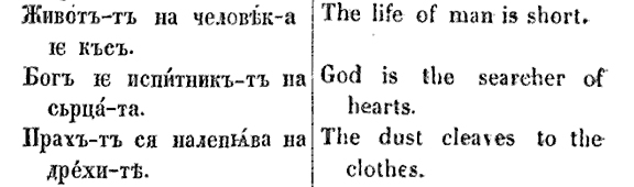
In this little section, there are a couple of iotified forms, so those, and possibly others, would have to be added too.
The accents could be done by the typographer.
But who would use such a font?
For comparison, it would be like setting Shakespeare in English with long s's -- sure, it would be nice, and very authentic, but consider how little demand there would be for that -- despite the huge readership of Shakespeare -- and compare that with the number of readers of old Bulgarian!
One would be better employed, as Adobe has recently done, extending Cyrillic support to cover further tens of millions of present-day readers/writers -- and is still criticized (on the Phinney blog) for its discretionary cut off-line that leaves out several languages.

And here is an iotified little yus.
So for 1859 Bulgarian I need to add:
little yus
iotified little yus
iotified a
iotifed e
Any more?
Considering that each weight has roman and italic, caps, small caps, and lower case, that's six different glyphs for each character, and at the moment I have a family of "only" three weights/styles, so that's 72 extra glyphs required to implement the feature...

So, I just got back from a trip to Vladimir (180km outside of Moscow), and I was amazed at how many shop signs there use "Bulgarian" glyphs (k and zhe with ascenders, "italic" d, t, etc. in upright use, etc.). I can post a picture or two if people want.
Nick, I've got you one, although cursive, not italic. However, it's not a little yus, but a big one that was part of the Bulgarian alphabet until 1945. I believe, its iotated cousin was also used in Bulgaria, until 1910s. There were attempts of using the iotated e in Bulgarian writing in mid-19th century (those are highlighted in red in the picture I refer to). Also, there are some claims to the occasional use of the iotated a in the second half of 19th century. You're sure you want to go there?

Nick,
regarding this image:
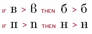
A.
Thanks for your concern Adam, but my face is a revival, and that "b" is the way it was made in this genre of typeface in the late 19th century.
Here are examples from four different books (one of which is a type specimen) of that era.
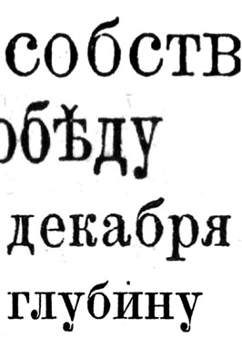
I was tempted to give my face a plumb-line, vertically-stemmed "y" tail, but decided that consistency with the latin over-rode that, and not all Cyrillic y's of that era had vertical tails, although from a design point it makes sense, avoiding bumping into the teeth (descenders) of preceding characters such as "de".
You're sure you want to go there?
Well, I let you talk me into making Fita, Yat, and Izhitsa :-)
Actually, I have decided against backwards compatability with 19th century Bulgarian.
It's one thing to do a type revival, but language revival is a horse of a different colour.
Thanks for the sample, though.
But seriously, let's talk about the yat. Pushkin, the great early-19th century author, used it, so the theory goes that it would be good to set his work that way (and a Scotch Modern would be the authentic type style) -- but what is the demand or inclination for that kind of thing? Wouldn't one employ one's time better making, for instance, schwa --to support present day Khazak users, etc?

Dear Nick,
I think that yat was a linguistic ballast in Pushkin's times. But...
He probably used it as tool of poetry; for various technical, or aesthetic, romantic reasons.
Including yat in the font could be a great hommage to his poetry. I suppose the poems ("modernised", written with e instead of Ѣ), loose the melody and probably some rhymes.

It is true that Church Slavonic is sometimes called Old Bulgarian, and that Russia and Bulgaria have had their own independent historical development of the Cyrillic letterforms.
But to go from there to criticizing Russian influence on Bulgarian type design as somehow inauthentic seems to be lacking something. Do people complain when Optima is used to set English texts as well as German ones, or when Bodoni is used to set French texts as well as Italian ones? No; it is recognized that from Poland to Spain, people are all using the same Latin alphabet, even if with slightly different sets of accented letters, and so of course they have the same pool of typefaces to choose from - even if different letter frequencies might make some typefaces more aesthetic in conjunction with some languages.
Bulgaria, Serbia, the Ukraine, Belarus, and so on share the Cyrillic alphabet with Russia. Here, some of the languages actually have additional letters, so the diversity is somewhat greater. But it is still not a question of trying to shoehorn one alphabet into the typefaces made for another - i.e., to take an Armenian typeface, and try to use those exact forms and styling for Amharic or Gujarati or Greek or Cyrillic or Latin.
Dear Marcin,
I am not sure what you mean by ‘linguistic ballast’. In early 19th-century Russia using yat’—and also the decimal i, the fita, the izhitsa, the terminal yer, all abolished in 1918—was not an option. For sure, Pushkin did not use the yat’ ‘as a tool of poetry’; b.t.w., he also used it in his prose, his essays, his correspondence, his notes, his diaries, etc. He simply followed the standard spelling rules used in his times.
F.y.i., the pre-1918 spelling is still used—in Russia and world-wide—in clerical literature, scholarly print, even general publishing. This is why the letters whose use was officially discontinued in 1918 are often included in the digital Cyrillic fonts.
I introduced confusion. I know, that Lomonosov stated that the difference between sounds of Ѣ and e was barely unrecognisable. For me it looked like the evolving language started to throw the ballast away. But the rest of my post was overinterpretation. Old spelling rules were ubiquitous at the time (and they come back as we've seen), so yat' should be included in good Cyrillic font.
Let me quote this photo as my self-ironic dedication to you, Mr. Maxim. Thank you.
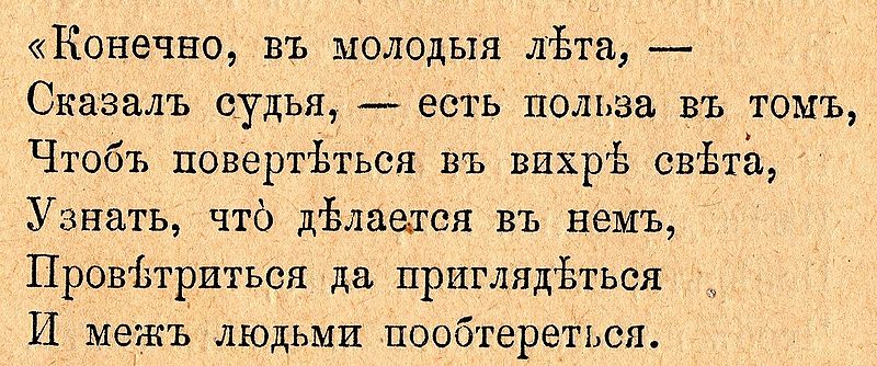
the pre-1918 spelling is still used—in Russia and world-wide—in clerical literature, scholarly print, even general publishing.
Yes, it is considered spelling, according to the Unicode distinction between character and glyph.
By the same token, the long s (used by all English authors prior to 1800) should be considered different spelling.
It was not abolished by government decree, but fell from usage.
I'm pretty sure, however, that nobody really considers the long s to be a different spelling, any more than changing from two-bowl "g" to single bowl.
To use yat', you need to hear it or know spelling rules. Without learning them, I, as a Pole, could only guess where to put it into Russian text, observing flexion of my language.

Nick – at the risk of pointing out the obvious (and offtopic too), the long s is not just a stylistic variant of the "s"; its use does (did) follow spelling rules. The comparison to one-story or two-story "g" does not make much sense to me, as those are purely variations in style, without roots in orthography.
What’s wrong with knowing spelling rules? Of your own, or a foreign language? Yes, in almost all languages there are many spelling conventions one could declare ‘a linguistic ballast‘… Say, why shouldn’t one spell physics as fiziks? That could work much better, right?
Marcin, it looks like you know Russian. If you do, check that excellent essay on yer (the hard sign) written by Professor Albert Baiburin. It is very well written. I loved his quoting Leon Trotsky’s passionate rejection of yat’:
Ah! ça ira, ça ira, ça ira. Tous les signes durs on les pendra!
Maxim, I prefer 'fizix'.

Tous les signes durs on les pendra!
I thought it was only those in final position.
In actuality those revolutionary sailors came and trashed all yers—both upper and lower case, from all compositors’ cases, and all matrices from all single-letter- and line-casting machines, from all composing rooms—nation-wide. When they recovered themselves it was too late: all yers were gone, and even if some have been left, no one would have dared using them. So they started using single or double apostrophe for the separating hard sign (e.g., под’ем instead of подъем); that felt both space-saving and politically correct. Here is a fragment of an old memorial plaque I photographed in downtown Moscow two years ago:
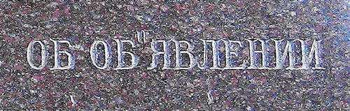
The long s certainly did follow regular rules for its appearance. Essentially, the long s was used everywhere, with two exceptions: short s was used at the end of a word, and if s occurred twice in a row, the second one was a short s.
However, since both the long and short s were forms of the letter S, and because the long/short s rules were regular, use of long and short s would be thought of, I would suspect, as part of "how you wrote" a word, not "how you spelled" a word, since how you spell a word is the sequence of letters of which it is composed. Thus, "princess" is spelled P - R - I - N - C - E - S - S even if when you write it in lowercase it looks like princefs.
You can write a substitution table for English that gives on the output the long s in the right places if the input file contains everywhere the letter "s" instead of 017F LATIN SMALL LETTER LONG S. Could you produce a unicode font good for Russian that would put the yat in the right positions if the input contains everywhere the letter "е" instead of 0463 CYRILLIC SMALL LETTER YAT?
Sorry* – I realize now I should've said I was thinking of German. AFAIK you can't do correct s -> longs substitution automatically in German; except maybe with a huge dictionary.
(* For any confusion; and also for sidetracking the thread.)
And I meant "opentype", not "unicode".
...and I would never write that knowing spelling rules. I just wanted to say, that the appearance of yat' is based on much more complicated rules than those of the long s.
OFFTOPIC: excellent essay. I don't remember when I read something so joyful and pleasant in Internet!
Not necessarily. Even in Fraktur typography where the use of the long ſ is not a stylistic option, not every s in the beginning and the middle of the word should be made tall, and not every second s short. On the other hand, historically, the ſſ combination was not entirely out of question:
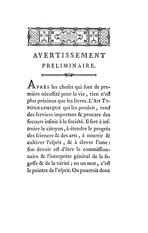
Please note those néceſſité, commiſſionnaire, ſageſſe. The ſſ ligature is part of the glyph sets of some popular digital fonts (shown here are Arno, Garamond Premier, and Adobe Caslon):
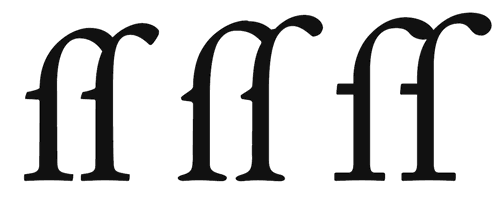
Cyrillic types from Bulgaria are more than calligraphy. It's art. I came across it while at the phoenix web design about a year ago.

All this just for spelling issue?
Hm... whatever anyone said, I'd always call it Ћирилица like we were taught and generations before us.
For English version of this word... I really don't care so much cause probably big % of English spoken population couldn't said Ћирилица on proper way like we said in Serbia... so if you ask me, I think no one should be offended by this.

You can’t write a substitution table, because some cases where ‘е’ is to be substituted by ‘ѣ’ results in multiple options, the choice amongst which is non-trivial and requires grammatical analysis of the sentence. The same can be said for other letters which appear in classical texts: ‘і’, ‘ѵ’, ‘ѳ’. Not only that, but the reforms of 1918 changed Russian grammar rules as well as spelling rules.
That said, I've created an online services that inserts ‘ѣ’ and other letters, including Bulgarian ‘ѫ’, where they should be in Russian and Bulgarian texts using a combination of algorithmic substitutions and dictionary lookups. Where multiple options are available for one modern word, all choices are presented.
You can access the Bulgarian interface at: бъл.славеница.com
Select Бъгларски - нови правопис and convert to Български - иванчевски правопис.
ръкописна книга → рѫкописна книга
For Russian, рус.славеница.com
Select Русский - новое правописание and convert to Русскій - петровское правописание.
Just tried the „блѣдно-сѣрый бѣдный бѣсъ убѣжалъ, бѣдняга, въ лѣсъ“. Works fine. Thank you very much, Danslav.
Yat' apears mostly where Polish uses ia: biały → бѣлый.
For Czech speakers, yat' appears where ě appears, and sometimes í: dílo, dělo → дѣло, v Prazě → в Прагѣ.
Captured from web.archive.org on 12 Sep 2019. view this capture

