Hi!!
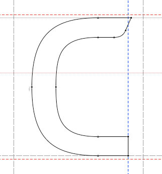
I'd like to share with you guys the concept of a new font I'm working on... it's the beginning, but it's right now that most of the decisions should be made.
I expect to design a legible headline font, that could be used also on about 12pts in small passages of text.
It's supposed to have a mechanical, industrial and geometric look...
I specially would like your opinions on two issues:
- the "a" design... there are three (the first one seems the best to me).
- Note that b p d q aren't just mirrored images of one and other. I believe I've got it right, based on the clockwise movement when drawing the letter... even this font concept not having anything to do with calligraphic origins, it looks nice (at least to me).
Let me know what you think...
many regards from sunny Brazil!
Fabio
| Attachment | Size |
|---|---|
| IronThree_030607.pdf | 49.07 KB |