
This doesn't seem to have come up before: Kai Bernau's project, now completed and on sale, to create the least remarkable sans possible. It's at http://letterlabor.de/typeface.php.
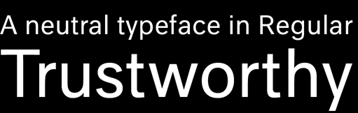
This doesn't seem to have come up before: Kai Bernau's project, now completed and on sale, to create the least remarkable sans possible. It's at http://letterlabor.de/typeface.php.

I highly recommend Kai's book on the making of Neutral. Excerpts will be published in the next issue of the SOTA publication Interrobang which will be available at TypeCon in Seattle.

It looks like a well constructed font, based on a well constructed philosophy. Given that his intended audience includes primarily the conceptual artist (from Kai's book), the idealogical underpinnings are sure to appeal. That said, I don't think it really adds anything new to the typographic landscape. Hats off to him though, I'll wager he learned a bundle in the process (ed. I did from reading the book excerpt, thanks for that). Congratulations on it's release. -- R

hi guys
you can of course find Neutral on www.bpfoundry.com, the new swiss type foundry, you can also order the book... and for the first time you have free trial version, don t wait to download it and try it... in a few month light versions and italic... and in 10 days the first public version of Romain du Roi, called Romain BP...
B&P typefoundry

This has come up here before, but I can't find the thread.
I bought a copy of the book at the time.
Captured from web.archive.org on 7 Mar 2015. view this capture