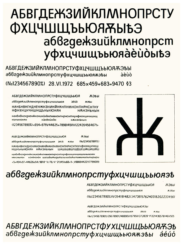
A first application of the "Papazian" Zhe, conceived
(structurally) on an Aeroflot flight in late 2004.
Fire at will - brutal honesty preferred.
hhp
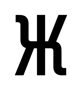
A first application of the "Papazian" Zhe, conceived
(structurally) on an Aeroflot flight in late 2004.
Fire at will - brutal honesty preferred.
hhp

how many cocktails did you have before you drew that? :^P

Wouldn’t mind seeing the rest of the glyphs to put the odd asymmetry in context. You’d know better than I would… does it need to symmetrical?
I assume you mean lateral symmetry, since as you might know Cyrillic tends to have a mix of straights and curls (which I adore) although in Industria-like fonts such as this things tend to be tamed. But if so, what other characters can I really compare to in this way?
Paul, in fact this is designed to help readers with drinking problems,
who I suspect outnumber dyslexics among Cyrillic-using populations. ;-P
hhp
i think it's perfectly recognizable as a Zhe, but i probably wouldn't use this form unless it's a display face, otherwise i think it might make the reader stop because the form is so unexpected. of course, this is just guessing...

> Fire at will - brutal honesty preferred.
First thought that came to mind: Walk like an Egyptian !
Ah, Egyptified Cyrillic! :-)
Paul, I think the potential "stopping effect" here is exactly the sort of thing in type that you can't know until you try it out. Sometimes you can tell with enough certainty before you even try something out, but my lack of "culturally progressive" experience in Cyrillic precludes that here; until now I'd only made "safe" Cyrillic glyphs.
So, you'll never know if you don't push. The trick I guess is to glean what kind of design (for what kind of customer) is a good opportunity to push, and when it's better to humbly follow precedent. In that this is clearly not a face for long text anyway, my chances seem decent; on the other hand it's a commissioned design, not a speculative retail one, so there's more risk than I might like.
hhp
{Edited reference link.}
BTW, the original sketch can be seen here:
http://typophile.com/node/30024#comment-173469
hhp

Lovely hybrid.

Doesn't Tom Grace's Zhe from his U. of Reading MA typeface (2003) have a flipped-symmetric form?
Needless to say I'd love to see it.
hhp
Just a click away…
http://www.personal.rdg.ac.uk/~lts98gl/
Tom Grace '03
Typeface: Strella (with distinction, it seems)
(click on the typeface name for the PDF)
You can see the Zhe rather big on page three of the PDF
The flipped-symmetric treatment seems to be present on the lowercase only.
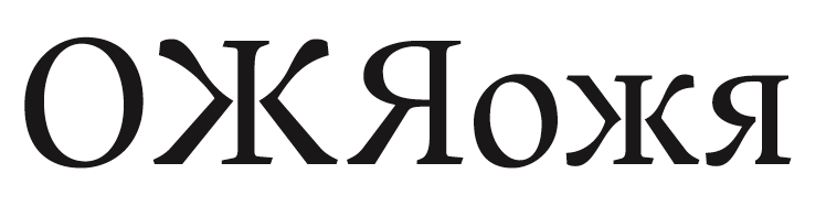
Niiice. This is quite encouraging, including the fact that the structures are different between the lc and UC, which I'm doing myself*. The fact that Grace has left the UC Zhe symmetrical also makes sense, since the UC set is monumental while the lc is more organic (and secondarily that the UC doesn't need to be as readable). You can see this in the Ya as well (and probably elsewhere - I'll be perusing the PDF for sure). And there's some other funkiness as well, like all the serif action - wow, brave student, that one.
* Mostly by having more rounded corners in the lc, and almost none in the UC.
One place I've been a little bit more pushy (quite likely too pushy) is that the Ka and the Zhe are vertically flipped: the curly arm on the Ka is the top one. Problem?
hhp

the curly arm on the Ka is the top one. Problem?
There's a display sans that I see everywhere here in Moscow that does just that, so it shouldn't be a problem.
But does it also have the curl on the Zhe at the bottom?*
It's that alternation (in mine) that I worry about.
* In case it matters: specifically, on its right side.
hhp
No, it doesn't also have that. It is symmetrical in the examples I've seen. Your Zhe strikes me as a reasonable display Zhe, but not for text, where it is a bit too unusual.
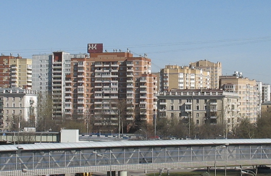
As for pondering Zhe, this is the view out my window:
Thanks for the feedback!
hhp
Here's the whole main alphabet:
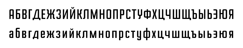
Fire at will.
hhp
интереснно, overall it seems pretty good. a couple things that are concerning. Your shape for У makes it hard to be read, i think it would be too easy to confuse with Џ. i don't understand why the leg on the д continues from the main stroke when this is not the case with Д, ц or щ. i'm wondering what your reasoning was behind this decision. i'd like to see the Д/д, Л/л all share the same structure, in particular i like the shaping of Д/д better, but that's just me. i'm sure you chose disparate forms for readability sake, but i think it would make the face more cohesive if they matched. The bar on the Ф can actually extend below the baseline and above the cap height a bit: I think it would look better with a bit bigger body. I'm wondering why you made the Г/г so narrow. Also, i would think the flag on the Ъ/ъ could be more pronounced as this is a distinguishing feature and would aid deciphering this letter in text. lastly, i wonder why the crossbar on the Ю/ю is so high, it looks funny to me.
Thanks Paul!
> i think it would be too easy to confuse with Џ
Even though there's a difference of vertical scale? Should I make
the top of it diagonal, even though it's a "U" shape in the Latin "Y"?
> i don’t understand why the leg on the д continues
To differentiate it from the UC. I actually started with the left spur also
coming straight out of the top part, but it was way too much like an "A".
But the same trick doesn't seem to work in the other spurred characters,
maybe because their structures are too plain? Maybe I should give those
ones another chance at straight-down spurs.
Basically it's the old Papazian "sacrifice consistency for the sake of differentiation"
routine. :-) This font is for use on-screen (although anti-aliased) so I think it needs all the help it can get.
> The bar on the Ф can actually extend below
> the baseline and above the cap height a bit
Do you mean optically or obviously?
> I’m wondering why you made the Г/г so narrow.
It's based on the Latin "L".
Normally I wouldn't think in those terms but when I suggested to the client that the Cyrillic should be wider overall than the Latin (I mean for so-called "cognate" forms as well) they were unwilling. And to be fair the narrowness of the overall design is a big part of its usefulness to them, so...
> i wonder why the crossbar on the Ю/ю is so high
Maybe it is too high. But it does match certain
things, including the way Verdana seems to do it.
hhp
Do you mean optically or obviously?
either way is legit (i think).
i think it would be too easy to confuse with Џ
Even though there’s a descender difference?
Well maybe native readers wouldn't make this mistake, but i for one would have a hard(ish) time recognizing it as an У if it weren't lined out in alphabetical order.
one thing i just noticed, the descenders on Д, Ц, Щ, д, ц, щ could be more pronounced (descend further) and they may not need to stick out so far (to the right). can we see some words or a bit of text in this?
> the descenders on Д, Ц, Щ, д, ц, щ could be more pronounced
> (descend further) and they may not need to stick out so far
Yes they could. Right now they're just brutally (but characteristically?) modular.
From: http://en.wikipedia.org/wiki/Pangram#Other_languages _
(Thanks to John H for that ref.)
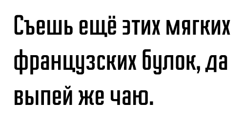
BTW, what do you think about the extenders of the ф (lc)?
hhp
what do you think about the extenders of the ф (lc)?
i think they're fine.
i think the descenders on Д, Ц, Щ, д, ц, щ could definitely be inward or add more space to the right side of these characters, or a bit of both: the descenders are almost crashing into neighboring letters.
one more tip: the bowl of the б doesn't have to necessarily rise to the x-height, it might look better a bit smaller.
OK, thanks again!
Anybody else have opinions?
hhp
The width of characters seems somehow not 100% ok to me. Maybe л and ч too wide? х too narrow? Zhe is very nice. Almost a logo.
Just my 2 cents.
In fact I'm not happy with the widths - they were rushed.
Any (further) specific complaints would be appreciated.
BTW Paul, it turns out the bar height on the ю (lc) was a plain vanilla mistake.
hhp
i know you don't want to hear from me, but the kratka (breve-like symbol) is a bit weak.
Why would I not want to hear from you?! The kratka/breve is from the base font, but maybe I should've made my own. Do you mean weak as in too small/light, or its shape?
hhp
Do you mean weak as in too small/light, or its shape?
yes and yes. i'd like to see something more squarish to match the letters.
I wrote up a bunch of stuff yesterday, but my internet died just as I went to post it. When I got connected again several hours later, I was just too tired to re-write it. (I've not yet had a day in Russia where my connection didn't go down for several hours during the day.)
Fortunately, Paul addressed most of my concerns. I, too, don't care for the U or the d. Aside from the bar position on the l.c. yu, I find it a bit too wide (esp. the bar part).
I also agree with Paul about the form of D/d and L/l matching a bit more. In fact, if you make your L more like the D, the face closely resembles the lettering used in the metro for "Don't lean" on the doors of the subway cars. (Which is something I get to stare at quite a bit.)
Sorry to hear about your lost feedback. :-(
Before I get into the mini-resurection of your feedback, let me check:
U = У
D/d = Д/д
yu = ю
L/l = Л/л
Correct?
hhp
Indeed.
My main question I guess is: what kind of У would you (plural) prefer?
Remember, in case it matters, that the Latin "Y" has the U top.
hhp
I don't think it matters, because Y and У are usually different. My return question is: what does your Latin l.c. y look like?
Not mine, but it's the same as the Cyrillic u.
hhp
The same as the Cyrillic l.c. u? In other words, there is a stroke the whole way down the right side? Ultimately, that's what I think the У's gotta have.
But wouldn't that make the UC and lc forms too
confusable, especially with that huge x-height?
hhp
The problem with Cyrillic is that there are quite a few cases where the UC and lc have the same form. In the case here, if you move your tail over (typographically speaking :-), there is still a difference in the treatment of the tail: curled back up for lc and curved leftward for UC.
Although I see where you are coming from, I just think your current idea is too novel, and will therefore seriously impede reading.
Hrant, you might like this form for У, particularly if you can make it harmonize with that wacky Zhe of yours.
Reminds me of Fleischmann's "y"!
hhp
Good news, Hrant. One of the lights on the Zhe from my picture burned out, rendering the form asymmetric.
:->
hhp
The reason I asked about the ф (lc) is that I've noticed a
number of fonts* where its ascender is short. What to think?
* Most recently: http://typophile.com/files/pejkova_normal.jpg
hhp
In Russian, the short ascender was more common in the 18th century. I rarely see it today.
I was thinking about your zhe a bit more. I have been very dilligently looking around town, and one absolutely never sees the asymmetry you have, with one exception: quick hand lettering. The pen strikes again...
Hey, I'll take an excuse from anywhere! :-)
And thanks for keeping your eyes so open.
hhp
I saw a non-symetrical zhe on a billboard yesterday: http://www.seneg.ru/.
:-)
Funny!
hhp
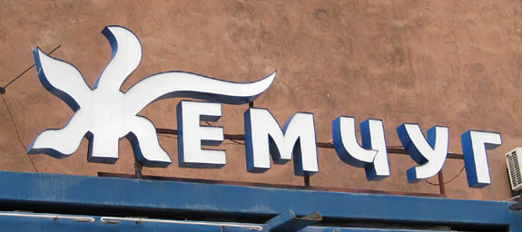
From Yerevan:
hhp

Maybe it's supposed to be a pearl in the middle of some seaweed?
- Lex
http://www.mimifroufrou.com/scentedsalamander/images/kim-kardashian-perf...
Funny, she doesn't look like a woolly mammoth.
hhp

Type battle Ж
https://www.facebook.com/notes/cyrillic-typography/type-battle-ж/396063967072151
I don't have Facebook...
But if anybody wants to post
this there that would be great.
hhp

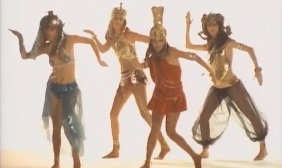
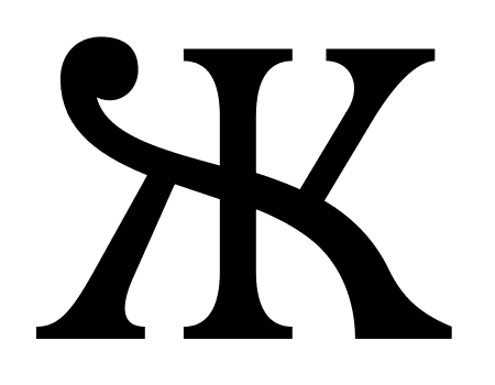
The original "organic" concept* isn't so Bangles. :-)
And after almost eight years I finally have a good
reason** to make it into beziers, so...
* http://typophile.com/node/30024#comment-173469
** http://www.facebook.com/cyrillictype
hhp
This is by Gennady Zarechnyuk, a "native":

Is this for real?! I mean, is it usable? Wow.
hhp

Gennady’s little joke.
That’s a Big Yus.

He is a couple from his family of fonts
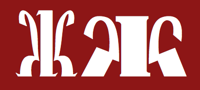
Doesn't the Big Yus need a closed top?
hhp
Yes, you’re right.
It reminded me of Big Yus.
Kind of a hybrid, then?

Do you want fancy? Please suit yourself ;-)
http://free.type.org.ua/en/category/style/fancy/
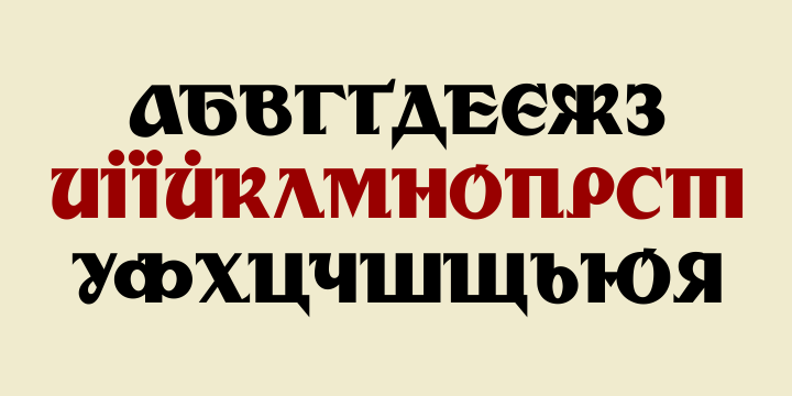
Another from Gennady:
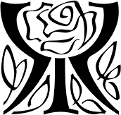
And some from Viktor Kharyk:
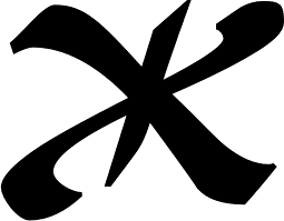
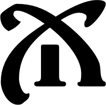
Your "ж" is cool, however "д" and "У" strike me as odd.
From a regular user of cyrillic typefaces.
Just to be clear: do you mean mine or Gennady's?
hhp

Strikes me that it makes more sense to have the italic rotationally symmetrical but the roman more reflectionally symmetrical (about the central stem/y-axis). Not sure why but feels more appropriate, maybe I'm thinking of those zhe's which have a lower case 'c' structure to them (a bit like a cursive Greek kappa with a vertical line down the middle. They only seem to exist in italic.
Plus don't you love the way both the words Italic and Roman effectively mean 'from Italy' (and thus Latin) and therefore are perhaps rather inappropriate in a conversation about Cyrillic? Maybe one should talk about cursive and upright instead? Can of worms maybe, sorry.
(If it's not already apparent, I'm out of my depth.)
@hrant Yours. д is weird because the base stroke doesn't continue to the right. And У is not Y...
Thanks for the native critique!
д: I think you must be right.
The "У" ended up that way because of how the "Y" and "y"
were in the original Latin (Primex). But maybe I did go in
the wrong direction...
hhp
Captured from web.archive.org on 14 Apr 2015. view this capture