Hi,
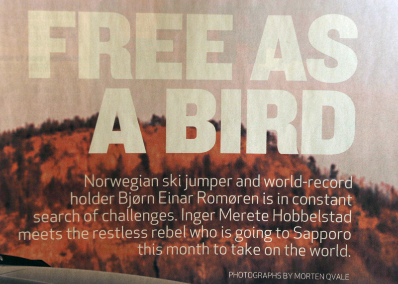
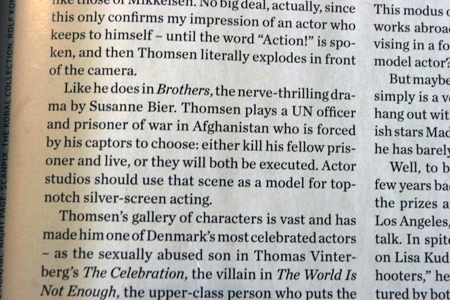
I'm doing an advertorial for a magazine and I'm trying to pin the fonts, so I can layout the spread like the original magazine.
- One font definetly looks like Apex New
- One – the large heading – looks like Helvetica black/heavy condensed – but has a different 'E'
– The serif I'm not sure about at all, other than it looks very familiar. The lowercase 't' puts me off trail (it's kinda like Bodoni, but not really)
What are we looking at?
Thanks a lot.