Hi everybody,
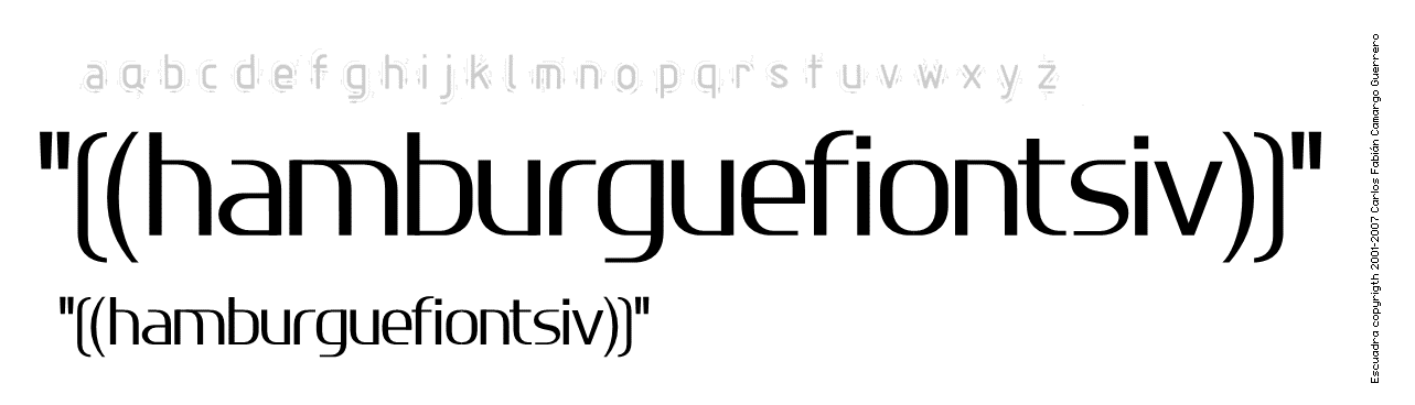
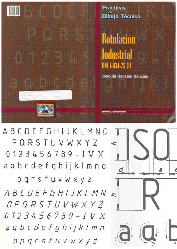
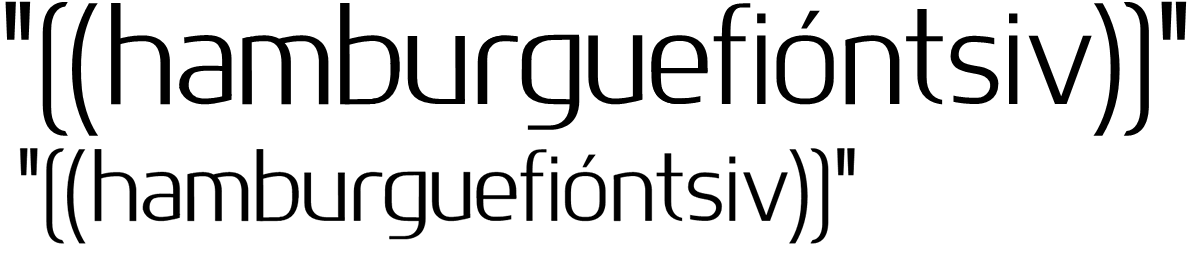
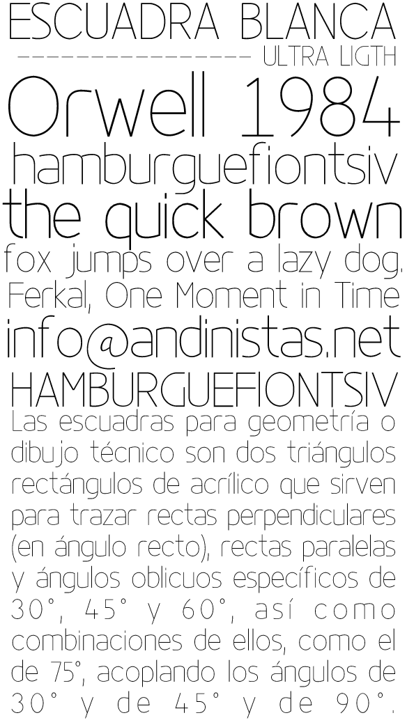
Escuadra was inspired in the font used by the architects in their drawings when computers were not created yet and they had to use chinese ink to label their plans. Any comments and criticisms would be most welcome.
Thanks!
—
Carlos Fabián Camargo G.