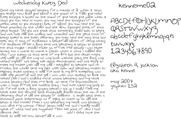
This is an exageration of certain features of my 'normal' handwriting that I developed for a Font design class at City College of San Francisco. My handwriting is a mix of upper and lower case, and tends to wobble a bit left and right. It makes me look psychotic, which I am, so it works on that account. I like some aspects of the font a lot, and would like an opportunity to develop it further. The pen used is a uniball Vision fine, which has been my standard pen for many years. Not finished to my mind, but here it is.