Hello.
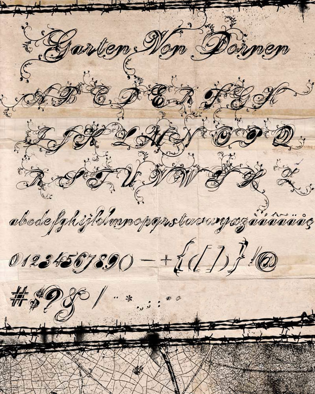
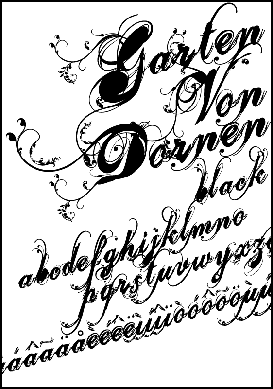
I am sending two new fonts for your suggestions.
Brazilian Hugs
MARCIO HIROSSE
www.fabrikadetypos.com.br
| Attachment | Size |
|---|---|
| GARTENNORMA2L.jpg | 211.95 KB |
| GARTEN_BLACK.gif | 53.33 KB |
Hello.
I am sending two new fonts for your suggestions.
Brazilian Hugs
MARCIO HIROSSE
www.fabrikadetypos.com.br
| Attachment | Size |
|---|---|
| GARTENNORMA2L.jpg | 211.95 KB |
| GARTEN_BLACK.gif | 53.33 KB |

Looks promising, but it seems hard to take a look at your glyphs in this context. How about some more settings and glyphs?
On another note— I'm scared of your website. :)

The second image is fantastic. In the right context this face would work beautifully.
I'm not as keen on the heavier weight though; It feels clumsy and not as refined. The swashes don't flow from the letter as nicely either (e.g. the t).
I would really like to see one of the letters (perhaps the 'G') up close to get a feel for the detail.
Sorry I don't have anything more helpful to say.
Out of curiosity, how did you start the design process? Did you use a pointed nib?

Looks great!
I'll second Andy on that request for a close up...

It’s a very nice take on the vein of Velvet and Porcelain. Your majuscules are absolutely gorgeous, and your normal specimen sheet is pretty easy on the eyes as well.
Do the end-user a favor and add in alternate versions of the filled-counter minuscules that aren’t filled in. There are times when having the counter filled just doesn’t work. If you really have the time, it would be great to do filled and unfilled versions for everything to make the whole font more versatile.
THANX FRIENDS
FABRIKA DE TYPOS
www.fabrikadetypos.com.br
FABRIKA DE TYPOS
www.fabrikadetypos.com.br
How about that close up, Mhirosse? ;-)

zu viel Pråsens
Captured from commoncrawl.org on 28 Apr 2015. original URL