hello.
this is new or fixed:
the bowl of a is a bit bigger.
the curves in h, m, n are more flat now.
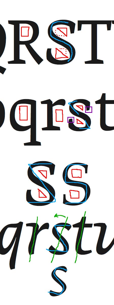
i changed the diagonal strokes of K, k, R so they match Q in both roman and italic style. i like this new sharp feeling more, but maybe it needs some more optical fixes.
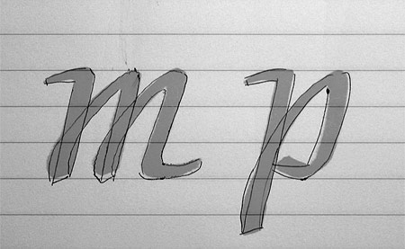
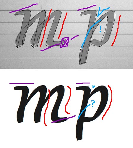
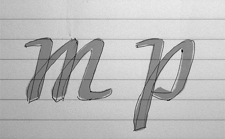
the italic style is more wild than i planned, so it is not possible for me to see all optical problems.
i would really appreciate your help. thank you.
| Attachment | Size |
|---|---|
| kompilat_070521.pdf | 101.5 KB |
| IMG_3238.jpg | 30.58 KB |