Hi!
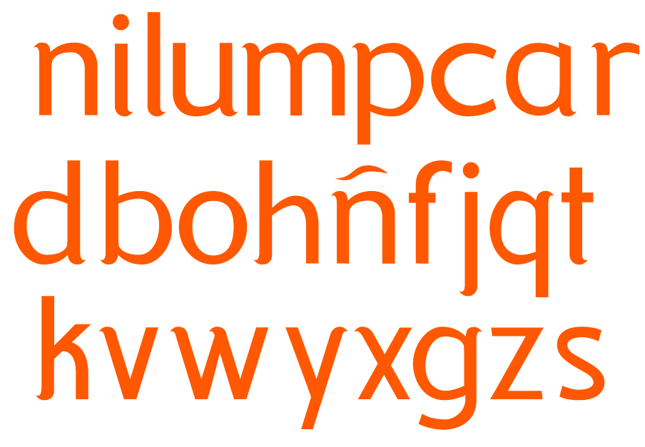
I love to express how much I hate certain fonts, but I've never done one myself until now. I can now say I hate my "c", my "s", the dot on my "i", the kerning and the belly of the "b" and "p". I also strongly dislike the "a", and don't really enjoy the general widths of the typography. But I think this could be a very nice thing if worked out correctly. I tried to stick to certain principles, but the result is less than satisfying. Now is your turn to critique it, but I'd prefer some constructive criticism :P
cheers, and thanks!
.rob
| Attachment | Size |
|---|---|
| eos.png | 34.53 KB |