
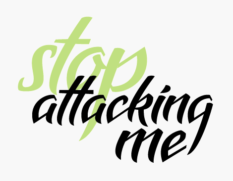
I just started on this one and like where its heading, please leave any comments/critiques. (which 'b' and 'p' do you like?) Thanks.
| Attachment | Size |
|---|---|
| Picture 5.png | 25.89 KB |
I just started on this one and like where its heading, please leave any comments/critiques. (which 'b' and 'p' do you like?) Thanks.
| Attachment | Size |
|---|---|
| Picture 5.png | 25.89 KB |

Very nice work. I like the b and p in the second row.
George Triantafyllakos - backpacker.gr

Oh, wow! I'm impressed!
ps. no ones attacking me :)

The g looks like a q
I read attackinq me
Captured from commoncrawl.org on 27 Apr 2015. original URL
