Typophile

modern alternatives to bodoni

beek

Hi,

I have been working on the branding of a company, but they do not like my choice of body font Bodoni in italics

The font will be rolled out on everything from stationary to the campaign adverts.. I have cused Bodoni Italic Bold/medium/light as this font, treated as so, but they dont like this, they feel it is dated (what the??)
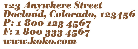
Anyway it has to work with certain quotes used througout the work eg:
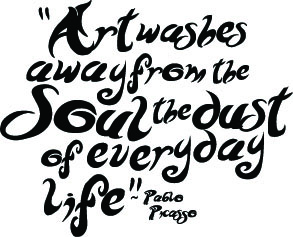
If anyone has any suggestions, i am after a similar serif font, elegant with some really nice curves, but quite soft in its nature.

fonts i like, but am not sold on certain charaters,

Didot, im loving this but im sure its way to elegant for them..

Ziggurat italics, dont like the "Y" as this is a crucial character in the brand name., but i think this font has the softness i like..

Souvenir italics, this has the softness, but lacks the class as in bodoni and didot.

AS you can see im just really after any suggestions, that you guys have of similar fonts, obscure, personal favorites anything at this stage will help me..

thanks.

Bodoni and Didot fonts were incredibly popular for business use in the mid 1980s to early 1990s. Unless you’re doing fashion work, where a Didot or Bodoni can still work, a Bodoni identity is going to look very, very dated.

Your other choices-Ziggurat and Souvenir—also speak much more to the past than to the present. What sort of company is this that you feel it needs to have an identity with a period look?

"Dated" is probably just the handiest term they could think of - even if it's not totally accurate there's something to it: Bodoni looks like some regal gandfather, aloof and old. In fact it's almost dead. As G W Ovink put it: "Bodoni is an admirable letter for a death notice!"

Didot will have the same problem.

Souvenir is just retarded looking.

I might recommend Mrs Eaves, as long as you won't be using it for anything over a line here and there, since it needs manual [re]spacing to look decent. Or you could try a Baskerville. Or maybe The Foundry's Wilson.

hhp

This is a fashion shoe company.

Although i was trying to target them towards more high fashion, they want a more friendly look and feel.

hmm, mrs eaves, is too elegant, im trying to find prehaps a more obscure, solid round serif font..

They want people to think their shoes are comfortable. So Bodoni is out.

You might narrow your search down to fonts that set wide.

hhp

oh hurant, its like you are reading the breif.. yes comfortable is a key element.. ut any other suggestions by anyone would really help.

Captured from web.archive.org on 20 Nov 2014. view this capture