hello people from typophile
i´m looking for any opinion on this cause i´ve never done this kind of work before...
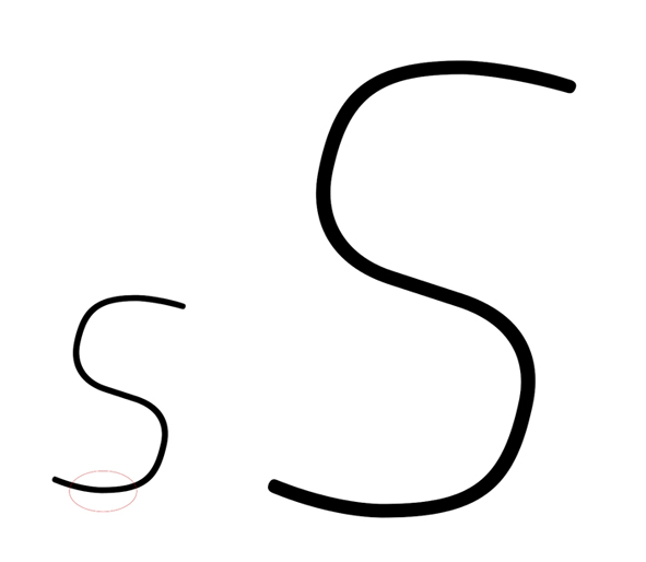
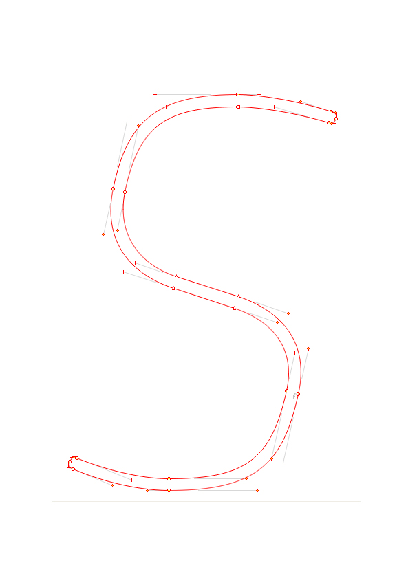
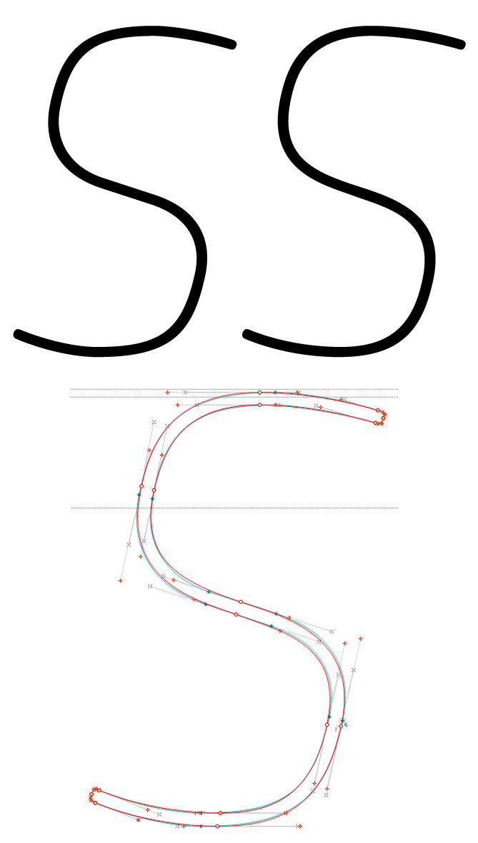
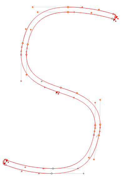
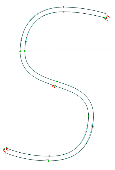
it looks like the curve of the bottom leg it´s not looking very good to me, i just can´t make it look smooth enough. Im getting the impression that its more dificult to control this on thin weights, cause the bolder weights seemed fine...
if it matters, i´m drawing shapes on fonlab
all apreciations are welcome,
thanks in advance