
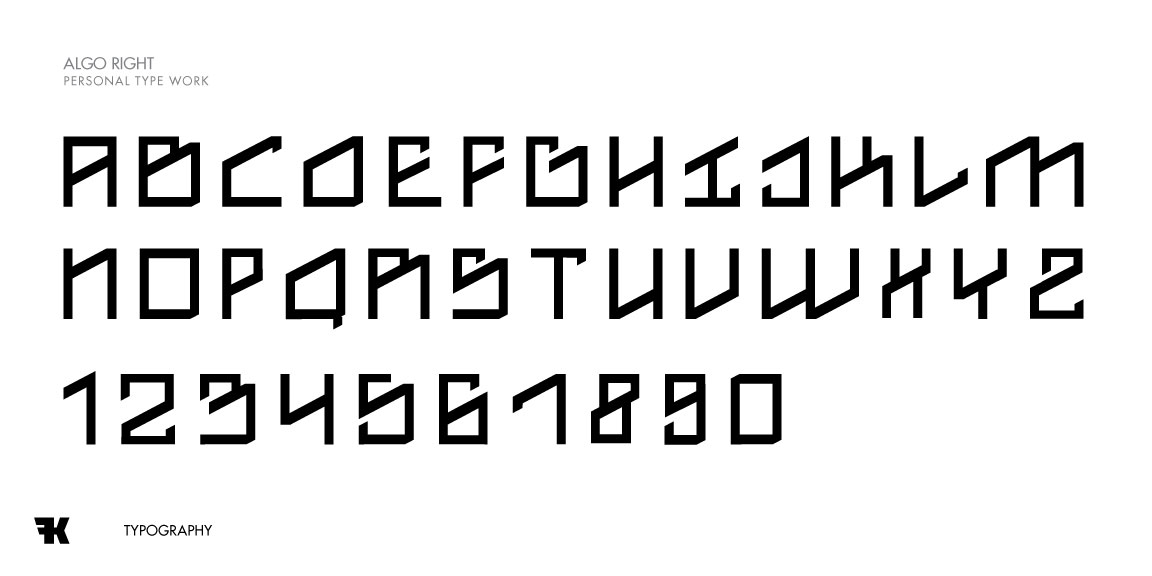
Let me know what you're thinkin folks!
Let me know what you're thinkin folks!

I like most these, especially how the R and S differ by only a tiny bit, but are totally different. The main letter that's grating me a little bit is the X, I kind of expect the bottom half to be forward of the top half ... the 8 as well.
«El futuro es una línea tan fina que apenas nos damos cuenta de pintarla nosotros mismos». (La Luz Oscura, por Javier Guerrero)
I like that - it would widen them out as well. Glad you you enjoyed it!
Captured from commoncrawl.org on 28 Apr 2015. original URL