Hello,
I'm making a logo for a rock band called Rock Fuel. It's not going as smoothly as I thought it would. It's actually pretty difficult.
I've picked out three basic sketches from all my wierd attempts. I used Helvetica in number 2 and 3 just because I don't have to think about the type, just about how to edit it and possible symbols. Wilhelm Klingspor Gotish is the type that think fits best to the namne Rock Fuel at the moment.
1
Here I first picked a type that I thought would be suitable and then tried some variations with and without symbols. This is the one that I feel most confident that could end up as a nice logo, or some version of it. I just haven't come that far with it yet.
2
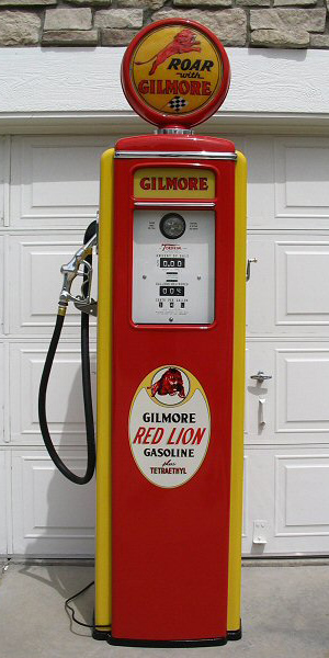
This is just a test with an old gaspump and how it could fit together with a text.
3 a and b
Just tried some variations of how I could have it just as text and no symbols. Used Helvetica again, it would ofcourse be some other type, I guess I pick Helvetica because it's comfortable to work with.
Any and all feedback welcome, thanks.
Peter
| Attachment | Size |
|---|---|
| ruckfuel_logo_skisser.jpg | 143.39 KB |