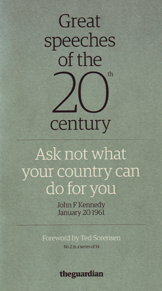
Need some advice folks.
Received this on saturday and trying to figure out typeface.
thanks
| Attachment | Size |
|---|---|
| sppec.jpg | 68.45 KB |
Need some advice folks.
Received this on saturday and trying to figure out typeface.
thanks
| Attachment | Size |
|---|---|
| sppec.jpg | 68.45 KB |

Not for sale sadly:

is there anything similar out there?
Oranda is probably closest:
http://www.paratype.com/btstore/default.asp?fcode=210&search=Oranda
any other suugestions as a poor replacement?

Poor as in quality or price?
There's Apex Serif.
Olsen has similar qualities: robust, big xheight.

"any other suugestions as a poor replacement?"
I'm poor, so I use ATF Antique...
http://www.fontsite.com/Pages/FFDownloads.html
(Apologies to the free font opponents.)
Another option is ITC Charter which is seeing a lot of action lately.

Or: http://www.tdc.org/news/2007Results/GretaText.html
hhp
----
Today, learn about the Armenian Genocide.

Nobody here opposes free fonts, only the rip-offs. ;^)

Hrant, what do you think of Greta? It seems to have the "obese x-height" you often rail against.
Well there are good and bad reasons to make an x-height obese. In the 70s for example many people did it purely for style, in disregard for anything else (think ITC Garamond). That sucked. On the other hand the smaller the point size the larger the x-height should be - and newspapers are a very prominent and long-standing case of small-size typography needing large x-heights.
Greta's x-height I would actually not call "obese" btw - I think if you measure it it'll come out to about what Times is. Also, width has a compounding effect; Times is narrow while ITC Garamond is wide, making the latter than much worse.
hhp
Thanks for clarifying, Hrant.
In the case of Greta, you're comparing the x-height to the height of the lowercase ascenders and not the caps, right? 'Cuz if you look at the words "Greta Text" at the top of the sample you linked, the cap-to-x-height relationship looks positively Vectora-like.
Yeah, I guess rather than call out Greta's x-height, you could deem its cap height diminutive.
Yes, caps constituting only about 5% of text aren't very relevant here. But Greta's sure are super short! Some kind of record*, or close. I personally like that, although it does have one drawback: for text that's likely to be scanned (as a rule for a proper name, hence something capitalized) it's less effective than caps that stand out a bit. And it seems to me that the types of settings that benefit from fonts with large x-heights also tend to benefit from being easily scanned.
* Vectora's caps are even smaller, but look at the x-height compared to the ascenders: gargantuan. I'd say this makes the caps relatively larger than Greta's.
hhp
Captured from commoncrawl.org on 27 Apr 2015. original URL