
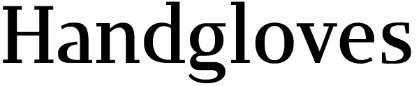
Here is my first attempt at a slab serif face, still in its earliest stages. For now, I just have the 24 basic letters of the alphabet in uppercase and lowercase and some bare-minimum punctuation.
The inspiration: I was daydreaming about how I'd go about designing a business card of my own; I've never had one. Maybe I'd like to see my name in distinctive slab serifs letterpressed onto some good quality business-card paper. The design elements would be severe geometric slab serifs, with straight horizontal and vertical lines emphasized, but the forms would also hint at some elegant text faces. Actually, I originally had a more distinctive display face in mind (just to set my full name, nothing else), but it seems to have evolved a bit to something with potential to work for longer passages of text.
Anyway, I came up with some weird stylized designs for the lowercase a and g, and finished the rest of the alphabet on loosely similar principles.
I thought this would be a good one to put on the critique forum, so I came back to the design after a few weeks' break and touched up the forms to make them a bit more presentable to the Typophile readers. I gave up the strictly rectangular vertical serifs (on E, z, etc.) for now. The whole thing is still at a very rough stage--I fixed the most egregious of the stem weight inconsistencies and overshoot problems, but several probably remain. I haven't even begun to look at spacing.
I'm still looking for basic solutions. I wasn't sure how to treat the lowercase f and r, and the lowercase g isn't still quite satisfactory. I'd appreciate any suggestions on these design issues.
Jongseong
| Attachment | Size |
|---|---|
| Armadillo070421.pdf | 16.63 KB |

