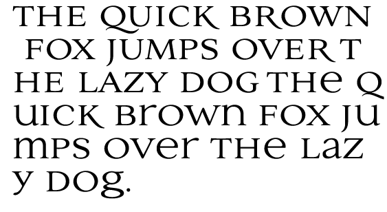
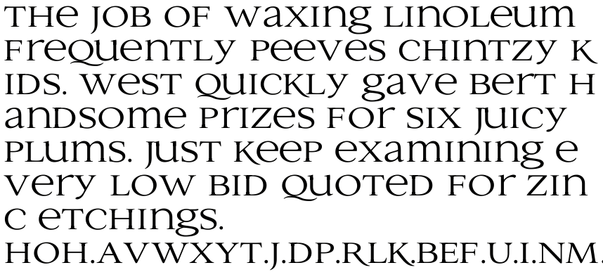
I have been working on a new Unicase Serif. These seem to be all the rage these days. This one is extended more than most. I have attached a quick .gif preview and a .pdf for more detailed examination. I think I have a few issues with the weights on the n, m and r. Please ignore the preliminary spacing for now. All comments are welcome.
| Attachment | Size |
|---|---|
| Unicase1.pdf | 230.11 KB |