Typophile

2007 Joyce Conference Logo

Duncan Robertson

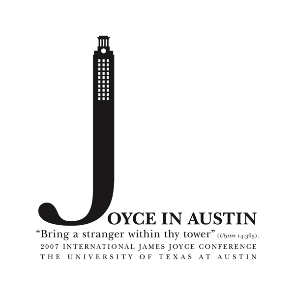
This is a logo I am working on for a literary conference. It is heavily type based because the inspiration comes from the opening spread of James Joyce's Ulysses.
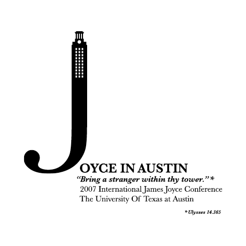
Please note 2 things:

1. I probably will not be able to make any drastic changes because we are coming down to the wire and we have gone through a lot to arrive at this concept.

2. The concept is based on the original spread, but I have taken creative license in an attempt to help the concept work as a logo.

That having been said, any feedback is greatly appreciated.

Thank you in advance,

Duncan
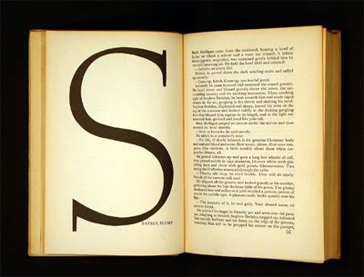
In case you are interested, here is an image of the original spread.

Duncan

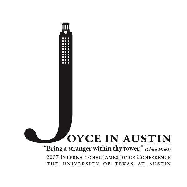
Had a late meeting and made some changs. Here is the newly revised version.

Duncan

Ahoi Duncan,
all in all I like the logo; it's just that I liked the first composition better.
The second is too static (for a joice conference :)
Maybe something in between?
And I'd use 'real SmallCaps' and give the textblock a bit more contrast.
See attachment (here with: Garamond Premier Pro / Semibold Caption / Bold Subhed (Bold Italic) / Regular

Best Regards

Your J seems a little flat at the base, emphasised in your second iteration by the text placed under it. My inclination for your first post would be to move the text up so that the fourth line lines up with the base of the J. I think the lack of asterisk in the second one is better, because that line looked a little spotty with the punctuation. I think it is worth adjusting the leading slightly.

Tim

Captured from web.archive.org on 5 Aug 2014. view this capture