Typophile

Footnote Suggestions

msilverz

I'm typesetting a friend's writing sample in philosophy, and I can't decide how to arrange and format the footnotes. (They must be footnotes, not endnotes.) I've attached an 8-page PDF. Each page is actually the same page of text but with the footnotes designed in a slightly different style. Here are the three main styles:

1. Note number outdented; footnote text flush left with main text.

2. Note number slightly indented, so that note text begins where indented paragraphs in main text begin.

3. Note number indented, so that number appears where indented paragraphs in main text begin.

Each style comes in two versions: one with a 2-inch rule separating the text from the notes and one without. The first style also has two more variations: one with a period after the note number and one without. In all of them, the main text is Aldus 12/15 and the footnotes are Aldus 10/13.

I can't decide which of the three main styles I prefer. (An obvious fourth style would be to have the note numbers flush left with the main text.) The first is recommended by Bringhurst, but I don't think he has academic papers (with their sometimes long footnotes) in mind. I'm worried that the numbers standing outside of the margins draw too much attention to themselves.

Does anyone have any comments about or favorites among these different styles? Any suggestions for doing something different? (I know that the hyphenation needs work.)

Any help would be greatly appreciated!

Matty

AttachmentSize
Footnotes.pdf79.17 KB

I think the rule is important. It shows that the two areas are not one text, even when skimming. (The smaller size is not enough because it could be a quoted passage or something.)

I like the outdented numbers, but I think flush, with periods, would be my choice for an academic paper.

I don't like the numbers outdented. I wrestled with the same situation recently - altho the notes were at the end of the chapter, not on each page. I checked a bunch of books for style, and ended up doing what you call the obvious fourth style, where the numbers were flush left with the main text (at least the longest number, as the numbers themselves were right aligned, and the text hung at the indent. It's a little less space-efficient but I also didn't put spaces between the notes themselves.

Most projects in this area I used footnote numbers left aligned with the main text, and the actual notes hanging at the indent of the main text. No line, as I used different font sizes with an obvious difference. Depending on the length of the average note, one space saving yet visually pleasant way is to have the footnote set in two columns (top aligned).

The usual style in the academic world is to use a paragraph indent for the note numbers, unless those numbers are also a superior. Outdenting the note numbers looks OK with loose leaves, but in a bound book, they are apt to get lost in the gutter on a right-hand (recto) page. If you want the note numbers flush to the text page & then block indent the notes proper (flush & hang), that's fine, though not as common. Cambridge University Press did this for a while, maybe still does.

With paragraph style, the numbers "decimal align" only per-page. In other words, if you have notes 1-7 one page, you do not "clear for two digits." That happens only on the page where you go from one digit to two, and from two digits to three.

Use of a rule may confuse some people. People reading this will be academics, who are use to footnotes. Usually, a rule is used when a footnote carries over from one page to the next. You always have to start a note on the page where it is called, but sometimes the footnotes are so long, there is no way to page the document without carrying part of the note over to the next page. In such cases, you use a rule to indicate the carried-over note. Three picas long is usually sufficient for the rule, but it can be full measure. If for some reason you must use a rule on all pages, make the normal rule a different measure than the rule you use to signal a carried-over note.

One of the oddest situations I've ever encountered was a journal article, where the first line of text called three footnotes. The third footnote took over three full pages to set, even in 8-point type. The forth note was called on the second line of text. After taking it over with the publisher, it was decided to set the article opening, the first line of text, then the notes on the rest of that page & the next two full pages (with rule, of course), before picking the text up again on the 4th page.

Obviously, a poorly written/edited piece. The author would have been better served to either incorporate the note in the text or make an appendix of it, and the editor surely should have pointed this out before accepting the article. But it happens.

Edit:

It is also unnerving for a reader to discover some designer feels that he/she needs "help" deciphering a normal situation. So, for example, you do not need extra spaces between footnotes, just like you do not need extra spaces between paragraphs in the text.

For example, some designers both block indent an extract, and set it in smaller type, so the reader "won't get confused." What reader? Most people who read this sort of thing are use to block quotes, they aren't going to get confused. You might as well put a printer's fist beside the extract. You wouldn't believe the number of things I've seen by both designers and editors "to keep the reader from getting confused" when it is obvious that anybody reading the text is going to have a college education or more. What usually happens is the designer/editor adds to the reader's confusion. There are ways to graphically help the reader, but they are usually not by highlighting elements he/she expects to see anyway.

I'm generally in favor of endnotes rather than footnotes for this reason, I think footnotes distract you from the text.

In my informal research among both scholarly texts and less so, books from university presses and trade publishers I saw very little consensus as to how they're handled. I don't think I ever came across outdented numerals tho.

And yes, I decimal align on a per page or per spread basis for sure.

One version is missing, and that is rule + numbers flushed with the actual text (+ possibly an indent for the footnote text). I agree with Utilitaritron that the rule is important.

Robin Kinross' essay "Modern typography" uses per-spread footnotes only on the right hand side (of course, this is a well-written and edited text, so the room for the footnotes does not exceed 1/3 to half of the page.
One more version I've seen is to use two different levels of notes: endnotes for citation stuff and less important information, and actual footnotes for important explanations, terms, and so on. Endnotes counted per chapter, footnotes with per-page symbols (*, dagger, §). Useful, and the endnotes "not distracting the reader" (whoever that may be).

Endnotes are fine if they are not meant to be read; but if the notes are somehow relevant to the text, I'd use footnotes. I personally find it interesting to read people's notes and I get quite annoyed by having to turn over the leaves every two minutes to find those endnotes.
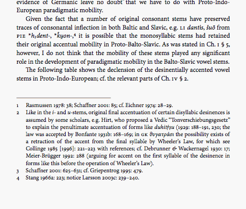
As for the layout of the footnotes, I second mili's version. I used something similar in my dissertation (see picture).

Thomas

That's basically what I was suggesting except that I think the numbers should right align with each other.

I agree, right aligning the numbers wouldn't be bad.
Thomas

Thanks for all of the suggestions (and a special thanks to Thomas for including the helpful picture).

Since the block quotations in the main text will stay at the normal text size (and instead be indented on both the left and right), I think I'm going to go without the rule (except, of course, on pages with a note continued from the previous page).

I haven't decided about the rest, but I appreciate everyone's input.

Matty

Since you've got your answer, I'll add another way to think about such things generally. Essentially, your question was "how should one handle the element 'footnotes'?"

There is another way of thinking about the topic, which is, basically, "how should the element 'footnotes' be blended into the text page?"

This is probably old-school thinking. I saw Helvetica last night, and was struck not so much by those who did and did not like the typeface Helvetica, but the two schools of thought, modernism and postmodernism. One of the older modernists remarked that you cannot spend your whole life looking at things a certain way and just change. But postmodernism has been around long enough for one of those devotees to walk slowly & have white hair as well; they too have spent a lifetime looking at things a certain way.

OK, back to the page. This is not a simple modernist versus postmodernist point of view; the notion of the type page is far older. I do suspect a postmodernist would disagree with what I'm about to say, but so too could a modernist.

The reason I don't like flush & hang footnotes is that it weakens the page. The page now has two distinct elements, the body text and the notes. Should these have a different graphic interpretation? I suppose it depends on your point of view. Mine is no, the page is one of the things (aside form the content) that unites these elements. Just like a widow weakens the page, so too do flush & hang footnotes. So would a full-measure rule, which, unlike a rule below the running head block, will not appear at the same place on the page.

The situation is rather different with endnotes, either end-of-chapter or end-of-book. Here, the problem is to let the reader quickly find the appropriate note & reference it to the text. Running heads giving the page number help (Notes to pages 000-00). So to can flush & hang note numbers/notes.

But this is just one analysis, and nothing new. The real question a designer has to ask is whether the design problem is to work to display differing elements, or to work to integrate them.

FWIW

Charles Ellertson

Also, don't forget to check with your friend regarding any style guide he/she must follow -- many academic disciplines (and their respective college and university departments) require that authors adhere to a particular style guide: The Chicago Manual of Style, MLA style, APA style, etc. Each of these includes specific requirements regarding citations.

Hope this helps!

--Michael.

------------------------------------------------------
// love what you do or do something else. //
Michael Ebert -- graphic designer, jazz saxophonist, horror movie devotee
------------------------------------------------------

I'm coming to this late, but Michael is absolutely correct -- the first criterion is that the footnotes match up with the style required by their faculty.

Most, but not all, let the author pick a specific style (Chicago, et al) so long as they stick to it throughout, but I have seen others that are positively repressived about everything from font (Courier) to size (10) to styles (no bold or italic, only underline), to line length and number -- yes, they would prefer something done on a typewriter!

Regarding style manuals, there aren't any hard and fast rules in philosophy. The key is simply to be consistent. Plus, this is not for official submission. It will be included in job applications, and so the point is merely to look as professional as possible.

(I'll be doing this for myself soon enough. I too am a philosopher and only an amateur when it comes to this typesetting stuff!)

Ah, yes. Should old Aquinas be forgot, and never brought to Mind.

BTW, I wouldn't use Palatino for whateverthisis.

Um, and why not? I used Palatino as the text for my Masters thesis -- which was quite philosophical -- and it was quite welcome....

Plus, this is not for official submission. It will be included in job applications, and so the point is merely to look as professional as possible.

Way (way) back when I was a philosophy grad student, we didn't have such stratagems. If you had already been published (rare, at least in those days), you might include one of your offprints. But if the point is to set yourself off from others, I'd suggest Palatino is not the best choice. I can't really tell the field (epistomology or aesthetics or ethics?) from the snippet, but I think I'd use Cycles, with Arepo display, which would work for any of these. I wouldn't use Cycles for for math logic, and for something in the history of philosophy, font choice would depend on the period & topic.

Interesting.

When I took a PhD philosophy seminar course (Philosophy of Language, with the thought of enrolling in the programme) a couple of years ago, I was singled out for exemplary use of type (um, Palatino, actually) -- compared to the presentations of my classmates (which were, um, Comic Sans), I was the A+ student....

Sorry Linda, but standing alone in a field of Comic Sans submissions, you would have been quite easy to spot as the A+... sometimes it's not that hard to look standout, even in Palatino.

Matty – most people have an aversion to what is rightfully called 'belt+braces' typography; it's just that they don't consciously notice (or verbalise) what it is that is inherently offensive about redundant levels of emphasis or subdivision on a page. Simpler is almost always better.

Just one more comment --

On Olanda's sample - more white space is shown between the text and the footnotes. All of Matty's samples show less.

I would suggest Matty - whichever style you are going with add an additional 10 to 12 points leading before the rule to the footnotes. Whew.

On more white space between text and notes:

Once again this depends on how you view the page, should you break it up visually, or integrate it. When I design a book interior with, say, 13.5 points text leading, I will use a minimum of about 19 pts b/b between the last text line and first line of notes and a maximum of about 34 points b/b. That is enough variance to allow for one text line to move, such as a widow, or a text line calling another note, or . . .

That is the other thing that hasn't been mentioned in this thread; if you are setting just a few pages, you can design tightly. If it really is a 200+ page book, you have to allow for the actual manufacturing.

Sorry, I do not know what made me forget to post what I had written earlier.
Here is the bit of information:
Footnotes References are usually differentiated from the body text by enclosing them with round (not square) brackets?!
Out of the Question but not off-topic?!

Just for the sake of linking this topic to:
http://typophile.com/node/33132

Captured from web.archive.org on 11 Apr 2015. view this capture