Typophile

The Power of the Quote

Hrant H Papazian

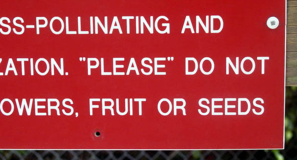
The quote is a tricky, powerful “shape-shifter” of a character, with abilities way beyond its formal uses for marking verbal expressions, titles, etc. We’ve all seen it used to mean “not exactly”, or even “not really, but this way you can’t sue me”, when a product is advertised to do something it doesn’t. I’ve also seen it used to mean “not exactly but there’s something to it”: during a visit to the Cayman Islands I saw a car rental place with a large “JEEP ONLY” sign, in quotes; it actually had other vehicles for rent too, but/so wanted to succinctly state: “This is the place for renting a jeep, but we have other stuff too”*. And during this past spring break I saw the quote used thus:

_
Can you guess what it’s doing there?
_
* Some years later I saw a similar thing at a motorcycle rental place in Hawaii: “HARLEYS ONLY”.

—

Please post other example of the quote doing something
besides what it’s “supposed” to. (And there it is again!)

hhp

Quotes used for “emphasis” are funny every time.

It’s funny, but here it’s also cool because there’s (probably) no other way to do it. Except letterspacing, but these guys aren’t German... In fact some years ago they were shooting Germans around there. :-)

hhp

Can you guess what it’s doing there?

Well, they started out in all caps, so when it came time to emphasize a word, they were stumped. Setting it in lower case wouldn’t look right, and they didn’t have a bold or italic font, or underlines [edit: or as hhp notes, maybe didn’t think of letterspacing], so quote marks did the trick.

Somewhat related, *certain* Typophilers use asterisks for emphasis — what’s with that?

I used asterisks heavily on Typo-L, and still do when when stuck without formatting (although sometimes I prefer all-caps these days). In fact I’ve noticed that sometimes the discussion list software will automatically make a word between asterisks bold.

hhp

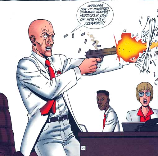
Here’s my favorite commentary on the matter, from the drunken Irish author Garth Ennis. Link goes to a PDF that expounds further, using language not remotely appropriate for posting directly into this forum.

Certain markup filters such as Markdown and Textile automatically convert words between asterisks.

Maybe he’s making a „kniebuiging”?
Nodding his head gently; pointing at ‚non-verbal-communication’? And why double-qoutes? Why not single? Or «German» or ‹Swiss› or Maybe French? I can’t remember?

There’s a sushi restaurant on my block that used to be a Chinese restaurant. They have a sign out front saying

“Chinese Food” for take-out and delivery only.

It makes me wonder what they’re trying to pass off as chinese food...

Even tho I hate underlining, wouldn’t it be more appropriate for emphasis than quotes?

Haha!

Where was this published? Great for educational purposes, there’s nothing more credible than comics.

I think the fingers making quote marks in the air while a snearilly spoken term is said demonstrates the most graphic form of this—as in some one saying, The Bush Center for “Intelligence”.

ChrisL

Where was this published? Great for educational purposes, there’s nothing more credible than comics.

Alamo, the ninth and final collected volume of the comic book Preacher. I think that I may have to post this one in the graphic design studios at school.

Even tho I hate underlining, wouldn’t it be more appropriate for emphasis than quotes?

Yes, but creating legibility issues is worse in some circumstances, especially signage.

Thanks!

I always thought the non-sarcastic use of emphatic quotes was the punctuation-equivalent of a misspelling or grammatical error. However, it is so common, and not condemned to the same degree. Lately, I am starting to suspect that there may be something more historical to it.

Nevertheless, with all the uses they already have, and visual similarity to primes, I think enough is enough. I am all for little *asterisk* stickers that I can slap over “abused” quotation marks.~

Ah, a Typographic Decency Vigilante! :-)

hhp

Even “better” than the inappropriate quotation marks - when they’re done with the “inches symbol!”

Here in Mx I see quoted words for emphasis all the time on hand made signs at markets, automotive workshops and diners along with underlining and terrible ortography... they can be funny as when a sign advertises «”original” audio cd’s»

Héctor

I vividly remember an ’”Eggs” for sale’ sign a while back. Still wondering what they were selling to this day.

For the few Dutchies here:

http://www.gummbah.nl/media/Foto%20van%20de%20maand/Natuurlijk.jpg

Courtesy of gummbah.nl

«”original” audio cd’s»

That sounds something like the “original” Rolex watches you get on the streets of New York from guys with brief cases :-)

ChrisL

I wish I could find one of my favourite old Dilbert cartoons, where Anne L. Retentive, the editor, spots a typo and goes into a comma — I had to explain both the typo and the sentiment to many people.

Where one can use emphasis tags, like here, I prefer them, but if I want to emphasize something elsewhere, I will use asterisks, as, has been noted above, there are programs that will convert them to bold.

Anytime I use quote to emphasize, I invariably put soi-disant before it. ;-)

(And don’t get me started with carved wooden signs like “The Carson’s”....)

> “Chinese Food” for take-out and delivery only.

Those are Japanese quotes. As a translator I see them all the time.
I won’t bore you with the details, but basically this is one way that people used to thinking in a topic-comment language try to make up for English’s lack of ways to formally mark the topic.

They just want everyone to be very clear that this sentence is about Chinese Food.

That made me recall another one: In Max Goldt’s book Die Kugeln in unseren Köpfen, there is a photo of a run-down snack stand and its sign saying »Fruchtsäfte« und »Appetithappen« (“Fruit juices” and “Tasty Bits”). Goldt captioned the image with “This stand had to close, because nobody demanded so-called fruit juices and pretended tasty bits” …

One of my favourite throwaway gags in the Simpsons is a sign outside the sports arena that says “no” gambling.

Though you are all showing a great sense of humor about the quotes - I doesn’t sound like anyone here has set type hand in hand with an editor - trying to meet deadline.

A decent editor would take those quotes (I am speaking from interior book design) and make them Italics for the emphasis.

Right now, I am laying out a story on Duesenbergs - and the author refers to them as “Duesys” (hmmm should that be Duesies?) and yes, in quotes - but when the article is published the readers shall see it in Italics...

Or are we just picking on the word that’s has the quotes around it...

And I love the inch-mark remark. When the New York Times back in 1987 printed a full page ad - and the quote marks were inch marks — everyone at TANY (remember them? Typographic Association of New York) commented how it was the end of the professional typesetting age... and yes, they were right.

Meanwhile, I always loved the oversized quotes found in Zapf Dingbats - they really get the quoted message across.

My sister sent me this “link” years ago:
http://www.juvalamu.com/qmarks/

This one’s “good” too:
http://www.flickr.com/groups/quoteabuse/pool/

David Thometz

David, super stuff! Thanks.

hhp

Captured from web.archive.org on 24 Sep 2008. view this capture