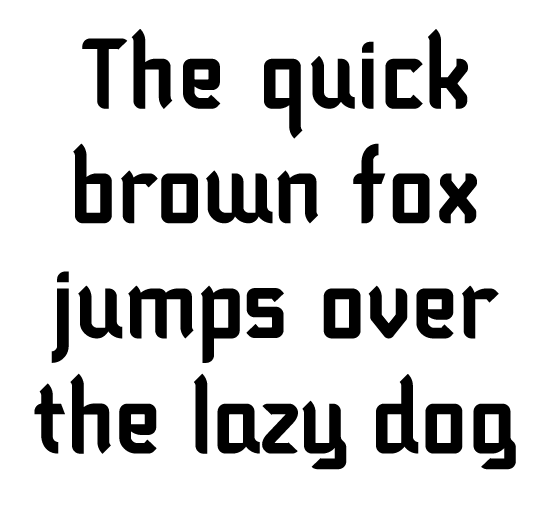
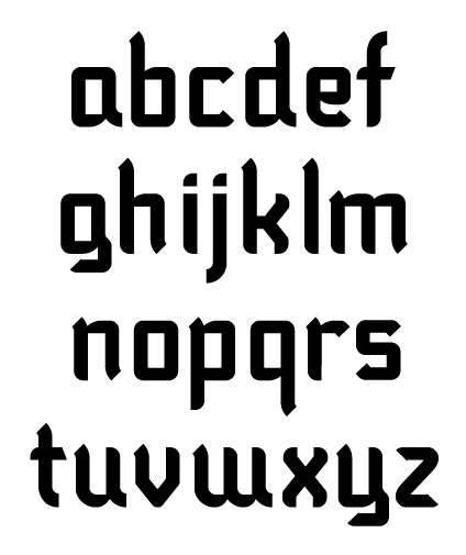
I've been developing this over the past few days and wanted to get some feedback. Thanks.
| Attachment | Size |
|---|---|
| benmont1.gif | 11.08 KB |
| benmont_caps.gif | 10.79 KB |
| benmont_small.gif | 9.42 KB |
I've been developing this over the past few days and wanted to get some feedback. Thanks.
| Attachment | Size |
|---|---|
| benmont1.gif | 11.08 KB |
| benmont_caps.gif | 10.79 KB |
| benmont_small.gif | 9.42 KB |

Russ, Benmont is quirky and I love it. I know that doesn't sound like a serious, bona fide crit, but that's how I feel!

I love those caps!
Not too sure about the lowercase just to yet, but those caps are very cute.

My reaction is the opposite of Alex's. The lowercase is nifty but the caps aren't quite there.
I think both W and w might be better off without the trailing stroke.
Thanks for the comments so far.
Alex, what is there about the lowercase you might change?
Cerulean, what could make the caps look better?
Thanks.
Just some things that look out of character. I would definitely:
Round the top left _or_ square the bottom left of the C.
Give the D a top-left stem (as on B, P, R).
Remove the upturn from the bottom right of the E.
Rethink the G completely.
Beyond that, the general squareness seems harsher on the tall capitals than on the lowercase, but as I flip back and forth between them it occurs to me that we can't really judge how well they go together without seeing them set together.

I agree with alexhb - I'm feeling the caps!
Thanks for the feedback cerulean and grosner. I'll make the changes and see what it looks like at that point.
Captured from web.archive.org on 24 Jan 2015. view this capture