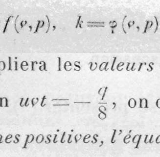
Looking through French mathematics books from the 19th century, I see mostly this typeface. I assume it's a standard Didot, but it has a more gentle thick/thin contrast than any Didone I see today. Also, it has a contextual italic-lc "v", rounded at the beginning of words but pointed when alone, in equations, or within words. The particular sample in the picture also has a straight italic-lc "f" whereas one with a curved tail is the usual.
As far as I can tell, the sharp "v" was used regularly until about 1910. Here are my questions:
1. What's the story on the sharp "v", that is, history and conventions of usage and why it ended?
2. Is there a digitized version of this font that has the moderate thick/thin variation and the alternate "v"?